The chat log era of artificial intelligence is coming to an end.
Google has just released a new version of its AI assistant, Gemini, that radically rethinks the prompt-and-response interface that has been a mainstay of the first few years of widely available generative AI.
Instead of users typing in questions or prompts and getting back detailed written answers—”the giant wall of text,” as Gemini’s UI/UX lead Jenny Blackburn puts it—Gemini will now respond with a wider variety of content, from rich visuals to interactive elements to magazine-like graphic layouts. Depending on the prompt or query, Gemini will organically respond with the most appropriate level of detail in the display format that makes the most contextual sense.
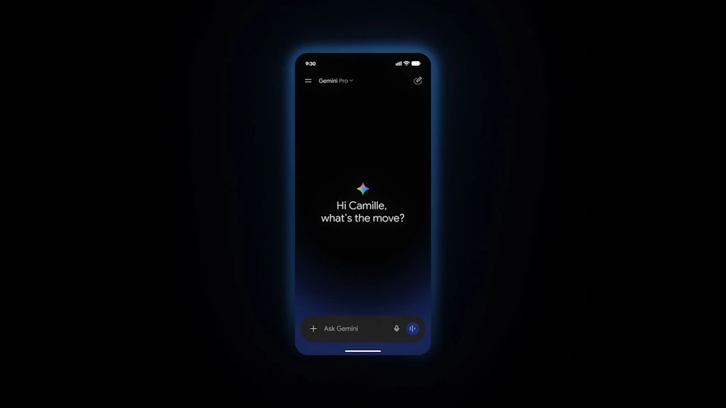
“It stops feeling like you’re scrolling through this endless chat log and more like the interface is organically adapting around the information that’s being generated,” says Blackburn.
Announced at Google’s annual developer conference, Google I/O, the redesign of Gemini is a major shakeup of the user interface of mass market AI. With an estimated 900 million monthly users, Gemini is one of the main ways most people interact with AI firsthand.
Until now, those interactions have been limited by the parameters of the chat format, a sometimes clunky conversation that can require asking and re-asking a question to get an AI to return a useful nugget of non-hallucinated information. The new Gemini app and desktop experience was designed around adaptability, with more intuitive controls and features, more ways of injecting information or collateral detail into a prompt, and more nimble responses.
“We think that as this technology becomes more capable, the interface should actually get simpler,” Blackburn says. “Instead of you as a user having to learn and adapt to the software, which has been how software has been forever, we really see a future where the software adapts to the user and takes into account their specific needs.”
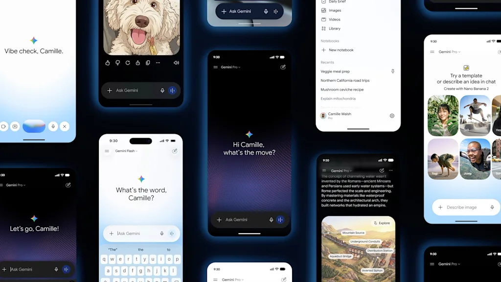
Blackburn and her team drew on a depth of user data and feedback to guide their interventions. One prominent request from users was to be able to toggle more easily between input modes, switching from typing a query to speaking to uploading documents or reference images.
“Multimodality matters a lot,” says Blackburn. “We see, particularly on phones, people use their camera a lot to give context to Gemini. They also really like to switch between voice and typing. And they were telling us you need to make this easier.” The redesigned Gemini streamlines the typing interface by displaying only the text box and the keyboard during written prompting, and has a separate menu with a simple grid of icons to choose other forms of input.
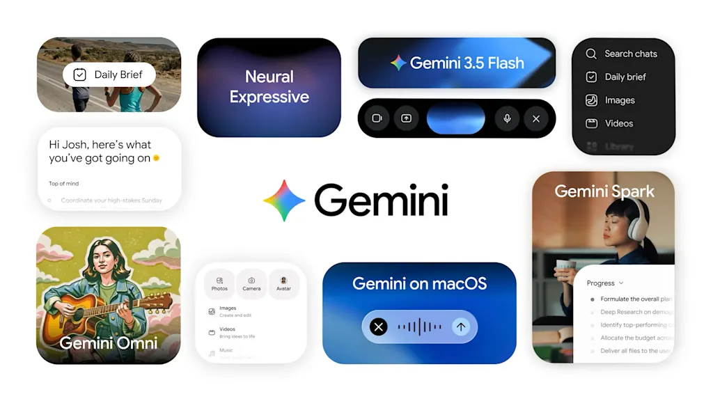
Blackburn says the redesign of Gemini was a chance to reframe the AI experience, offering not just a superficial gloss but a more thoughtful design scaffold undergirding the entire process of prompting and receiving a response. She and her team developed a visual concept for the new Gemini that references the atomic-level movement of energy, and simple interconnected units that work together as a system.
“This is a subtle nod to what’s happening behind the glass. And it’s intended to capture the fluid momentum of the model as it’s processing data,” she says. They named the resulting design language Neural Expressive. “We wanted to create the feeling of seeing neurons fire,” she says.
This shows up in various ways, from the procedurally created animated background on the main query screen to the motion in the menu when the system is listening to a query or processing information.
The design language also governs how Gemini’s responses get displayed in that text-wall-busting visual layout, giving information a hierarchy and organizing it in ways that make processing large amounts of information easier.
For a typical query, a simple, overarching answer is displayed at the top of the page, with additional information presented in digestible layouts like chunks of text broken up by embedded images or videos, and offset bullet points summarizing key takeaways.
“Every single change we made was really engineered to make it more scannable, reduce the fatigue of reading, and really make it easy and effortless to deep-dive into the content,” Blackburn says.
On the imagery side, some of what Gemini will display to users will be real images, like photos of actual products in response to a shopping query. Other times, like when a diagram would do a better job than text in explaining a scientific concept, the images will be created on the fly using Google’s Nano Banana AI image generator.
Blackburn says this added functionality within Gemini works without bloating the system, or taking extra time to field a query. “The way I thought about that was this can’t be slower. If people have to wait, that’s a really hard trade-off,” she says. “We did a lot of rigorous testing to make sure that these responses are not slower because they have these new attributes in them.”
The Gemini redesign is so dramatically different from the typical AI interface that it may set a new standard. At the least, it will make Gemini a less rigid AI tool for its many users.
“It’s not just a cosmetic refresh. It really is sort of like a deep reimagining of the experience,” Blackburn says. “As responses become a lot more tailored to what the user needs, that’s going to change how they use the product.”