The much-loved developer site has had a tough couple of years. So Koto’s job was a tricky one: not just a fresh look, but a fresh argument for why Stack Overflow still matters in the AI era. Here’s how the global studio pulled it off.
There are really only a handful of reasons a brand decides to reinvent itself. Sometimes it’s a growth spurt, and the old look simply doesn’t work any more. Sometimes it’s a new market or audience. And sometimes it’s because the world has shifted under your feet, and you need to remind everyone why you still matter.
Stack Overflow’s new identity, by global studio Koto, has a little of all three. And that, for me, is what makes it such a good project to pick apart.
If you’ve spent any time near a developer these past couple of years as I have, you’ll know it’s been difficult times for Stack Overflow. It’s an 18-year-old site where programmers have always gone to get unstuck. But as Gergely Orosz pointed out in The Pragmatic Engineer, the number of questions being asked has slipped back towards where it started, with the sharpest drop coming once ChatGPT turned up in late 2022. And you can see why. When a chatbot trained on Stack Overflow’s own answers will reply in seconds, the old ritual of posting a question and waiting for an answer starts to feel, well, clunky. Even so, I have a soft spot for the place. My husband is a software engineer, so I’m rooting for it.
You might expect a rebrand at this point to be a lick of fresh paint and not much else. But Koto and Stack Overflow have done something far cleverer. Rather than tiptoe around the AI wave, they’ve gone and planted the new brand right in the middle of it.

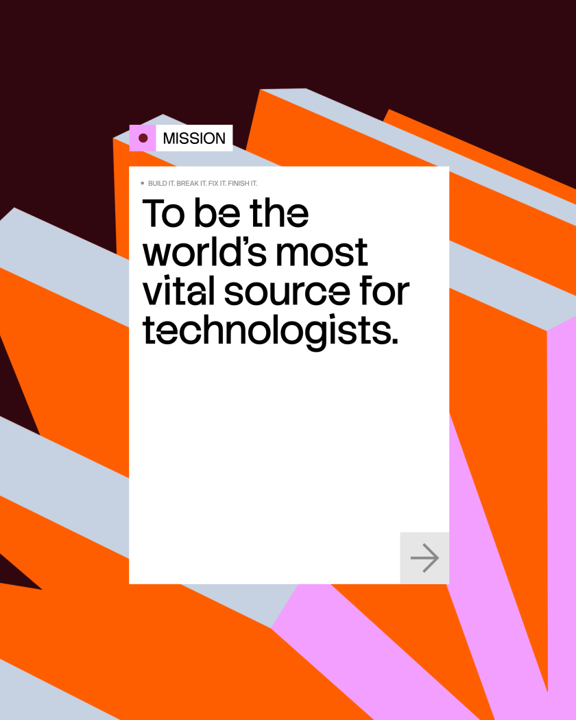
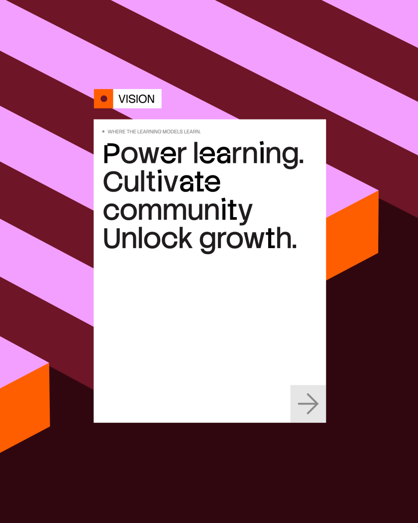
The whole thing hangs on one rather sharp truth: AI is only as good as the information it learns from. “In the AI era, everyone wants faster answers. But speed is only useful if the knowledge underneath is trusted,” says Cat Hill, senior strategist at Koto. “Stack Overflow’s advantage has always been its community: people asking, testing, correcting, and improving technical knowledge in public. The strategy was about reframing that value, from a Q&A platform to the world’s most vital source for technologists.”
It’s a clever pivot, and a fair one. With more than 83 million community-contributed questions and answers, Stack Overflow holds one of the largest stores of human-checked technical knowledge anywhere online. That’s pretty valuable when the machines occasionally get it wrong.
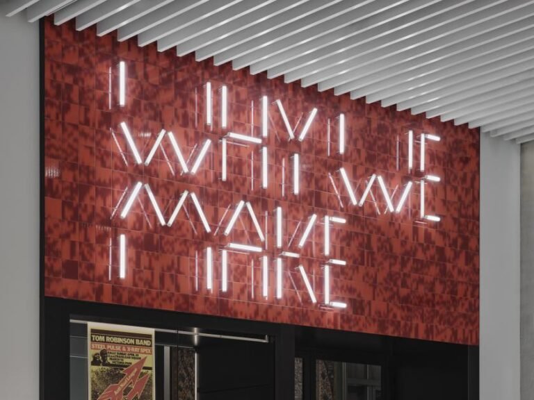
Always in build
The identity itself is built, appropriately enough, around the idea of “always in build”. The brand behaves like the community it serves: modular, iterative, responsive, put together layer by layer, answer by answer. The evolved logo keeps the equity everyone already knows but sharpens its meaning, with stacked, offset lines that hint at accumulation, overflow, and steady progress. From there, “stacking” becomes the organising idea for everything – structuring layouts and hierarchies in their simplest form, and creating real depth and momentum in their more expressive moments.
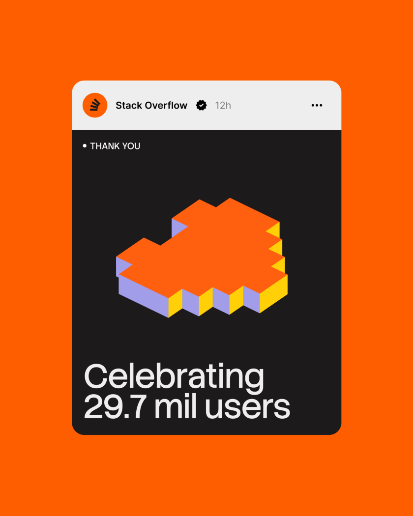
“The new Stack Overflow identity embraces the spirit of its community, visually referencing the fact that its users are always building,” says Joe Ling, creative director at Koto. “The multi-state building blocks (‘the stack’) became the central brand asset as they symbolise the infinite possibilities of what can be achieved on the platform.”

Here’s the smart bit. To keep the system as lively as the community itself, Koto translated all that behaviour into a custom generative tool, built with Claude, that lets teams nudge composition, motion and colour to spin up fresh assets without the brand ever wandering off-piste. The palette layers up from Stack Overflow’s signature orange, and the typography is led by Stack Sans, a custom typeface by Koto that you can find on Google Fonts. There’s a new tone of voice, too. One that’s clear, direct and a little bit cheeky… written to sound like the technologists who’ve relied on the site for nearly two decades, rather than at them.
And here’s the part I love most: the process mirrored the community behind the platform. Koto and Stack Overflow shared their design routes out in the open and put them to a vote at WeAreDevelopers World Congress 2025, before launching the brand at Microsoft Ignite in November 2025 and rolling it out across the website. “Our partnership with the Koto team clarified both our business and brand imperatives – who we serve and why,” says David Longworth, senior director of design at Stack Overflow, “and ultimately helped translate this direction into a strategy and tangible decisions on what we build and how we market it.”
Founded in 2015 by James Greenfield, Caroline Matthews and Jowey Roden, Koto now operates five studios across Berlin, London, Los Angeles, New York and Sydney, serving clients including Google, Netflix, Meta and Microsoft.
So, which kind of rebrand is this in the end? A bit of everything, really – a brand making the well-argued case that human knowledge is the very thing the machines can’t do without. And if that holds, Stack Overflow has just given itself a rather lovely reason to stick around.