The sun is shining, the type industry is buzzing, and the latest fonts are by no means playing it safe. We check out the most interesting releases of July 2026.
In mainstream journalism, July and August are often called the “silly season” because, without Parliament sitting, there’s not much serious news to report. But the world of typography couldn’t be more different, with new developments continuing apace despite the heat of the moment.
NaN, the foundry behind custom fonts for Deezer, Wise and Channel 4, has launched fonts.xyz a new platform for independent foundries and designers offering an 80% royalty cut, a unified all-inclusive licence, an 80% student discount, and a 1% solidarity tax. It’s a direct challenge to the platform monopolies that have shaped font retail for years, and well worth keeping an eye on.
It’s a rich month for individual font releases, too. Max Phillips returns from Dublin with another idiosyncratic gem. Mark Caneso releases his warmest typeface yet. A Galician designer finally publishes a project she started at Reading University eleven years ago. And a Brooklyn-based designer gives away a free typeface as a love letter to a neighbourhood. Read on to learn about these new fonts and more.
1. Solaflare by John Roshell
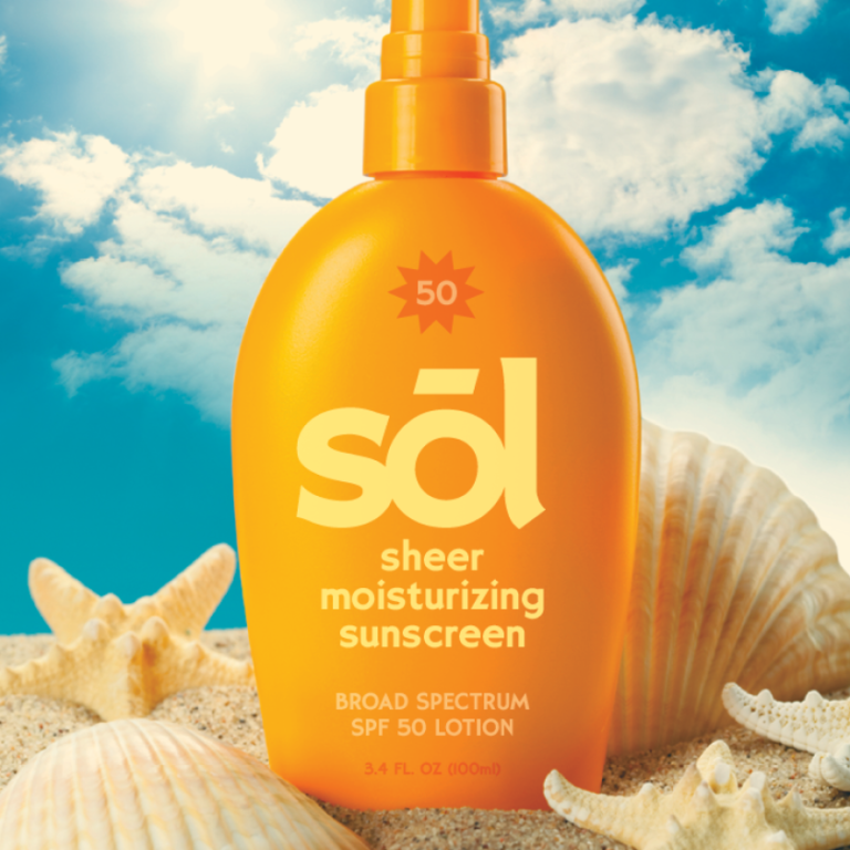
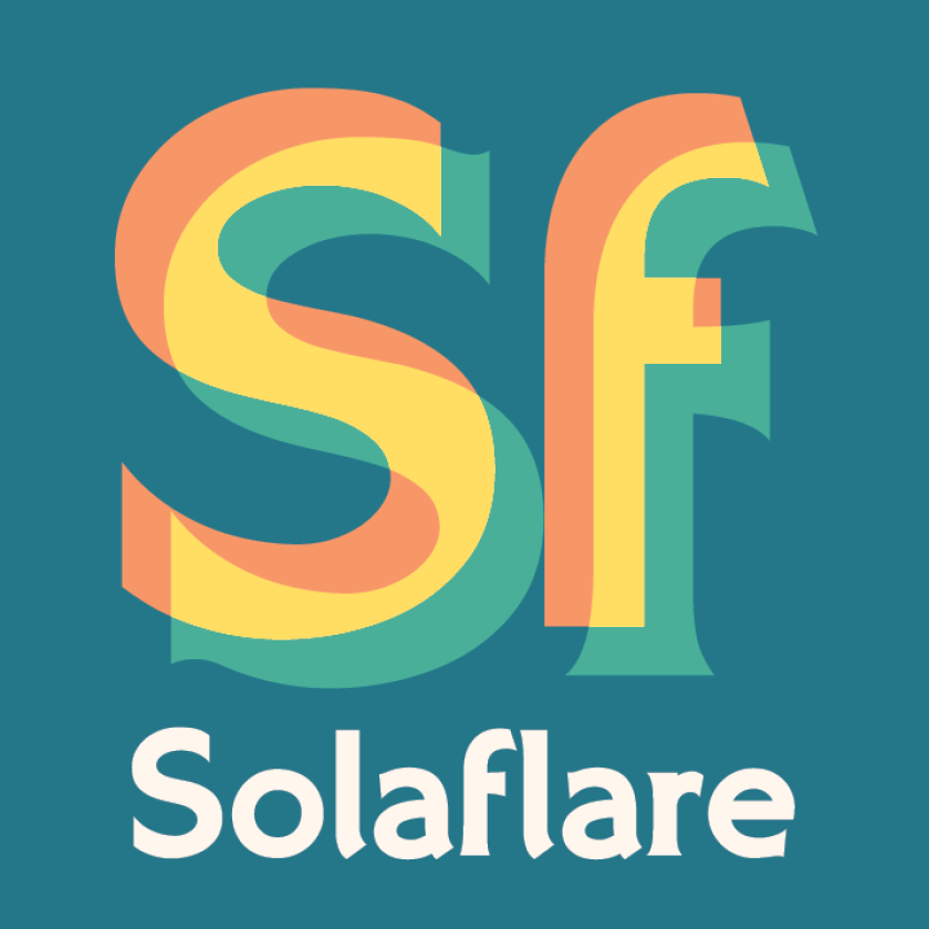
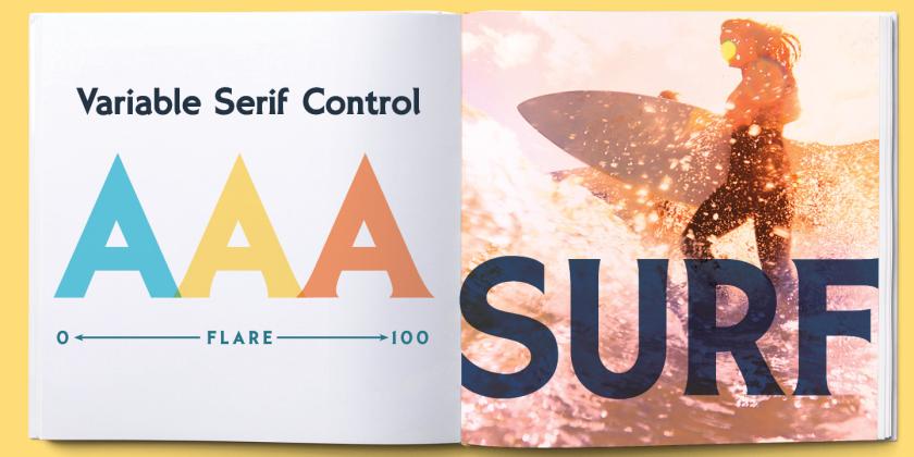
Solaflare’s mood is both unmistakable and timely, evoking warm evenings, hand-painted shop signs, and the particular quality of light in a California coastal town. John Roshell of Swell Type was inspired by the hand-painted signage of Santa Barbara, but rather than simply reviving that aesthetic, he built a variable font around it; one that lets designers slide between three distinct typographic personalities within a single file.
At one end of the axis sits Sans: clean, geometric, decisive. At the other is Serif: bold and sharp, with the confident weight of display type that knows it has something to say. Between them is Flare, which captures the quality that makes hand-painted signage so appealing: that gentle widening of strokes at their terminals, as if the brush held on just a moment longer.
2. Cajueira by Sofia Mohr
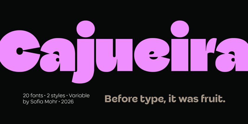
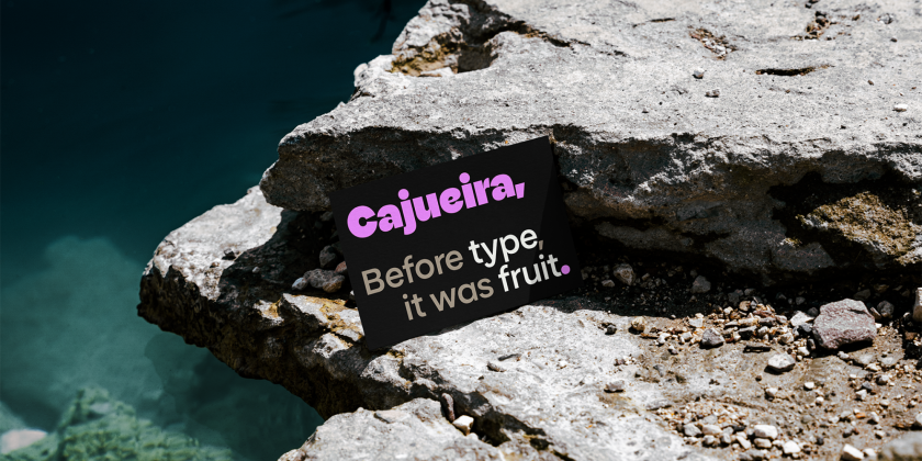
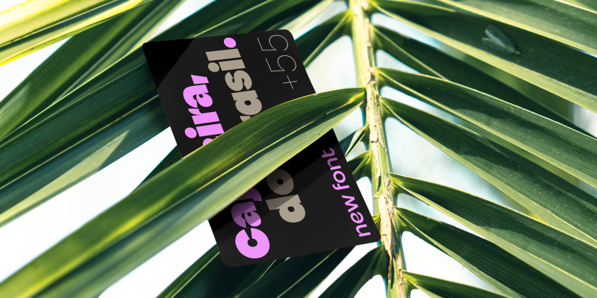
We featured Sofia Mohr’s Autêntica Sans back in April, and she returns this month with an even more ambitious project. Cajueira takes the Brazilian cashew tree (“caju” for the fruit, “-eira” for a place of becoming), not as a visual reference but as a conceptual framework. This typeface is about growth, expansion, and maturation, and how that process changes form over time.
There are 18 styles from Thin to UltraBlack, across Normal and Display versions, plus two variable fonts. As the weights increase, counters tighten, curves expand, and the typeface shifts from clarity toward expression, each weight represents a stage in development rather than simply an increase in thickness. The project was recently selected for the 10th Bienal Tipos Latinos, one of the most important showcases of contemporary Latin American typography, which suggests the broader field has noticed what we noticed in April: Sofia Mohr is producing some of the most thoughtful and original type design currently emerging from Brazil.
3. Detail by Mark Caneso
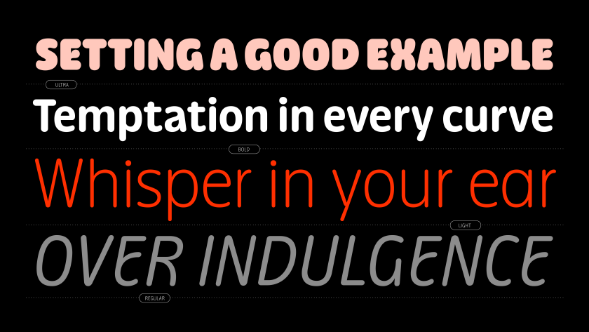
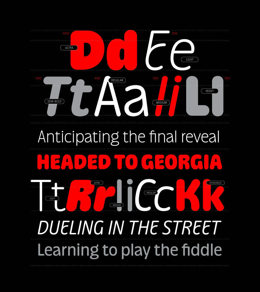
Mark Caneso’s Please, from earlier this year, was a typeface that got “delightfully strange” at heavier weights. Detail takes a different approach entirely: it has character you can get away with. Eight weights with matching italics and two variable fonts, all wrapped in a rounded sans idiom that feels warm and familiar at first glance… until you look closer.
The personality is in the deviations. A slight bend here, a small tilt there. These carefully placed departures from convention add what Caneso calls “flavour to the familiar,” creating moments of distinction within an otherwise dependable system.
Stylistic sets and alternate forms reveal further layers: designers can shift the tone toward restraint or expression without losing the typeface’s consistent voice. The overall effect is of a typeface with, as Caneso puts it, “a smirk hidden beneath its composed contours.”
4. CoFo Robert Sans by Liza Rasskazova
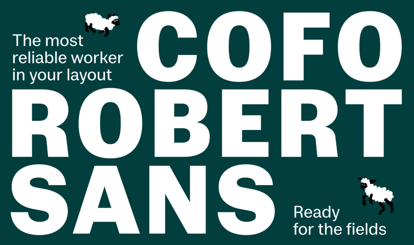
Most sans serifs appeal to rationality: clean, neutral, mechanical. CoFo Robert Sans makes a different argument: what if a daily grotesque was built not from geometric abstraction, but from the warm proportions of a slab serif? Liza Rasskazova’s design for Contrast Foundry takes CoFo Robert, the foundry’s bestselling Clarendon-inspired slab that has been in the library since 2014, and uses it as a structural foundation, translating those traditional, calligraphically grounded proportions into a modern, clean grotesque with a human touch.
The special features are subtle but present: moderate contrast, balanced proportions, and a softness in the curves that brings warmth without compromising function. Seven weights from Light to Black, with small caps, superscript and subscript figures for both Latin and Cyrillic, make it a comprehensively specified workhorse for complex typographic needs.
5. Sastre by María Ramos
Some typefaces take years. Sastre took 11. Galician designer María Ramos began the project as a student at Reading University in 2014, and NM Type—the foundry she runs with designer Noel Pretorius—is only now releasing it to the public.
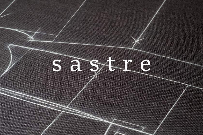
Ramos found the broken structure of Sastre’s letterforms in the drawings her father made on fabric at the tailor workshop her parents had run for over 40 years. Natural patterns contributed too: the surface texture of a tree leaf, the geometry of spider webs. Beatrice Warde called fonts “the clothes that words wear”; Adrian Frutiger compared the type designer’s work to a dressmaker’s. Ramos took those analogies seriously and built a typeface from them.
The result is a text serif with five weights and a variable font, featuring 663 glyphs, including a collection of 25 stitches that function as geometric shapes for creating patterns and borders. Small caps are set in a monospaced font, adding a further typographic voice.
6. Differently by Elena Genova
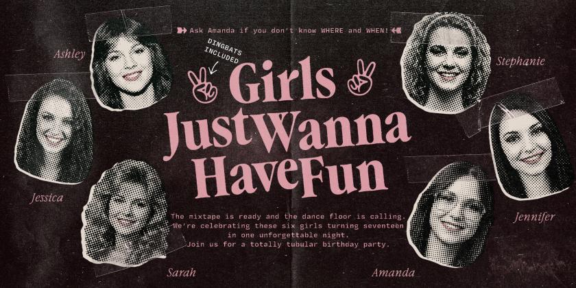
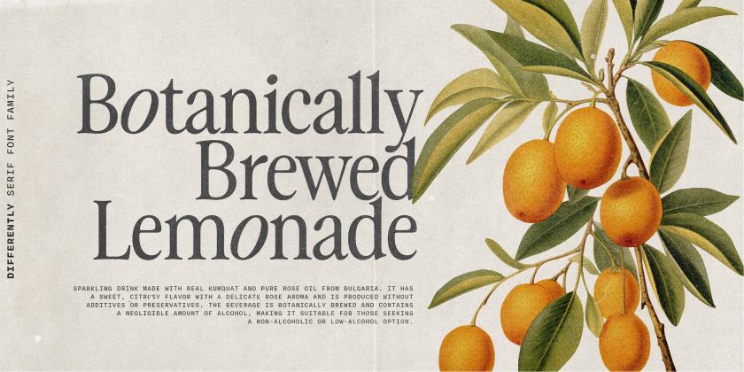
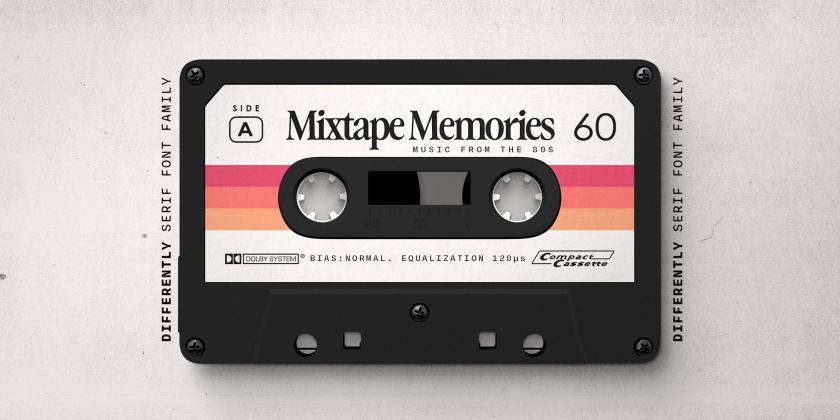
Picture the brief: a Garamond revival that references Apple’s print advertising from the 1980s and early 90s; those carefully typeset magazine ads that reminded a generation of designers how powerfully typography could carry a campaign. Elena Genova of My Creative Land has taken that specific cultural moment and used it as a lens through which to reinterpret a classical tradition. The combination is more coherent than it might sound.
Softened forms give Differently a tactile, almost printed quality; the texture and humanity of vintage magazine ads translated into contemporary letterforms. Ligatures and a true italic add rhythm and expressive character, and the result sits in that productive space between nostalgic and retro. For branding, editorial, packaging and campaigns where the audience should feel the typography before they consciously register it, Differently offers a distinctive voice.
7. Stylenoir Script by Tasos Varipatis
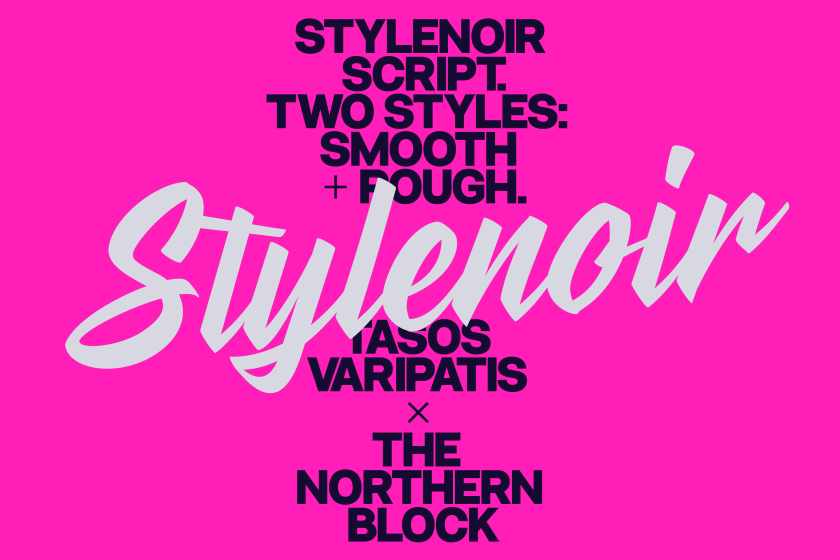
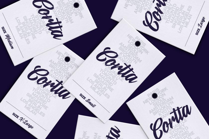
Stylenoir Script is a script typeface that bridges the gap between refined and raw, without compromising either quality. Designed by Tasos Varipatis for The Northern Block, under the creative direction of Donna Wearmouth, it draws on hand-painted signage, brush lettering and urban graffiti culture. It delivers both influences in two distinct styles.
Smooth is the polished version: clean lines, expressive movement, handwritten rhythm, but without any rough edges. Rough is the honest version: textured, imperfect, organic, recreating the appearance of lettering made with a dry brush or marker. Together, they give the family enough range to serve both contemporary layouts and more tactile, character-driven applications without feeling like two separate typefaces forced into the same family name.
8. Greenpoint Sans by Sasha Denisova
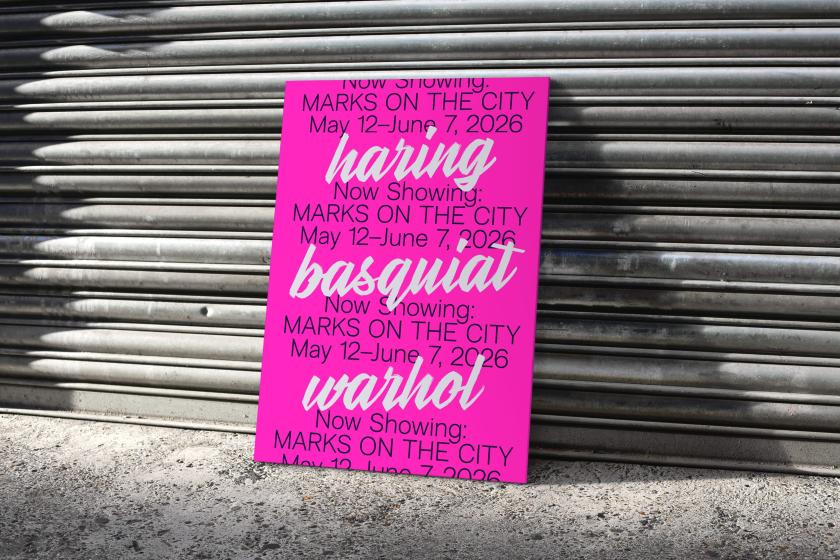
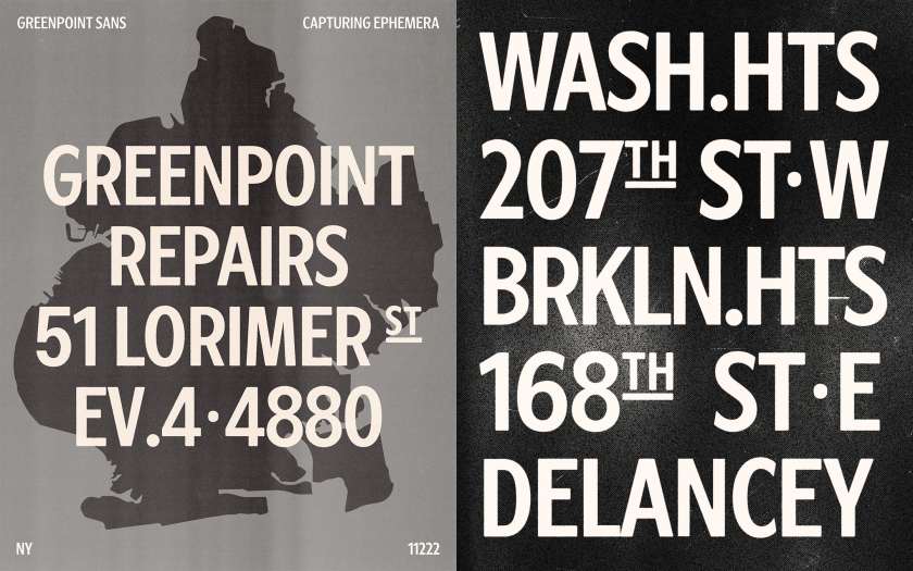
Sasha Denisova moved to New York and started looking at the everyday typography that rarely gets treated as design. Bodegas and brick façades. Hand-painted signs and narrow storefronts. Dense menu boards. Greenpoint, Brooklyn, became the neighbourhood she understood through observation, and after a year, she transformed that archive into a typeface.
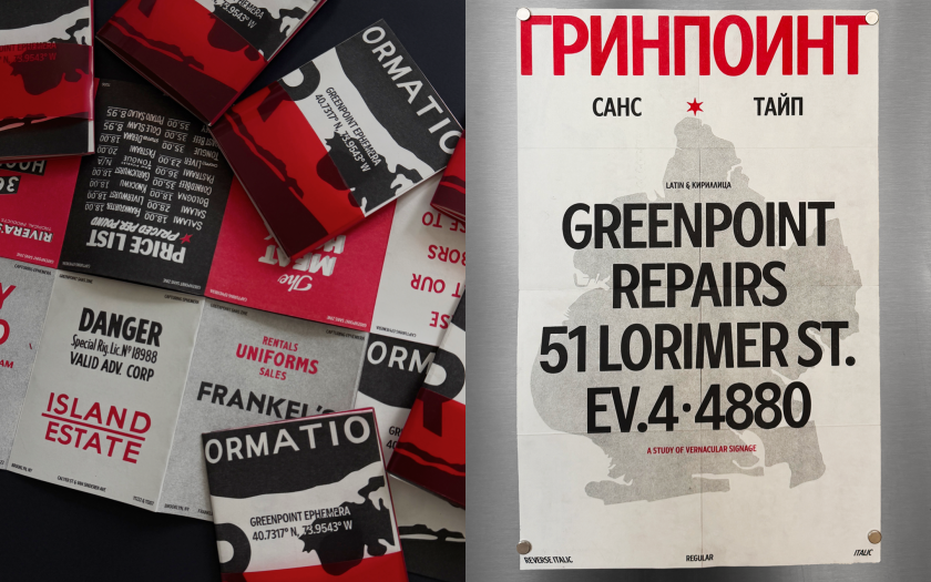
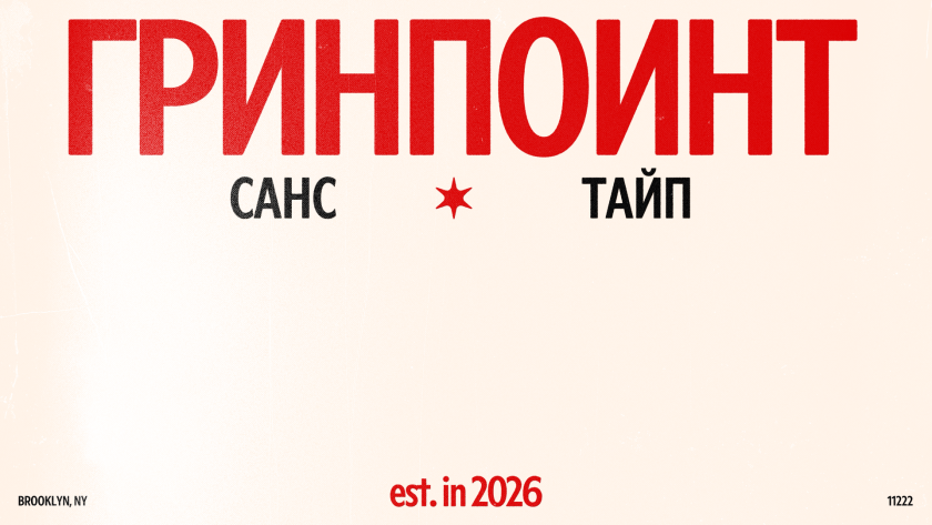
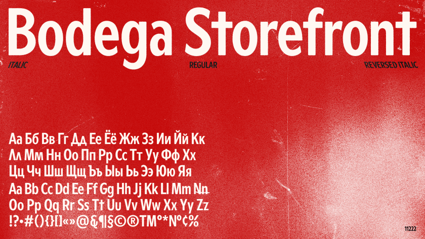
Greenpoint Sans is a condensed sans serif that translates the local visual language into a contemporary type system without actually recreating specific signs. Instead, it distils recurring traits: tight proportions shaped by narrow façades, raw geometry, reverse-slanted lettering, dense rhythm, subtle irregularities. Alongside the typeface, Denisova created a risograph-printed specimen zine documenting the source signage, a small archive of Greenpoint’s typographic ephemera as the neighbourhood changes around it.
Best of all, it’s released under a Creative Commons licence, making it free for personal and commercial use. This is Sasha’s way of giving something back to the place that taught her to see typography differently. It’s one of the most generous gestures in this month’s round-up, and one of the most charming too.
9. Rosebriar by Laura Worthington
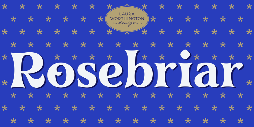
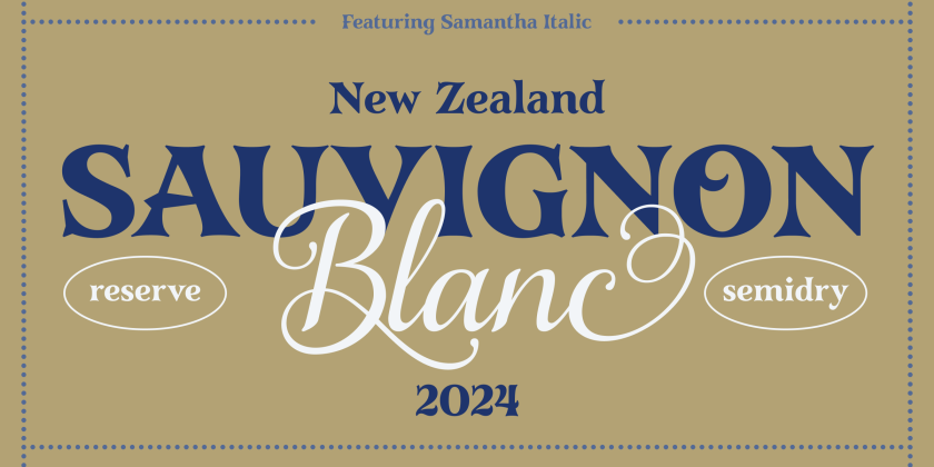
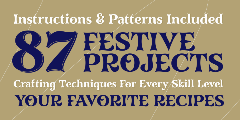
There’s a particular category of project for which Rosebriar was clearly designed: the book cover, the wedding invitation, the small-batch spirits label, the heritage brand refresh that needs to feel handcrafted and considered rather than generically “vintage.” Laura Worthington’s decorative display typeface occupies this space with confidence, drawing on Gothic ornamental traditions without ever tipping into pastiche.
The Roman structure is solid and readable. What makes it distinctive is the selective application of ornamental details—wedge cross strokes, splayed terminals and diamond-shaped tittles—that give the letterforms a crafted, foliate quality. Primarily designed for titling, it extends to subheads, callouts and short passages without losing composure.
10. P22 Stickley 2 by Michael Stickley
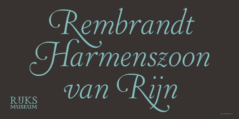
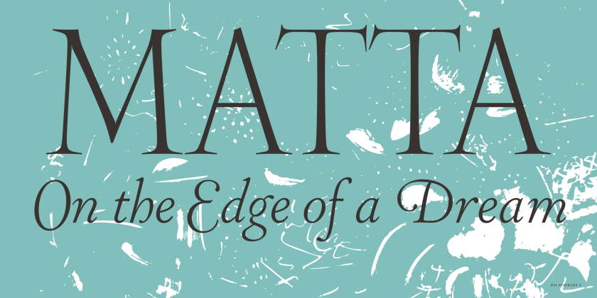
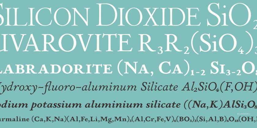
The original Stickley Pro was a well-regarded Old Style humanist serif. Stickley 2 is an expansion of that design, and the scale of the expansion is substantial. Five optical sizes (Caption, Text, Headline, Display and Banner), three weights across all sizes, and subtle variations in proportion, detail and contrast between them. Multi-script support for Cherokee, Cyrillic, Greek and Latin. The kind of comprehensive typographic specification that publishing and editorial designers who work across complex systems will recognise as genuinely useful.
P22 Type Foundry has been doing this kind of work since 1994, focusing on letterforms that would otherwise not exist in digital form, and Stickley 2 fits that mission well. It’s sturdy and refined, with the “true thoroughbred” quality the foundry claims: this is a typeface that has clearly been developed with serious long-form use in mind.
11. Micronova by Michael Mischler and Nik Thoenen
Designed by Aldo Novarese in 1962, Eurostile occupies a particular place in the typographic imagination thanks to its super-elliptical letterforms, technological optimism, and a design that felt genuinely futuristic at the time. Micronova, from Zurich’s Binnenland Typefaces, builds on that lineage with a rigour and systematic intelligence that honours the source without simply repeating it.
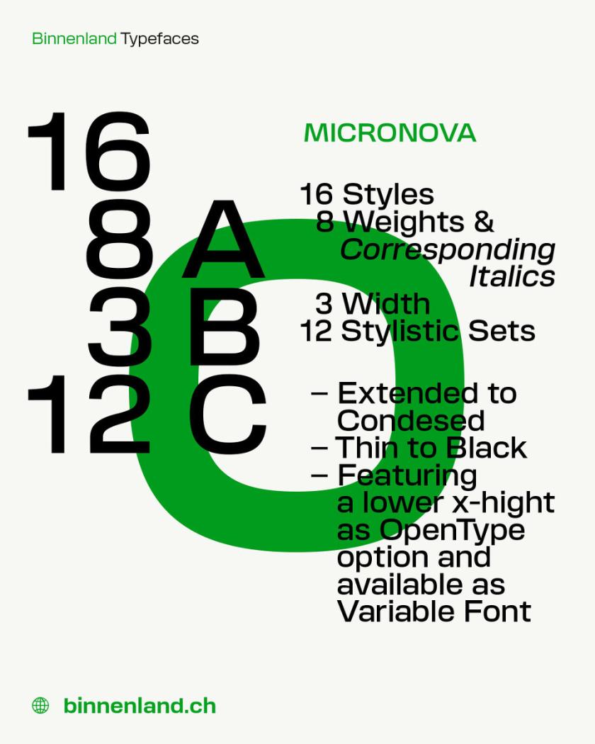
Three carefully tuned variable axes (weight, width, and x-height) are designed for precise control rather than exaggerated variation. The width axis runs from Narrow (60) to Extended (120); the x-height can be reduced from its default of 500 to 470, available as an OpenType feature or via the variable slider.
Sixteen static styles across eight weights with corresponding italics, plus three widths and twelve stylistic sets, complete a system that Mischler and Thoenen describe as offering a fresh perspective on progressive modernist principles. It is now also the corporate typeface of Binnenland itself.
12. Oratorio by Alex Chavot
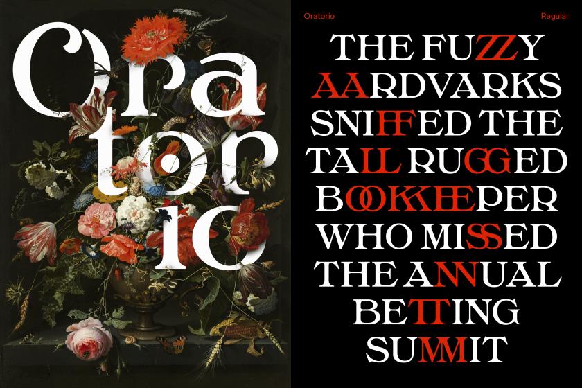
What happens when a Jugendstil tenor meets a 1970s American funk band in a phototypesetting studio? Oratorio, apparently. Alex Chavot’s latest release for Apex Type Foundry — launched alongside a comprehensively rebuilt foundry website — takes Halbfette Cantate, a display face released around 1910 by H. Berthold AG and designed by Johann Graf, as its starting point, then runs it through the filter of Ed Benguiat’s flamboyant 1970s classics.
The result is sweeping swashes, lyrical terminals, high contrast, and an unapologetically theatrical personality that Chavot describes, accurately, as ornamental excess meeting typographic swagger, with just enough restraint to keep it printable.
Single-weight display faces are increasingly rare in an era of variable families. But Oratorio makes a compelling case for a single weight, applied to the utmost expressiveness. Four sets of initial capital forms, numerous alternates, and robust OpenType features provide a wide enough range of expressive options to sustain genuine variety in use.
13. Milgram by Max Phillips
Max Phillips of Signal Type Foundry has a gift for describing typefaces, and his account of Milgram is direct. They’d always wanted to add a humanist sans to the library, and always wanted to add a rounded sans. So they decided to save time by making them the same typeface and seeing what happened. What happened was a wave of nostalgia for Frankfurter, VAG Rundschrift, and an all-caps dry-transfer face called Formula One that nobody else seems to remember.
The result is a family of 12 styles in which the lightest weights have a slightly technical air, as if engraved on a glass beaker, whilst the Black weight is (Phillips’ words) “zaftig, and maybe a bit Bootsy Collins”. Very open counters and low contrast make for excellent readability across the weight range, and support for 140-odd languages, including Vietnamese, is impressive.