For any brand, a major redesign is a make or break moment. But for legacy companies with decades of clout behind them, the stakes are even higher.
So when Coca-Cola unveiled a new global visual identity this week (it has not yet launched in the North America market), it also gave the internet something to talk about.
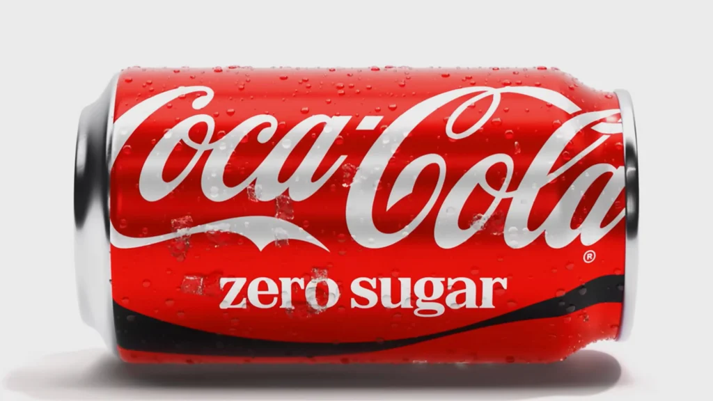
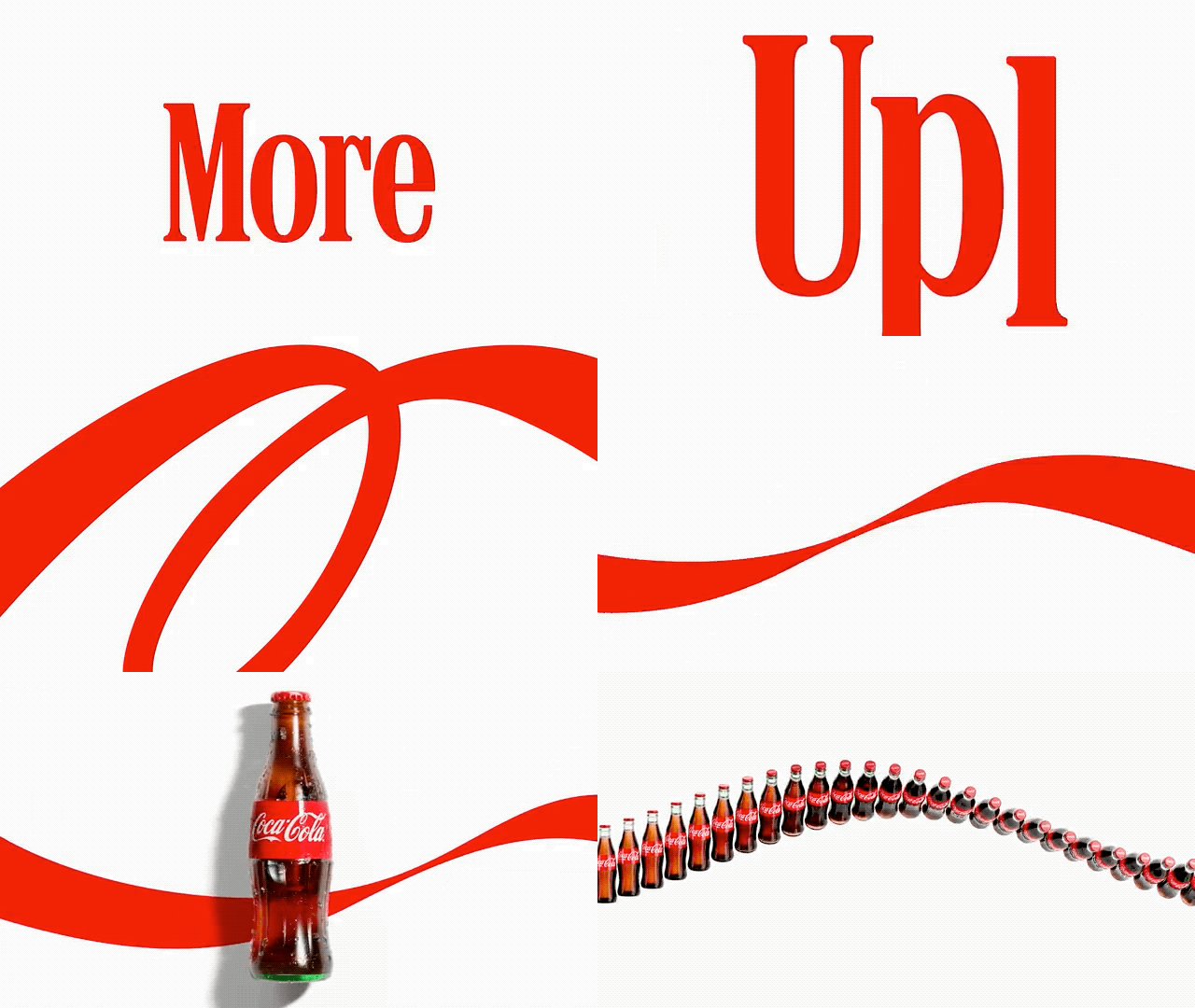
The new identity retains the 140-year-old brand’s unmistakable red-and-white color palette and the logo is the same. Now, however, the “Coca-Cola” wordmark on cans sits vertically. And no matter the variety, the logo is also now the same color (for reference, Coke Zero used to bear black lettering). Additionally, the identity leans into one of the brand’s most iconic assets, the ribbon, which can be woven in to still mediums like cans or billboards, but also come to life dynamically on video. It’s an update that honors the brand’s past while updating assets for the myriad platforms where brands need to appear today.
“Coca‑Cola is one of the most recognized brands in the world, and with that comes a responsibility to keep evolving” Arnab Roy, President of the Coca‑Cola Global Category, said in an announcement. “By building on the things people already know and love, we’re creating a stronger foundation for growth while staying unmistakably Coca‑Cola.”
However, there is one new design feature that is reminding users of something else: a tall serifed typeface from Brody Associates that resembles the wordmark of an iconic brand of cigarettes.
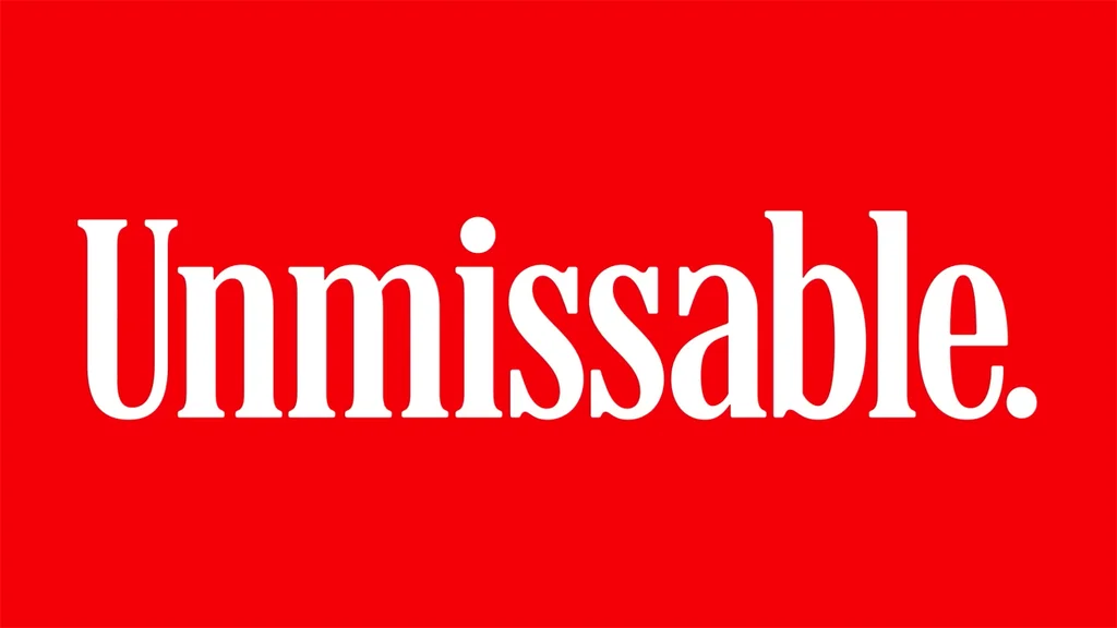
“thats Marlboro font lmao,” a user wrote on X, referencing the typeface used across Coca-Cola’s new visual identity.
The fonts are not identical, but the similarities have struck a cord with users.
“It’s not the same typeface, but it’s too close. A sugar company should not remind people of cigarettes,” a user said.
The Coca-Cola-cigarette connection goes deeper than lookalike fonts. Last summer, the phrase “fridge cigarette” took over social media, a nickname for a crisp and cold Diet Coke becoming a guilty pleasure.
Some armchair critics questioned if the trend inspired the artistic direction.
“When we joke about calling a crispy Diet Coke a fridge cig we didn’t mean rebrand coke to Marlboro,” a user said on X. Another added, “Love that they just leaned into the fact that soda is the new cigarettes by just straight up doing the Marlboro font.”
But for others, the big highlight of the visual identity is not the alleged similarities with other brands, but the resemblance to its own, elevating its existing identity rather than completely changing it.
For instance, part of the new visual identity shifts focus back to the Arden Square, a product of Lippincott & Marguiles’ corporate identity work for Coca-Cola in 1969. By doing so, the brand not only nods at its own history, but also taps into nostalgia a growing trend favored by consumers today.
“I can’t stop thinking about why I love it so much,” Stef Ivanov, founder of branding agency Pony Studio said on X. “I think it’s because everything around us became disposable…We got so used to replacing things that keeping them feels weird now. Boring, even.”
He added, “Here’s a hundred-year-old brand saying no – not enough. We need more of us. We’re keeping it. That takes way more confidence than any redesign.”