
All photography by Jade Ambre
We meet the art director behind the bold new look for Round: the egg bun joint shaking up the French capital.
Paris isn’t short of stylish eateries, but few are as punchy or irreverent as Round, a Californian-style egg bun restaurant founded by two passionate foodies with a flair for the unexpected.
Tucked near the hip Canal Saint-Martin, its minimalist interior features rough, exposed walls and a long, industrial counter, a gritty backdrop that gives the space its unmistakable skate-inspired edge. Customers rave about the friendly staff, the atmosphere, and its Instagram-worthy bites, with one review claiming: “Literally the best breakfast sandwich I’ve ever had”.
It’s the kind of spot that instantly speaks to the creatively inclined. Think graffiti-covered walls, custom sock merch, and an attitude that crackles with energy – like a kickflip captured mid-air.
Round first opened its doors on Rue Louis Blanc in 2021, quickly becoming a cult favourite in the 10th arrondissement. Fast-forward to 2025, and the founders were ready to open a second location on Rue Saint-Denis – and with it, give the brand a fresh new look. That’s when they called on Paris-based art director Pierre Rousteau.
With 14 years of experience in editorial and visual identity design – and a strong typographic sensibility – Pierre took a no-holds-barred approach to the brief. The mission? To build an entire universe around Round’s irreverent spirit, channelling skate culture, tattoo art, and graffiti into something wholly original.


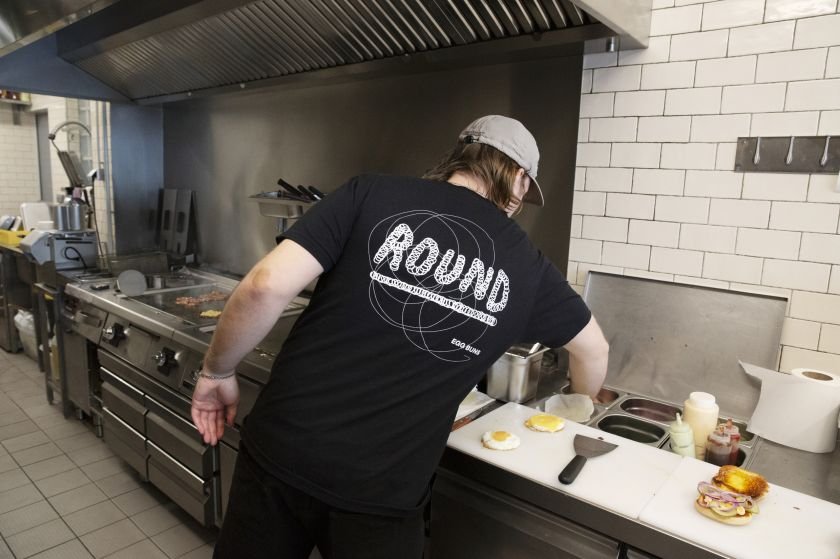
At the heart of the new brand is a hand-drawn logo built entirely from scratch. Its circular motion nods cleverly to three references: beaten eggs (the star ingredient of Round’s buns), the smooth curves of a skateboarder in a halfpipe, and the whir of a jump rope — a subtle allusion to boxing, and a wink to the restaurant’s name.
This freewheeling energy runs across every touchpoint, from wall-painted signage and hand-drawn titling to custom packaging and wearable merch such as tees and socks. The result is a unified yet unruly identity — one that makes Round stand out in a sea of minimal cafés and heritage bistros. And believe me, when you’re opening a new joint in Paris, you want it to be memorable.
“I wanted the branding to feel alive – like something in motion,” says Pierre. “It had to echo the energy of the place, the people, the food… nothing static or overly polished. Just raw, joyful, and full of attitude.”


Looking through the stylish shots of the revamped eatery — beautifully captured by local photographer Jade Ambre — it’s clear Pierre has bottled up exactly why people love Round. One Google review puts it best: “Absolutely loved this spot! The guys behind the counter were super cool, friendly, and clearly passionate about what they do. The vibes inside are spot on — great energy, slick design, and a killer soundtrack playing in the background that really set the mood.”
So, can a brand match its reviews? “So good you’ll get the T-shirt … Incredible egg buns … Super cool skater vibe.” It looks like it can.
Whether you’re biting into an egg bun or pulling on a piece of branded merch, Round doesn’t play it safe. And its new look makes sure you won’t forget it anytime soon.