Cracker Barrel, the “old country store” eatery that has been a staple of interstate detour dining since its growth in the 1990s, is facing backlash and becoming a point of partisan conflict as the chain tries to meet modern times.
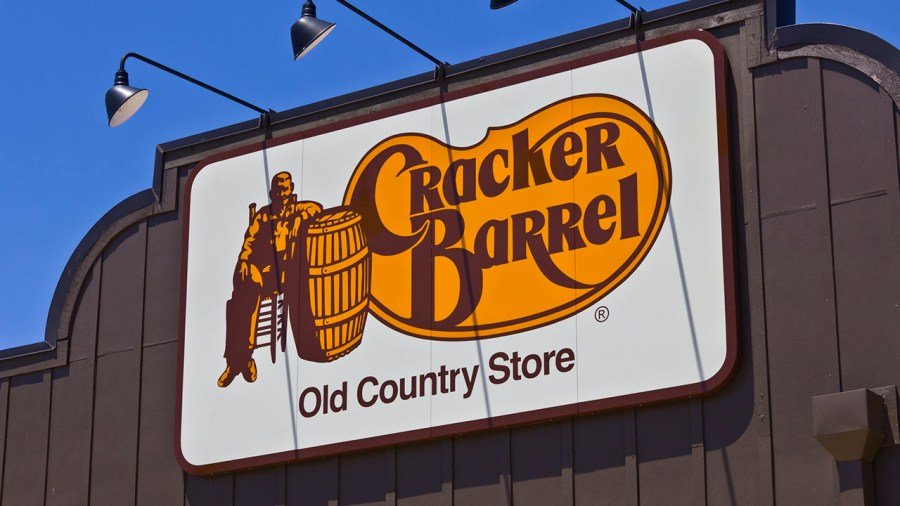
The Southern-style restaurant/gift shop announced Wednesday that it is changing its logo — removing the old man and carefully sketched barrel, as well as the whipping “K” flourish over the restaurant’s name.
“We believe in the goodness of country hospitality, a spirit that has always defined us. Our story hasn’t changed,” the company’s chief marketing officer, Sarah Moore, said in a statement. “We’re honoring our legacy while bringing fresh energy, thoughtful craftsmanship and heartfelt hospitality to our guests this fall.”
Customers and social media users had a different response, though.
The name “Cracker Barrel” was initially derived as an homage to people in the South who gathered to play cards and other table games around barrels, which were used to transport items that could be crushed in delivery, like edible crackers. “Cracker” has also been used as a derogatory euphemism for white people, creating fodder for a younger generation as Cracker Barrel faces its new hurdles.
“Cracker Barrel has been a destination for comfort and community for more than half a century, and this fifth evolution of the brand’s logo, which works across digital platforms as well as billboards and roadside signs, is a call-back to the original and rooted even more in the iconic barrel shape and word mark that started it all back in 1969,” the company said in a statement on its new marketing focus.
The new logo is sleek with few flourishes — nothing beyond brown text and a simple brown outlying loop on a deep golden background. But it quickly drew questions from people wondering what happened to the iconic man and barrel that featured in the old logo.
Some on social media contemplated the sterile aesthetic of the newly remodeled Cracker Barrel dining rooms, even though the eateries aren’t home-sprung businesses.
“It’s not supposed to look like an antiseptic airport lounge,” one critic wrote online.
Other fast-casual chains also got in on the ribbing, including Steak n’ Shake, which embodies its own 1950s aesthetic.
“Sometimes, people want to change things just to put their own personality on things,” the burger chain wrote on the social platform X. “Their goal is to just delete the personality altogether. Hence, the elimination of the ‘old-timer’ from the signage.”
“Heritage is what got Cracker Barrel this far, and now the CEO wants to just scrape it all away,” the restaurant’s official account posted.
California Gov. Gavin Newsom’s office also got into the discussion. Newsom, a potential Democratic candidate for president in 2028 who has increasingly been adopting President Trump’s tone and all-caps style on social media, said Cracker Barrel should stick with the old logo.
“WHAT IS WRONG WITH CRACKER BARREL?? KEEP YOUR BEAUTIFUL LOGO!!! THE NEW ONE LOOKS LIKE CHEAP VELVEETA ‘CHEESE’ FROM WALMART, THE PLACE FOR ‘GROCERIES’ (AN OLD FASHIONED TERM)!!! ‘FIX IT’ ASAP! WOKE IS DEAD!! THANK YOU FOR YOUR ATTENTION TO THIS MATTER,” Newsom’s office posted on X.