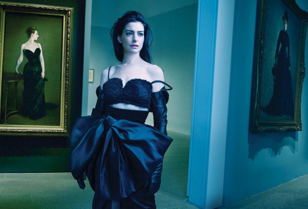

One of the best parts about aging, as an artist and a woman, is finding untapped confidence and reaching the absolute heights of your technical abilities and means of expression. Unless you are photographer Annie Leibovitz, whose recent Vogue cover shoot with actor Anne Hathaway, in support of her forthcoming A24 film Mother Mary, has been met with vitriolic criticism over its lack of basic ability to light her subject correctly. Or unless you are Hathaway, whose self-reinvention, as touted on the cover, seems to include withholding her signature fan-favorite smile. Between Anne and Annie, according to the armchair art directors of the internet, there is basically nothing lighting up the room correctly.
“Someone behind the camera needs to retire,” commented fashion-Grammer Alexandre Feldhaus, on a preview image released on Vogue’s Instagram, ahead of the August issue’s July 15 newsstand release, which features Hathaway in Givenchy as a pastiche of a John Singer Sargent painting, “Madame X” (1883-1884), seen hanging in the background. While the art is well-referenced and Hathaway’s poised expressions successfully echo the mood of the eponymous subject, the foreground lighting is in a death struggle with the background, including Sargent’s painting. Hathaway appears ethereally washed-out in cool blue lighting, the color balance of which turns the warmer painting light a sickly green.
“Can someone pls get Annie a new colorist,” asks digital creator Liam Haehnle. “What the hell is going on with the edit on these images.”

Art references paired with selections from Sarah Burton’s March 2025 debut runway collection for Givenchy keep coming, with an image of Hathaway standing in front of Franz Kline’s “Mahoning” (1956) at the Whitney Museum in New York. The composition is arresting, the pose is powerful, and the juxtaposition between painting and model is compelling – but seeming to comprehend that the pictures from the Sargent shoot at the Met were too dark and cool, Leibovitz over-corrects by making this one much too warm. What should have been a high-contrast vision of black-and-white is instead a yellowish miasma – the kind of diffuse and ominous light that foretells storm’s-a-comin’ in tornado country.

But the worst, by far, is a second image from the Sargent shoot, featuring Hathaway sitting cross-legged in front of two smaller Sargent paintings, wearing a top composed entirely of giant gemstones. The top is doing Hathaway no favors – it looks like if you shrank her down to the size of The Borrowers, and then she borrowed hunks of costume jewelry from the Big People, and then fashioned it into weird ad hoc chain mail for some reason. You can see the hard flash reflecting off facets of her be-borrowed gemstones, throwing her careless bedhead hairstyle into upsetting relief, and also causing the frames of the two paintings behind her (whose subjects at least had the decency to be shirtless) to cast huge shadows.
In fairness, I am a woman of a certain age who is basically the same as Hathaway’s, and I have very much embraced the “We Do Not Care” summer. For all the hate the photos are receiving, there are plenty of commenters who love them, and Hathaway, on her worst day, still is more beautiful than me trying my absolute best. I am not here to tell a woman to smile or wear a bra, no matter how harsh the lighting or exacting the expectations. But it perhaps does bear mentioning that for people of even more advanced age, cataracts can sometimes affect color vision, and maybe someone – not saying who – should look into finding a good ophthalmologist.