Bentley has updated its emblem for just the fifth time since its founding in 1919, and without breaking hard from 106 years of branding tradition, it still manages to be the most radical redesign in company history. A Jaguar-style rebrand this is not.
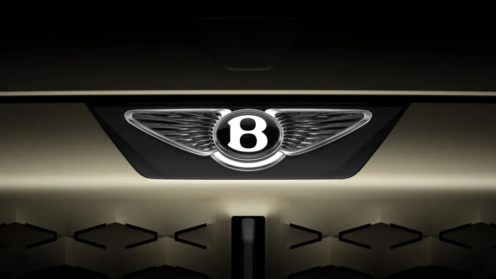
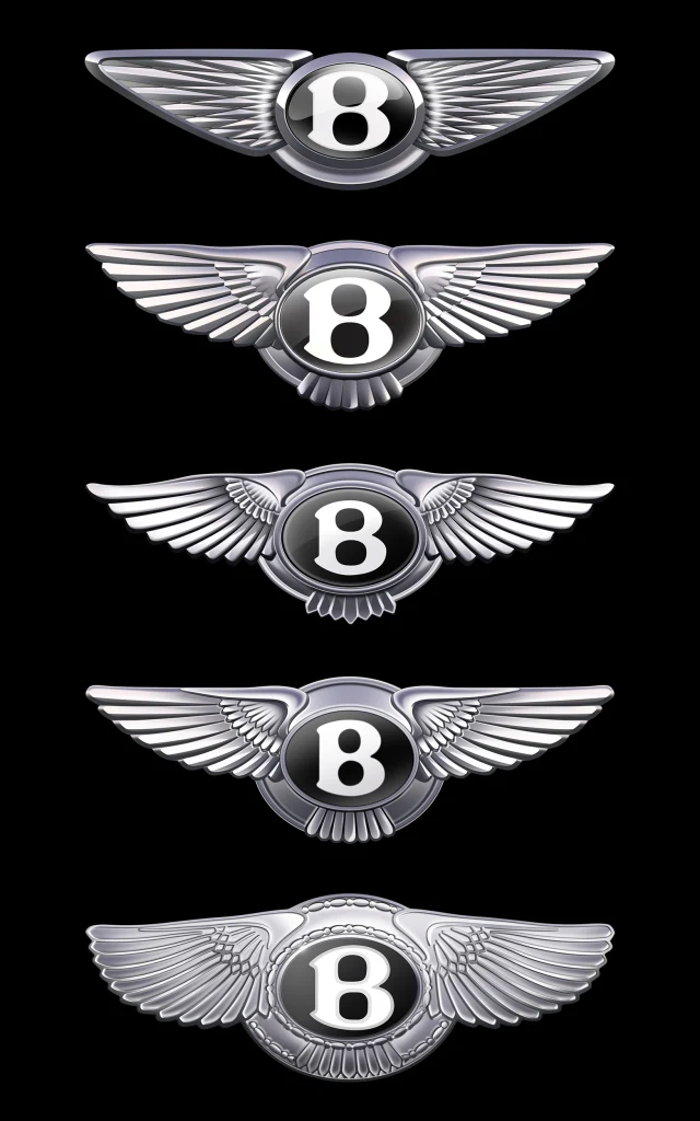
The British luxury automaker’s “Bentley Wings” are a chrome winged monogram showing a white B for founder Walter Owen Bentley’s last name inside a black oval. Originally designed by British automotive illustrator F. Gordon Crosby, updates were made in 1931, the 1990s, and 2002, according to the company, but the changes were small and subtle. A tweak in the angle of the wings here, changes to the decorative elements on the metallic seal there, but the form has stayed the same. The company’s latest logo redesign of its “Winged B” logo still keeps most of the basic elements in place, but it’s the sleekest, most minimalist version yet.
Designed in-house by a creative team led by Bentley director of design Robin Page and based on a concept by Young Nam, a member of the company’s interior design team, the new wings have been reshaped and abstracted with the feathers turned into a radial diamond design. The B mark, which Bentley calls the emblem’s center jewel, was redesigned to be able to stand on its own as a mark without wings, and the feathers below it were removed to look cleaner. The details, like a bevelled glass edge, were inspired by luxury watch design.

Look at Bentley’s logo evolve, and like a Transformer or Animorph book cover, it slowly changes one frame at a time from bird to machine as the wings go from soft to sharp. Bentley says its new shape was inspired by the the angled wings of a peregrine falcon, but it also looks more high tech.
“The mission in designing the new emblem was to capture some of the beautiful details from the previous designs — for example, the diamond pattern of the inner wings and the B ‘centre jewel’ — but create a more modern and progressive design,” the company said in a statement.
Their attempt at a modern and progressive rebrand stands in contrast to Jaguar, which retired its jaguar logo last year for a controversial all-lowercase sans-serif logo. Rather than build off the brand’s legacy and heritage like Bentley, Jaguar started from scratch, and so far, it hasn’t paid off, as production, and thus sales, are down.
Still, the rebrands for both British luxury automakers are signs of a larger shift as companies adapt for a future that’s more electric. There’s an industry-wide trend towards lighter, rounder, simpler logos. Whereas car logos once resembled the physical car badges, brands like Audi, Toyota, and Volkswagen have in recent years flattened and de-chromed their logos.
For Bentley, the rebrand signals a new era. The company plans to debut its first fully electric vehicle next year and promised a new line-up of products to come. Next Tuesday, it will unveil a still-under-wraps concept car and new design studio at its headquarters in Crewe, England.
Reimagining a legacy brand for the future can be challenging, but Bentley’s finished product delivers on the mission it set out to accomplish. Without jettisoning the core visual elements of it’s long-running brand, designers found a way to make heritage look modern and new.


