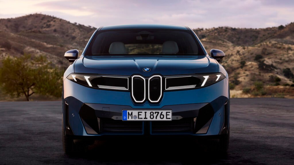
From Digital to Production Reality
BMW hosted a change at the beginning of this decade when it unveiled a flat, transparent-ring version of its classic roundel for marketing and digital use. That logo stripped away chrome and dimensional effects, a sharp contrast to the three-dimensional badges that had adorned BMW cars for decades. At the time, the company made clear that the minimalist mark was intended for screens and printed material, not the metal panels of its cars.
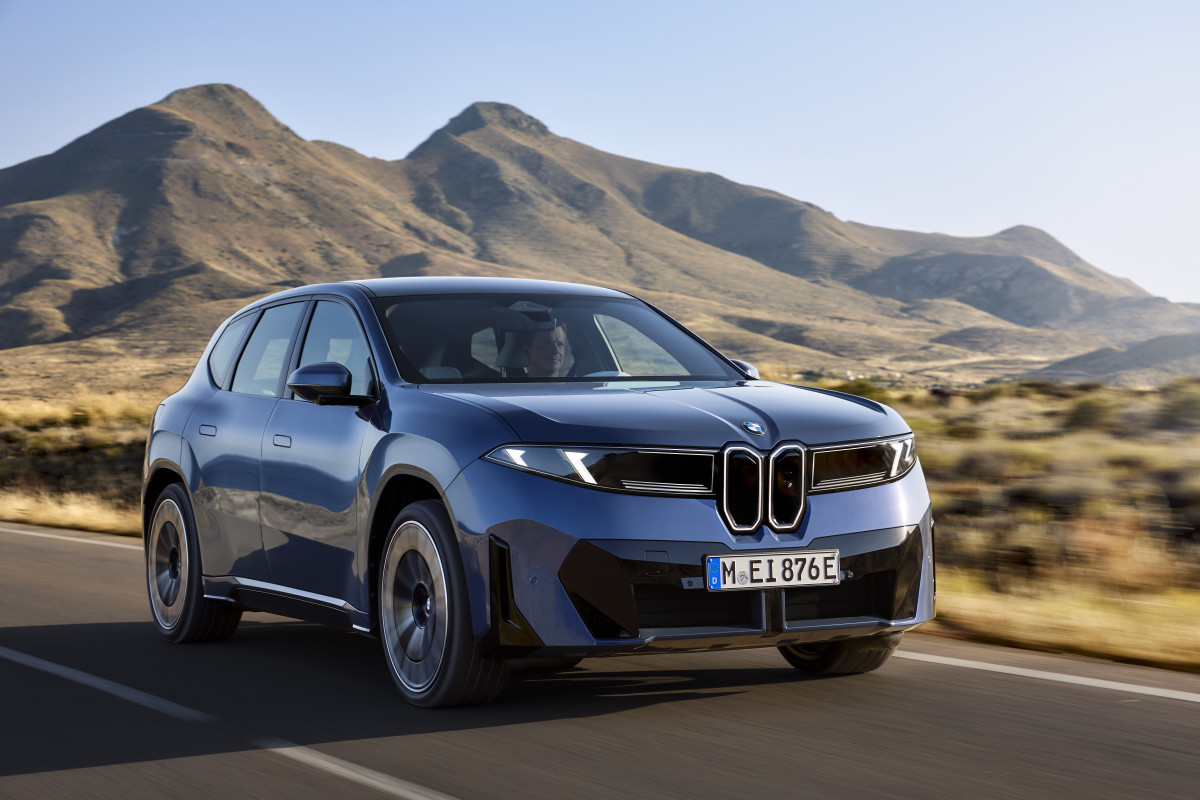
Five years later, the Neue Klasse era has brought that experiment closer to reality. The first production model to wear a new physical badge is the 2026 iX3, introduced at the Munich Motor Show. BMW confirmed the updated emblem will gradually appear on all new or refreshed vehicles, electric and combustion alike – a single visual identity across its lineup.
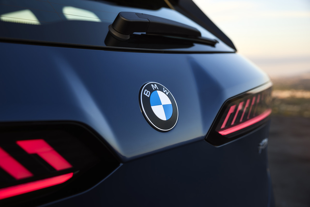
Subtle Refinement with a Purpose
The revised badge stays faithful to the blue-and-white propeller motif but introduces minor, deliberate adjustments. The inner chrome ring, which separates the black border from the quadrants, is gone, and the thin silver crossbars that once divided the blue and white sections have been removed. Remaining chrome is confined to the outer ring and features a smoked finish. The black surround now has a satin, almost matte surface, and the “BMW” letters appear slimmer and more precisely cut.
Oliver Heilmer, Head of BMW Design for the Neue Klasse, described the goal in an interview with BMWBlog: “We wanted to keep the heritage, but bring more precision to the logo. The chrome is still present, the letters have been refined with a shiny pattern often found in watches, and the white surfaces now sit closer to the outer ring. It’s flat, but when you touch it you can still feel the ridges.”
The new look also drops the blue outer rim once used to distinguish electric models, which means BMW no longer treats EVs as a separate branch.
Other Emblem Updates This Year
BMW’s logo update isn’t the first of its kind, with other luxury brands redoing their emblems this year. Bentley recently revealed its fifth logo redesign (albeit subtle) in 106 years, an evolution that alters the famous “flying B” while simplifying wing details for easier reproduction across digital formats.
Range Rover, meanwhile, announced the first overhaul of its wordmark since 1970, replacing the long-standing oval badge with a cleaner typeface intended to reflect modern design language.
