Mattel just got its first custom global typeface in over 80 years, and it’s brimming with brand easter eggs.
Mattel operates dozens of brands under its corporate umbrella, each with their own visual identity and brand voice. But, until now, Mattel has never had its own proprietary typeface for its overarching brand, instead opting to license multiple existing fonts on a global scale—an endeavor that was not only expensive, but also came at the cost of visual consistency across Mattel’s many product lines. Otis Gibson, founder of the Chicago-based creative agency Gertrude, says his agency was tasked with “putting a lasso” around Mattel’s corporate identity.
Their solution, a typeface called Matty and Belle Mattel Sans, can be translated into multiple languages, read in even the smallest of fine print, and used on everything from social media and pitch decks to product packaging. And while the typeface was designed for maximum practicality, Gibson’s team also wove playful allusions to the brand’s history throughout their work.
A typeface inspired by ’50s toy mascots
When designing Mattel’s new typeface, Gibson’s team was guided by an unusual creative ethos that he describes as “fun in a library.”
First and foremost, Gibson explains, the typeface needed to “be legible,” “work across mobile,” and “be global,” given that Mattel planned to use the design in other languages like Turkish and Greek. For those reasons, it couldn’t include too many flourishes or unexpected design details (hence the “library”). At the same time, though, it still needed to hint at the brand’s playful spirit.
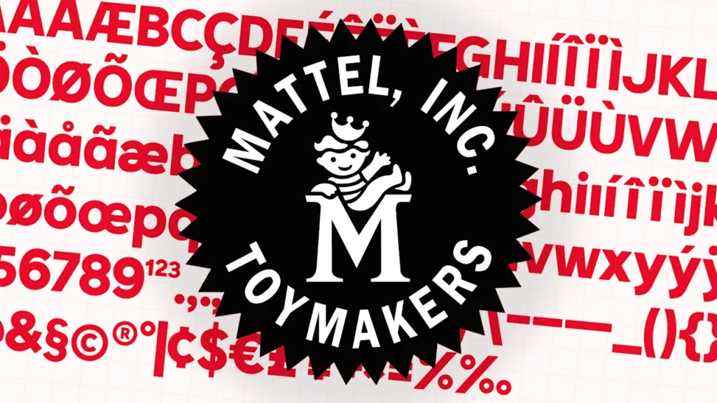
To strike that balance, Gertrude looked back into Mattel’s archives for inspiration. While combing through old assets, they stumbled across a pair of characters named Matty and Belle Mattel, a sibling duo that featured in illustrations, advertisements, and cartoons for the brand from the ‘50s to the ‘70s. At one point, Matty even starred on a Mattel logo that appeared on all of its packaging. The logo was an emblem featuring Matty, in his signature striped shirt and crown, sitting atop a Mattel “M.”
For Gibson’s team, Matty and Belle offered the perfect way to bring both historical influence and fun into their design. They used the characters as inspiration for two different fonts: one more grounded, practical font named after Matty, and another more playful font named after Belle.
Matty Mattel Sans is Mattel’s new core font. It’s a chunky sans serif, available in regular, semibold, and bold weights, that’s been maximized for readability. Crisp lines and angles, paired with distinct letterforms, mean that it jumps out on a PowerPoint deck, at a trade show, or in an Instagram post, but can also be parsed as fine print on a toy box.
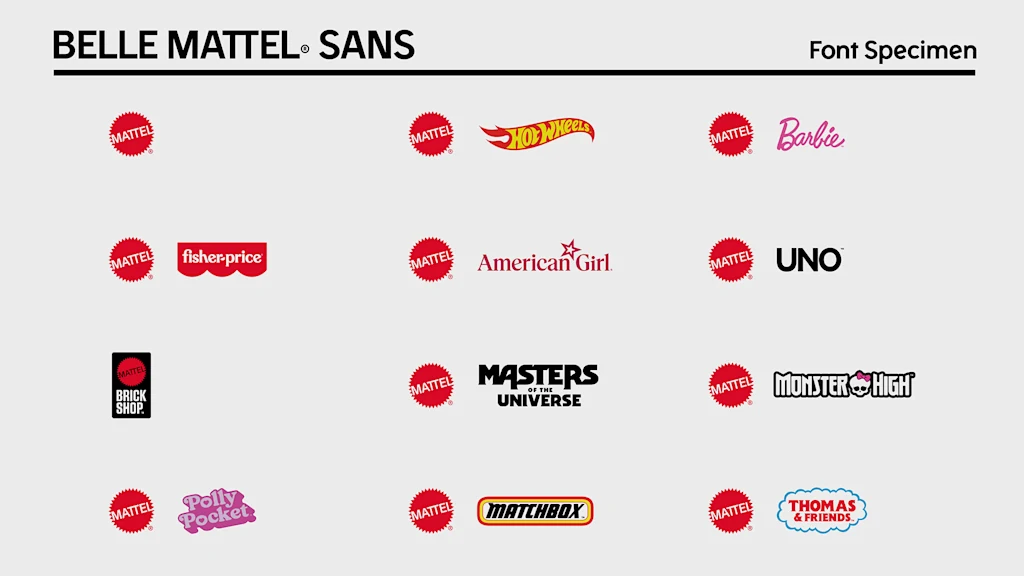
Belle Mattel Sans is a library of special characters and glyphs, cleverly stored within Matty Mattel Sans. When employees install the typeface to their computers, they simply have to click the “option” key to unlock a whole array of Mattel-themed easter eggs—like the business in the front, party in the back of typefaces.
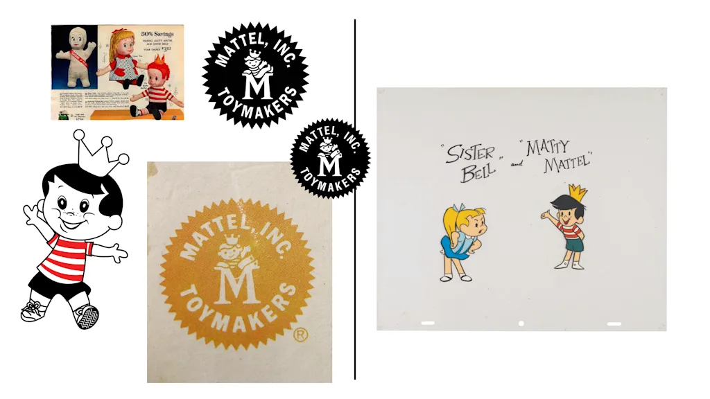
By selecting and highlighting a lowercase “e,” for example, users unlock a new “e” that’s tilted to the exact angle of Mattel’s logo, resembling a cheeky grin. Highlighting two uppercase “T”s results in a conjoined character, also mimicking Mattel’s logo. And by highlighting an uppercase “M,” users can find a shortcut to twelve official Mattel logos, including for verticals like American Girl, Barbie, Hot Wheels, and Fischer-Price, ensuring that any designer working with the brand automatically has up-to-date assets for its major brands. As a final touch, Gibson’s team also created an updated version of the Matty emblem logo, now incorporating the new official font.
The project’s final result is a corporate typeface that gets the job done without shying away from the whimsy of Mattel’s core products.