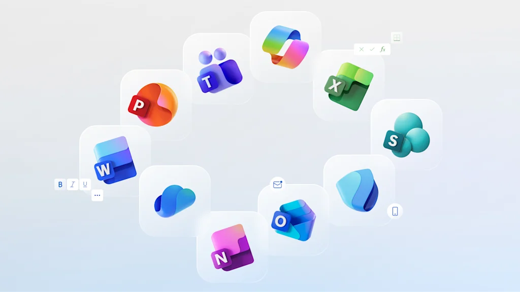
Microsoft just redesigned all of its Office icons to embrace the AI era, and, according to the company, that means ditching solid shapes for all things “fluid and vibrant.”
The 12 new icons, which began rolling out on October 1, encompass all of Microsoft’s platforms from Outlook to Word Documents and Teams. This is the first time that Microsoft has updated the icons’ aesthetics in seven years, and the company’s designers have reworked every logo to be curvier, brighter, and more colorful.
“Today, as we roll out refreshed icons for Microsoft 365 apps, small but significant design changes are a reflection and a signal,” a Microsoft blog post, published on October 1, reads. “As a reflection, they encapsulate how AI is shifting the discipline of design and the nature of product development.”
Microsoft’s new icons are reflective of a broader trend in the tech world. Now that AI is ushering in the next major era of the industry, its biggest players are trying to figure out exactly how these expanded capabilities should be reflected in their branding. So far, one trend is clear: AI is becoming visually synonymous with a colorful gradient.
Why Microsoft just redesigned its icons
Microsoft, like many of its competitors, was a victim of the 2010s “blanding” trend, when companies across a variety of sectors were scrambling to trade their serif wordmarks for sans-serif and ditching 3D logos for ulta-simple 2D shapes. For tech companies, blanding and flat logo design was especially rampant, as simplified branding made it easier to design for different devices and apps (Google was arguably one of the first tech companies to go bland back in 2013).
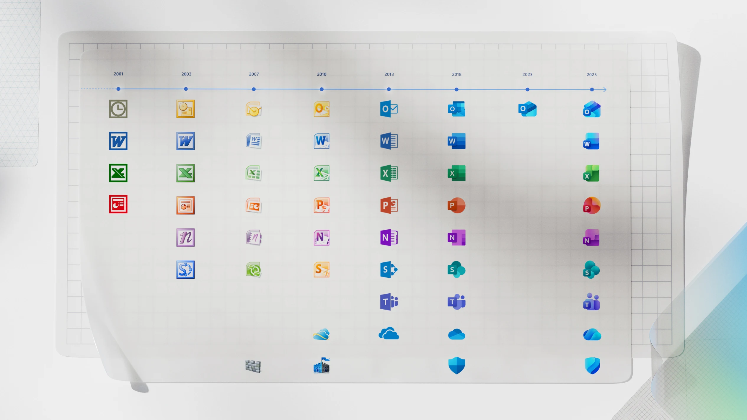
Microsoft’s last icon redesign effort was in 2018, when it adopted ultra-flattened versions of its 10 Office app logos. Per the recent blog post, those designs were intended to offer a connected look across platforms and devices in “the early days of apps that composed together and truly collaborative experiences.” Now, the post continues, workflows have undergone a major change thanks to AI: collaboration is no longer just human-to-human, but also human-to-AI.
“With that paradigm shift come significant changes to the UX discipline itself and how we approach product making,” the post continues. It explains that, while longer cycles of development used to be followed with a reveal of big changes, AI models are allowing UX developers to make changes in continuous waves. “Research shows changes to iconography are almost always received as a signal for product changes and in an era of ongoing, smaller shifts, the icons should reflect that.”
The flat logo is out. Say hello to the gradient logo
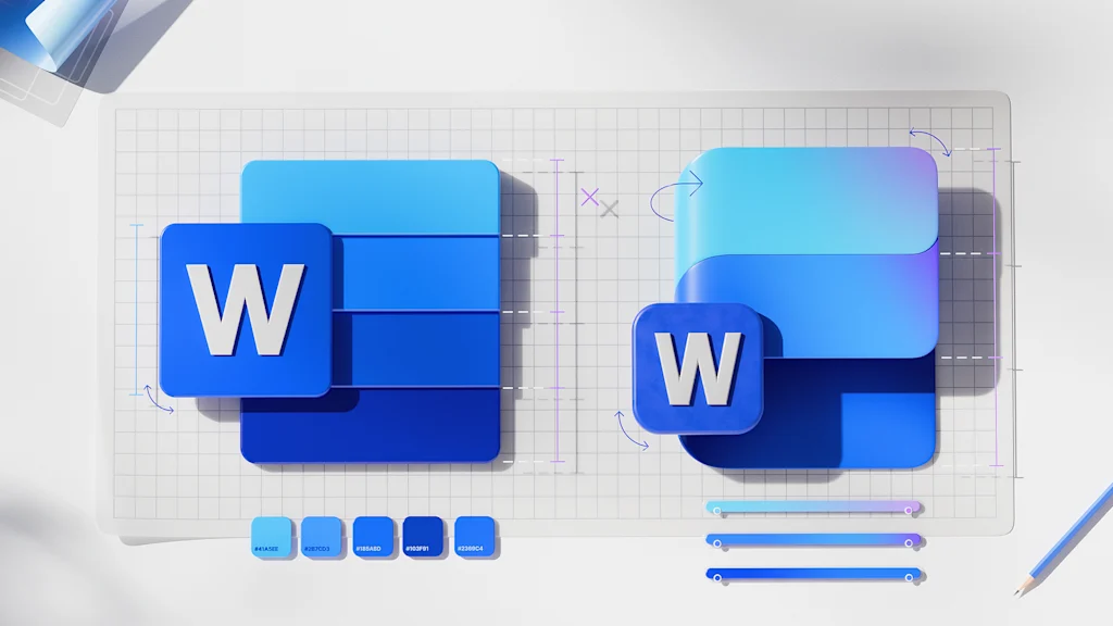
Microsoft’s answer to that challenge has been to bring a tiny bit of life back into its icons. A broader color palette has allowed the company to give icons like the Outlook envelope, PowerPoint bubble, and Teams people more visual depth. Any sharp shapes and crisp lines have also been swapped with curved ones.
“We’ve modernized Microsoft 365 icons to feel alive and approachable—soft curves, smooth folds, and dynamic motion that reflect Copilot’s brand,” says Gareth Oystryk, Microsoft 365’s senior director of consumer marketing.
Perhaps most noticeably, Microsoft has implemented a gradient color palette across almost every icon. Word’s flat blue hues are now blue, navy, and purple; PowerPoint’s orange is accented with pink and red; and Excel’s green includes a hint of yellow.
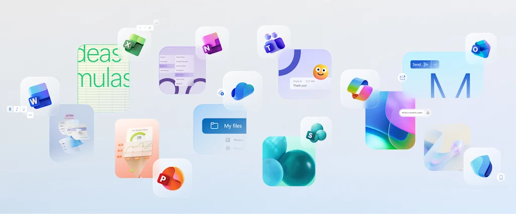
“Where gradients were once subtle, they’re now richer and more vibrant, featuring exaggerated analogous transitions that improve contrast and accessibility,” the post reads. “This shift makes the icons feel brighter, punchier, and more dynamic.”
Gradients have long been a motif of choice for tech companies (see Instagram and Apple Music), but, more recently, they’ve become analogous with AI for companies that choose not to go the Open AI black void route. Microsoft’s own Copilot has embraced a gradient logo, alongside others including Apple Intelligence, Google Gemini, and Meta AI. Google recently reworked its iconic “G” to feature a gradient across all platforms, noting at the time that the move “visually reflects our evolution in the AI era.”
This embrace of gradients is, to some extent, Big Tech’s safest answer to visualizing something as amorphous as AI. But it may also be evidence that the tech design pendulum is swinging away from blanding and back toward an earlier era of playful color and skeuomorphic icons. If “flat logos” were the hallmark of the digital era, it’s possible that gradient logos are becoming the symbol of the AI age.
