Fashion resale company Poshmark just got its first app redesign in 15 years, and it’s taking a page out of Depop’s book of UI.
The new look encompasses an updated algorithm, redesigned navigational tools, and a new, streamlined aesthetic. It comes as a pivotal moment for the second market, which, according to ThredUp’s 2025 Resale Report, is expected to reach $367 billion by 2029, growing 2.7 times faster than the overall global apparel market.
The majority of this growth, the report notes, has been driven by young consumers—millennials, Gen Zers, and Gen Alpha shoppers who are familiar with buying products through apps or in-app features like TikTok Shop. And competition is getting more fierce in the resale industry in light of eBay’s recent acquisition of Depop, which will allow the two platforms to pool their resources (though Depop will retain its own brand and site).
Technically, Poshmark’s user base is actually broader than Depop’s, boasting 165 million active users compared to Depop’s 56.3 million. But unlike Depop, Poshmark’s previous app was not set up to capitalize on resale’s big moment, for the simple reason that it was difficult and unpleasant to use. Crowded design and unintuitive sections made shopping on the app feel more like a chore than an enjoyable activity.
Now, though, Poshmark appears to be taking notes from its Gen Z-centric competitor and other social media sites to design an app that’s both easy on the eyes and easy to use.
“The former UI was focused on transaction over inspiration”
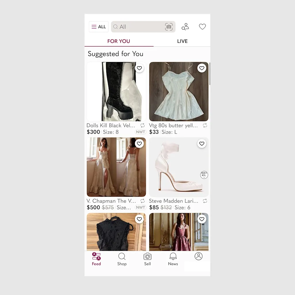
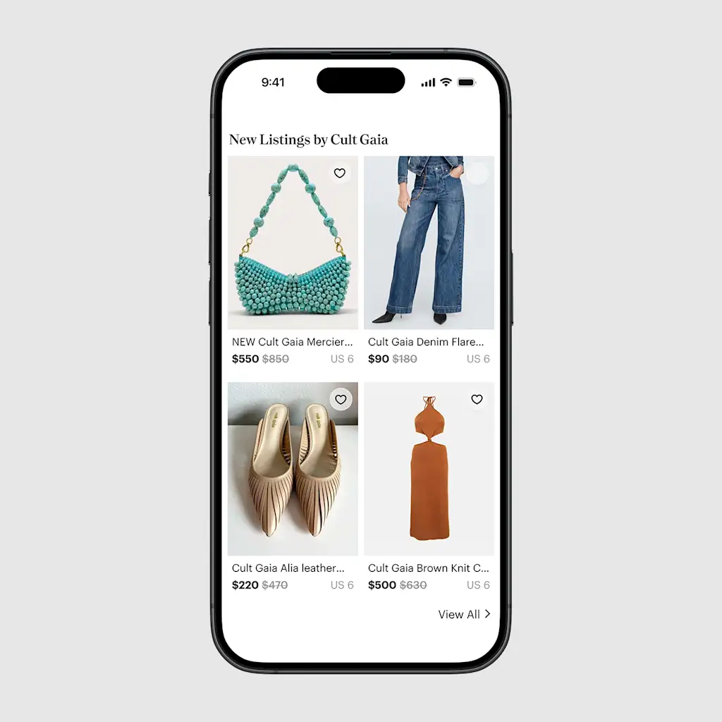
The first word that comes to mind to describe Poshmark’s previous app is clutter.
Opening the app would lead to a front page, called the “Feed,” which was bisected into a page of recommended items and a page of Poshmark sellers hosting livestreams. Each featured item was previewed inside a small window, allowing nearly six items to fit onto the page at a time. Most of the page was black and white, but some pops of the brand’s signature purple would appear on highlighted pieces of text.
Navigating to the app’s search function only made matters worse. Underneath the general search bar, the app included a laundry list of suggested destinations, like popular brands, the user’s liked items, and, for some reason, more live Poshmark shows. These were accompanied with additional tiny images of items and previews of livestreams.
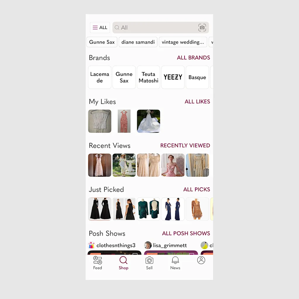
The result of these design choices was an extremely information-dense experience. Looking at the old Poshmark app felt like being bombarded with layers of text and imagery that the user would need to dig through to find even a nugget of interest.
“The former UI was focused on transaction over inspiration,” says Heather Gordon Friedland, Poshmark’s chief product officer. “For shoppers, this often translated into a feeling of ‘endless scrolling,’ making it challenging to find unexpected pieces that matched their personal style.”
Poshmark gets the Depop treatment
In comparison, the new design is a breath of fresh air. The entire app has been simplified: Photos are displayed in a larger portrait mode, allowing only four to appear on-screen at a time; livestreams have been sequestered into a small icon at the top of the homepage; and the search function now loads to a clean, white page that only highlights past searches. The pops of purple have been eliminated in favor of a clean black-and-white look. Like Depop, the new app prioritizes white space and large images to keep the user from feeling overwhelmed.
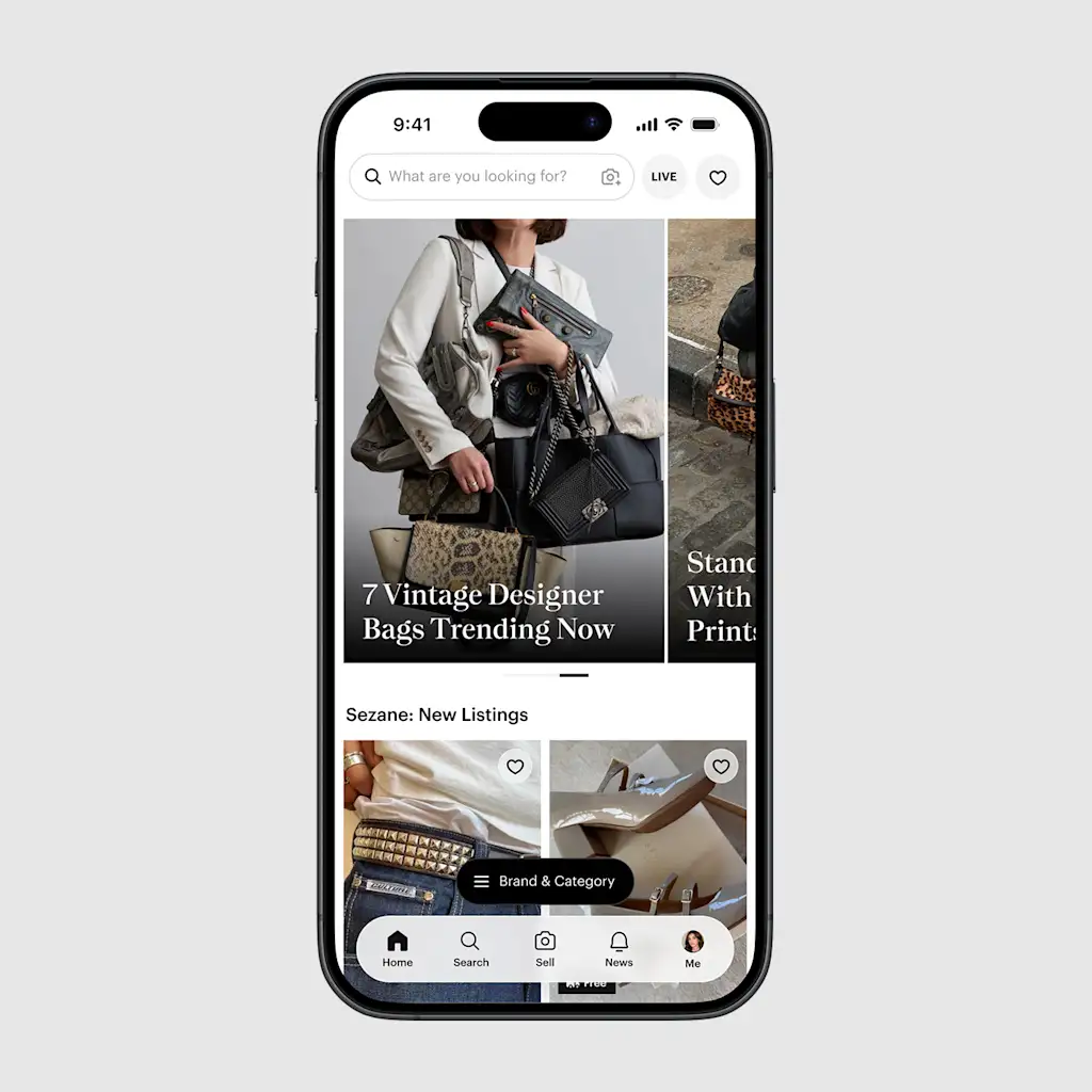
“The app now features larger, more immersive portrait imagery, shifting the focus to visual storytelling, much like on platforms such as Instagram or Pinterest,” Friedland says. “This makes browsing more engaging and allows the quality of our sellers’ items to shine.”
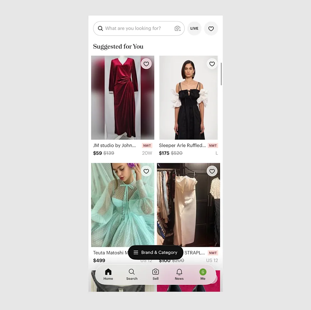
Design inspiration from socials also shows through on Poshmark’s new TikTok-esque “For You” page, which surfaces trends and styles related to the users’ tastes. According to Friedland, the algorithm uses AI that’s been trained by human sellers and editorial teams to help users stumble across more niche items that the former algorithm, which prioritized shares, might not have surfaced.
“While we’ve retained the share button, a core community feature, the new ‘For You’ feed prioritizes the relevance and quality of a listing over the frequency of sharing,” Friedland says. “This ensures a more magical discovery experience where users find high-quality, unique items, rather than seeing the same posts repeatedly.”
When it comes to resale app shopping, young users want to feel like the act of scrolling is helping them imagine their dream closet, not forcing them to sort through as many options as possible—and it looks like Poshmark finally caught on.