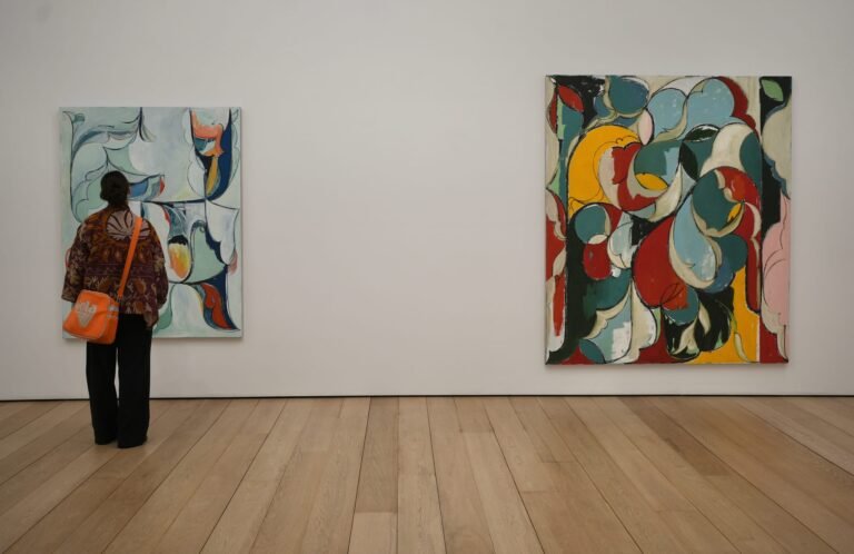

How drab the palettes of today have become. We knew the moment grey was being advertised to children—who have yet to fully develop their rods and cones—that we were on a distinctly more boring path. Color reflects the brilliance of our natural world, and has even been shown to make us happier overall, certain hues lifting our mood simply by entering our field of vision. Memphis Milano, established in the eighties in Italy, signaled a release from Modernist conventions and was both revered and reviled by critics and the public. Memphis Style has been described as “a shotgun wedding between Bauhaus and Fisher-Price.”

Prism Stack Glasses

Prism Stack Glasses
Forever fans of nonconformity, the Cedric Mitchell x JOOPITER collaboration embodies the spirit of these trailblazers, yet filters it through a distinctly contemporary lens. Released as part of JOOPITER Marketplace—an always-on, buy-it-now platform offering direct access to the personal collections and archives of influential cultural figures—the collection situates Mitchell’s work within a broader ecosystem of cultural artifacts, where provenance and narrative carry equal weight to form. Texture, color, and transparency all play major roles here, with high-gloss and satin finishes lending a frozen, almost suspended quality to frosted surfaces. Ideals of contrast and constraint emerge to define a new Memphis, where color is not merely decorative, but declarative.

Modern Funk Jacket II
Each piece brings its own unique flavor. Mitchell’s practice—operating at the intersection of craft, utility, and visual culture—draws from a wide spectrum of references including ‘90s hip-hop and retro streetwear to graffiti and childhood iconography. Color, in this context, becomes emotional currency, triggering responses that feel at once nostalgic and immediate. Thick, hand-blown glass cylinders transition gracefully into seating and sculptural forms, emphasizing tactility and the push-pull of saturated tones. Totemic silhouettes emerge throughout, their stacked geometries lending the objects an almost anthropomorphic presence—creatures of color that mirror our enduring fascination with the natural and the constructed alike.

Modern Funk Jacket I
Continue reading to get a glimpse of Mitchell’s world as saccharine hues stack, bend, and spill into various forms. What you’ll see is a cast of colorful characters–playful, a little off-balance, and entirely alive—each one speaking fluently in the language of Modern Funk…

Primary Portal I
Primary Portal I
Primary Portal I opens a threshold. Bold geometric framing surrounds a mirrored center, pulling the surrounding space into the work itself. It’s furniture, object, and environment all at once—always shifting with light and reflection.

Playhaus Perch Chair
Playhaus Perch Chair
The Playhaus Perch Chair brings Mitchell’s language into the realm of sitting. Lacquered geometry meets soft lambskin upholstery, turning a chair into a sculptural experience. It invites use, but never loses its presence.

Art Deco Diaspora
Diaspora Deco Chair
Diaspora Deco Chair bridges eras. Glossy, architectural forms meet plush lambskin, reinterpreting Art Deco through a Modern Funk lens. It’s grounded yet expressive, where history and experimentation sit side by side.

Plonko
Plonko
A quiet detour, Plonko trades gloss for a fully sandblasted finish, letting form do the talking. Soft volumes intersect at subtle angles, holding motion in suspension like a paused gesture. It’s restrained, tactile, and just a little mysterious—a study in what happens when Mitchell turns the volume down.

Petal Stack
Petal Stack
Petal Stack rises like a bloom mid-thought, each hand-blown element stacking into a rhythmic ascent. A chartreuse base anchors the piece before lavender and deep pink nodes lead to a soft, petal-like bowl. Equal parts vessel and sculpture, it softens geometry with a floral exhale.

Play Loud
Play Loud
As the name suggests, Play Loud doesn’t whisper. A lapis dome, electric rings, and a saucer crown collide in a glossy, saturated stack that feels both retro and futuristic. It’s a totem of joy—bold, buoyant, and impossible to ignore.

Verdant Oracle
Verdant Oracle
Verdant Oracle reads like a prophecy in color. A striped green base grounds the piece while a violet sphere and magenta ring give way to an asymmetrical teal rise. Pattern, gloss, and proportion work together to create something that feels both ancient and electric.

Zestrel
Zestrel
Zestrel is a balancing act in full color. Teal, chartreuse, orange, and turquoise stack into a tower that feels both precise and playful. Its glossy surface sharpens every hue, turning structure into spectacle.

Groovy Sprout
Groovy Sprout
With its matte finish and pastel palette, Groovy Sprout softens the tempo. A chartreuse dome anchors frosted violet and translucent blue forms, punctuated by a ring with a circular void. It’s light, architectural, and just a little dreamy.

Bubble Funk
Bubble Funk
Bubble Funk leans into contrast—rigid meets fluid, polished meets playful. A lapis cylinder grounds a pink ring dotted with blue nubs, while a red twisting form rises like a gesture mid-dance. It’s kinetic, cheeky, and full of attitude.

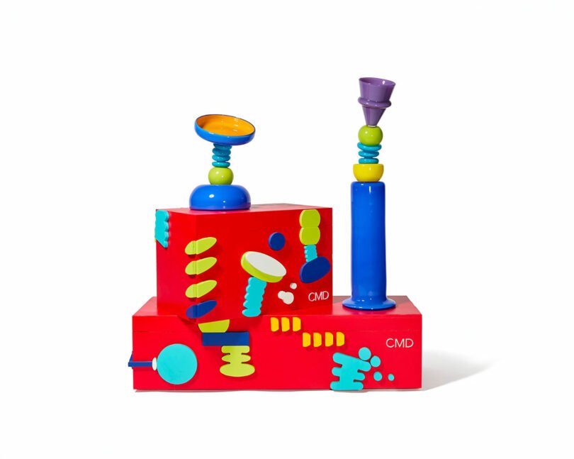
Primary Assembly I
Primary Assembly I
A study in structure, Primary Assembly I builds from intersecting planes and rounded forms. Its lacquered yellow finish amplifies the clarity of composition, turning geometry into a bold spatial statement. It’s furniture, yes—but it behaves like sculpture.

Moonstruck
Moonstruck
Moonstruck tilts toward the unexpected. A lapis base and chartreuse sphere give way to a turquoise spiral and an off-axis blue vessel with a glowing amber interior. The imbalance is deliberate, lending the piece a quiet, cosmic energy.

Triovo
Triovo
Triovo plays with expectation. A flared teal base supports magenta forms and a vivid orange sphere before an angular wedge breaks symmetry at the top. It’s precise, but never rigid—always just slightly off.

Orbolo
Orbolo
Texture takes center stage in Orbolo. A cratered violet base, dotted sphere, and ribbed stem build into a tactile, matte composition that invites touch. Its totemic form feels grounded, even as it lifts visually.

Halo Study
Halo Study
Halo Study is a vertical meditation on form. A lapis cone rises into a spiral, sphere, and disc, each element articulating a clear progression. Balanced yet animated, it’s as crisp as it is playful.

Badu Bloom
Bada Bloom
Bada Bloom grows upward in a rhythmic burst of color. From a grounded teal base, dotted and ringed forms lead into a swelling pink column crowned with a dome. It’s symmetrical, but never static—always in bloom.

Counterweight
Counterweight
Counterweight finds equilibrium in contrast. A warm orange base meets a violet hinge and teal lift, culminating in a tilted chartreuse bowl. The off-axis top keeps the piece alive, always in gentle tension.

Bendrix
Bendrix
Bendrix curves with intention. An amber column arcs upward from a green base, punctuated by red rings and a translucent collar before opening into a flared cup. It’s fluid, off-center, and quietly dynamic.

Ettore’s Echo
Ettore’s Echo
A nod with a twist, Ettore’s Echo channels postmodern lineage through a slender, stacked form. A lapis shaft rises through a spiral and sphere before ending in a tilted violet vessel. It honors the past, but refuses to sit still.

Primary Pivot
Primary Pivot
Primary Pivot turns balance into a question. A chartreuse base, red joint, and blue cylinder stack into a composition that feels both stable and on the verge of motion. Functional as a vessel, it reads as something more sculptural—almost architectural.
To learn more about the Cedric Mitchell x JOOPITER collaboration or shop the drop, visit joopiter.com.
Photography by Julie Dickinson.