© Shrey Kathuria
We hear from the Delhi-born, London-based designer behind One Little Independent Records’ visual identity about why he launched Mindspill – a growing archive of typographic posters.
During a particularly quiet moment in time, when work had slowed and social life had gone still, Shrey Kathuria sat down and made a poster. He created Slowness Is Not Your Enemy, the first of a massive poster archive called Mindspill.
Shrey is a Delhi-born, London-based designer and art director who has spent the past four years as the visual lead at One Little Independent Records, the label that is home to Björk, Laura Misch, Galya Bisengalieva, Asgeir and the Sneaker Pimps, among others. His day-to-day work involves directing album art, artist branding, merch and commissioning other creatives – designing intimate, high-stakes visuals for a label that has never been particularly interested in playing it safe. Alongside OLI, he freelances across music and branding, with credits including Jordan Rakei, Aurora, Atlantic Records UK and Anoushka Shankar.
The personal work, on the other hand, operates a little differently from his commercial side. Shrey grew up in Delhi, within a small, tight-knit music scene centred around metal, then electronic, and then experimental – where hanging around with artists and collectives became the soft launch of his design career. Moving to London for his master’s at the London College of Communication in 2021 was the transformative moment. “Almost as if I started to shed my old skin from day one,” he says, “and continue to do so.” That process of navigating a new city, a predominantly white industry, a collectivist upbringing transplanted into a highly individualistic culture, became the material from which Mindspill was built.
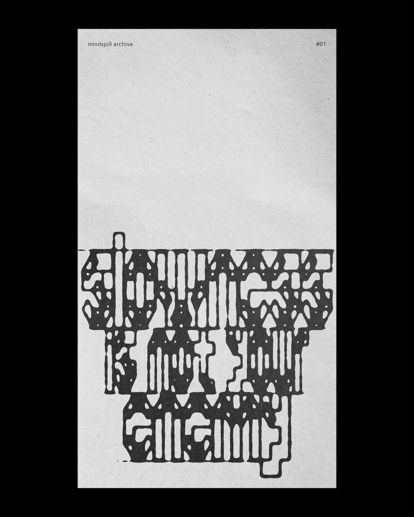
01A © Shrey Kathuria
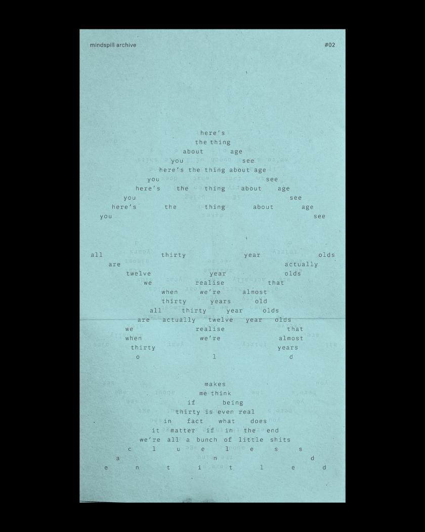
02A © Shrey Kathuria
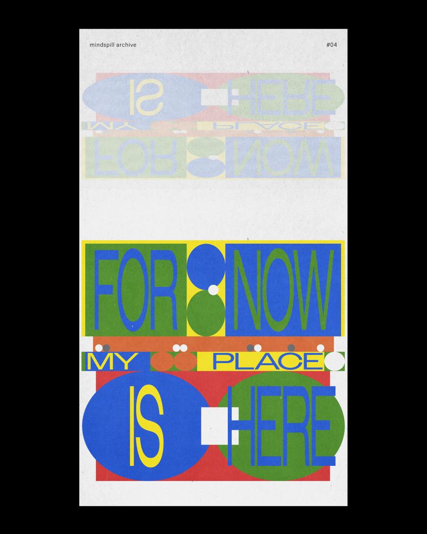
04A © Shrey Kathuria
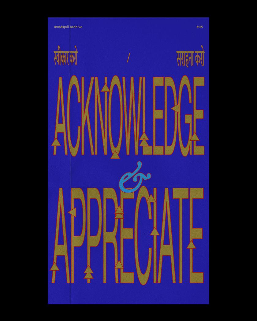
05A © Shrey Kathuria
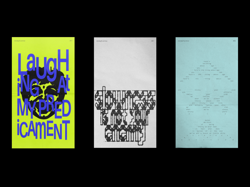
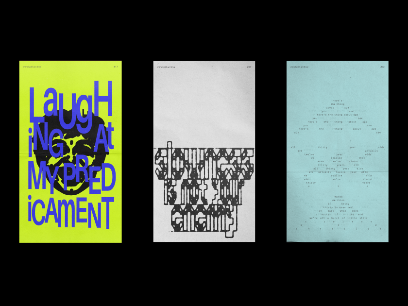
The archive, started in late 2025, is a series of typographic posters, each one rooted in something Shrey was thinking, feeling or telling himself during this time. “For the most part, these posters came together from things I kept telling myself during difficult periods, or thoughts that surfaced when I was a far more anxious person,” he explains. “Somewhere in the process, my inner dialogue slowly began to change. So what began as anxious, negative thinking gradually turned into a much kinder voice – a sort of inner dialogue rooted in optimism and reason. And that is the crux of Mindspill. Each poster is a little milestone in this long journey of self-discovery and learning.”
Shrey’s process starts with a phrase in a simple font created in Illustrator. Then he pushes it as far as it will go, using different brushes, shapes, and letters drawn directly on a trackpad. There was also a brief charcoal phase, during which he drew with his left hand. Next, he moves the vector skeleton into Photoshop, where blurs, filters and effects are applied until the visual tone matches the emotional weight of the words. Other posters use experimental typesetting in InDesign, in which he creates type on unusual paths and grid-based compositions, where colour and texture carry the feeling. The results are deliberately hard to read. “I get immense joy from distorting the sh*t out of a typeface,” he says, “and for me, that’s the purest form of rebellion against cleanliness in graphic design.”
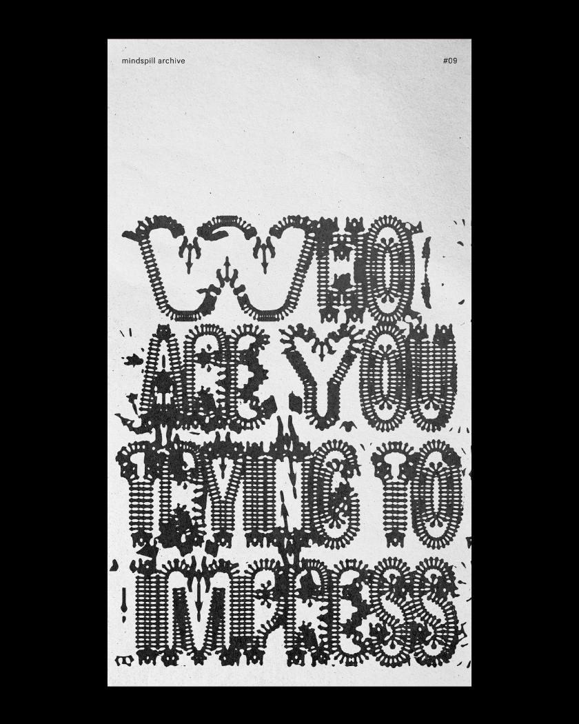
09A © Shrey Kathuria
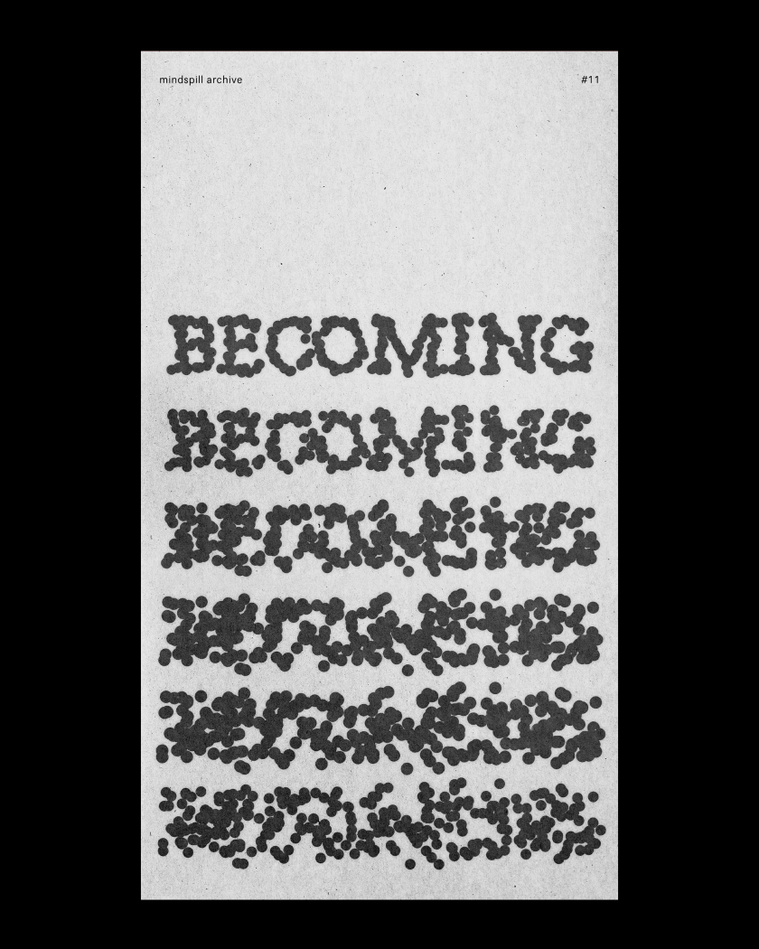
11B © Shrey Kathuria
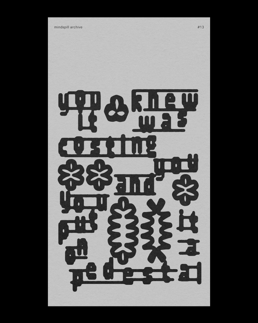
13A © Shrey Kathuria
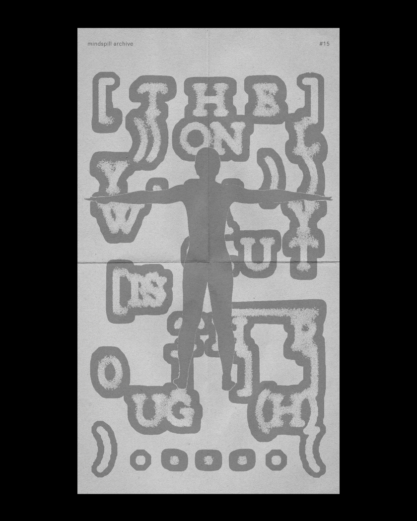
15C © Shrey Kathuria
In Number 07: Decentre All That Doesn’t Serve, the poster was derived from a period when friendships felt hollow, and the cultural gap between his collectivist background and London’s individualism felt especially sharp. He rendered it in 3D, shaped like a rock – which he admits, with a little self-awareness, he probably should have spent a bit more time on. #13: You Put It On A Pedestal was created after a long, complicated friendship ended, in a tangle of envy, self-doubt and something close to love. The typography is actually quite simple; it landed well. “Maybe less really is more,” he says. “Who knows.”
Number 18: Don’t Burn The House That Made You is about the house in Delhi where he grew up. “I mostly felt embarrassed by it, but over the years I’ve come to feel a real love and connection to it. It still feels slightly uncomfortable, but it’s still my nest, y’know. My parents are always there, and whenever I go back, it feels like I never left.” Zoom into the poster, and there is a poem written on it. Moons float through the composition as symbols of the mysticism of leaving your childhood home and ending up somewhere new.
Shrey’s plan for Mindspill is to open it up, eventually inviting other designers to contribute posters, turning the archive into a shared space for typographic experimentation and emotional honesty. For now, kinetic type is next – returning to After Effects and exploring Cavalry, bringing motion back into personal work. “I’m busier these days, and finding time for new personal challenges is harder,” he says, “which is exactly why I want to get back into it.”
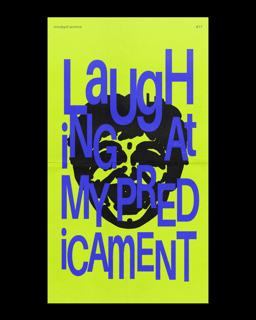
17B © Shrey Kathuria
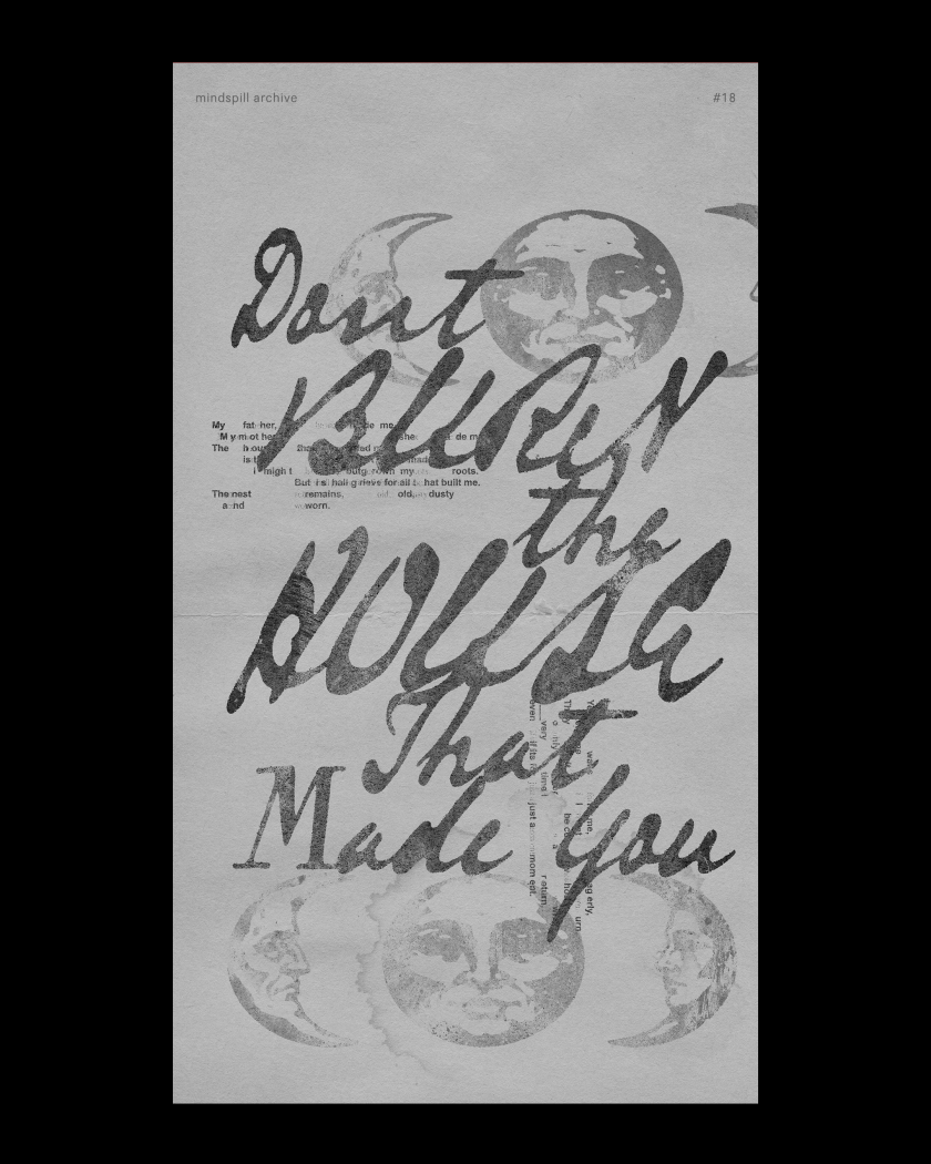
18C © Shrey Kathuria