To announce his executive order renaming Lake Ontario last week, President Donald Trump brought props that wrote out his new name for the lake using his administration’s official font. A typeface chosen to convey seriousness ended up looking like a joke.
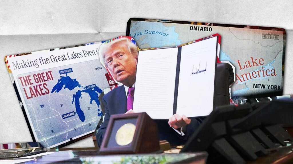
During an Oval Office signing ceremony Thursday, Trump signed an order making the Interior Department’s Board on Geographic Names rename Lake Ontario to “Lake America” amid an escalating trade war between the U.S. and Canada. His visuals for the event included two posters on easels, with text on each written in Instrument Serif, a condensed serif designed by Rodrigo Fuenzalida with direction from Jordan Egstad and released in 2023. It gives the second Trump term the look of an A.I. tech company.
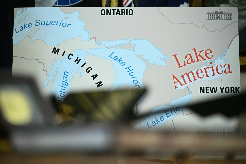
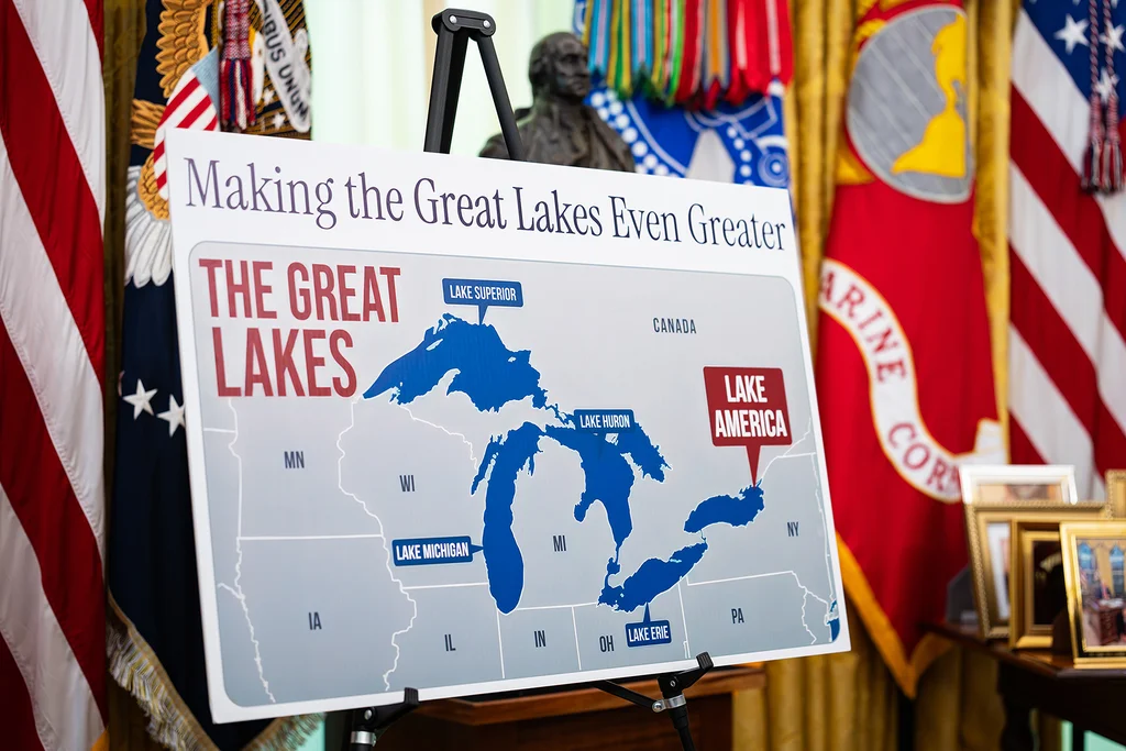
One of Trump’s posters showed a map of the Great Lakes region with “Making the Great Lakes Even Greater” written across the top in Instrument Serif and “Lake America” written in a different font inside a big red box like this is a Daily Mail story. The image on the other poster was a close-up map of the lakes, which the White House also shared on social media. While Lakes Superior, Michigan, Huron, and Erie are all written in this map in a blue, nondescript, sans-serif font that looks like standard map typography, “Lake America” is written in red and on a curve in Instrument Serif.
It looks kind of goofy. About as silly as the phrase “making the Great Lakes even greater” when all Trump’s proposing here is a stunt name change, his second in two years. The circus is boring and the bread is moldy.
The right typography can go a long way in conveying a sense of authority and trust. One 2012 experiment, for example, found the serif Baskerville is the most believable font. When it comes to government communications, type choice is all about credibility. You won’t see a jury summons or voter registration materials written in Comic Sans or Impact. Instead, fonts are chosen to convey formality and carry the weight of the state.
Modern presidential administrations use serious serif fonts. In his first term, Trump’s White House used Merriweather, while then-President Joe Biden’s administration used Mercury. For term two, Trump’s administration chose a typeface that’s on trend for the branding of Big Tech’s A.I. boom.
Young A.I. startups looking to brand for visual credibility often use serif typography to suggest a sense of humanity and the retro style of fonts like vintage Apple Garamond, Apple’s classic serif font of the 1970s and ‘80s. The Trump administration uses Instrument Serif on its website, social media posts, event signage, and executive orders, and when it comes to the written word, it’s as much of a part of Trump’s second-term visual identity as the gaudy gold White House redesign is to the executive mansion and awful A.I.-generated MAGAslop social media content is to the realDonaldTrump account.
Trump’s always pushed the boundaries of presidential communications though his posts and speech, but the goofy use of Instrument Serif for his latest body-of-water stunt rebrand feels like another degradation.
Make no mistake, under Trump, Instrument Serif carries weight. It’s the headline font for executive orders that restructured the federal government, called Iran a national threat, and applied tariffs on products that in total have cost the typical American household more than $1,000 a year. And yet by using the font for something as unserious as yet another stunt rebrand of a body of water, Trump’s diminishing its power. It’s like the font version of his hurricane Sharpie mishap in the first term.
While “Lake America” will no doubt delight his MAGA core (Glenn Beck promoted a new “Lake America” tee he’s selling with an A.I. video), a 2025 poll found Trump’s renaming of the Gulf of Mexico was his least popular policy along with his pardoning of Jan. 6 defendants.
It’s hard to imagine pulling the trick for a second time will be more popular, especially if it’s associated with higher prices as Trump’s trade war with Canada is expected to bring. Trump’s actions are also worrying Republicans running in swing states who believe the trade war will make winning their elections harder in November.
Across the lake in Canada, Ontario Premier Doug Ford put up a a billboard that says “Lake Ontario, Now and Always,” in a friendly sans-serif font and called Trump’s rebrand “something out of Saturday Night Live.” Then there’s surging downloads for MapQuest, which isn’t renaming Lake Ontario, after Google Maps did.
U.S. missile stockpiles are down, measles cases are up, and the average cost of gas is more than $4 a gallon. Americans can point to executive orders written in Instrument Serif for all this.
Now they can also point on a map to where that same font has also been used to rename a lake that’s not making life any cheaper and no one seems to take very seriously.
This story originally appeared in Yello by Hunter Schwarz, a newsletter about politics, aesthetics, and design.