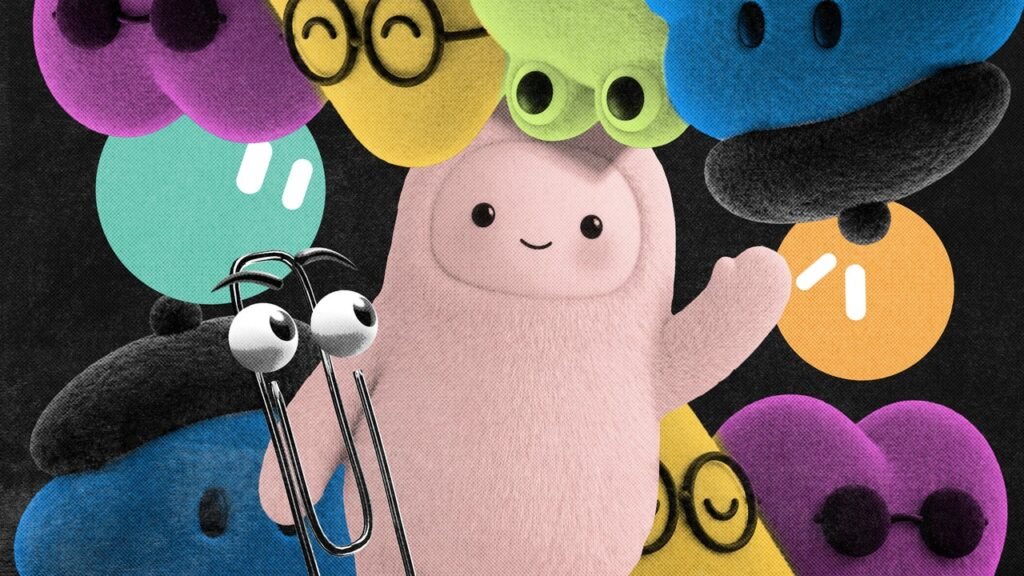
First came the buttholes. Then the sparkles and gradients. Now, the next Big Tech AI branding trend has arrived. As the biggest artificial intelligence players introduce new agent capabilities, they’re all converging around the same visual shorthand: cute little guys.
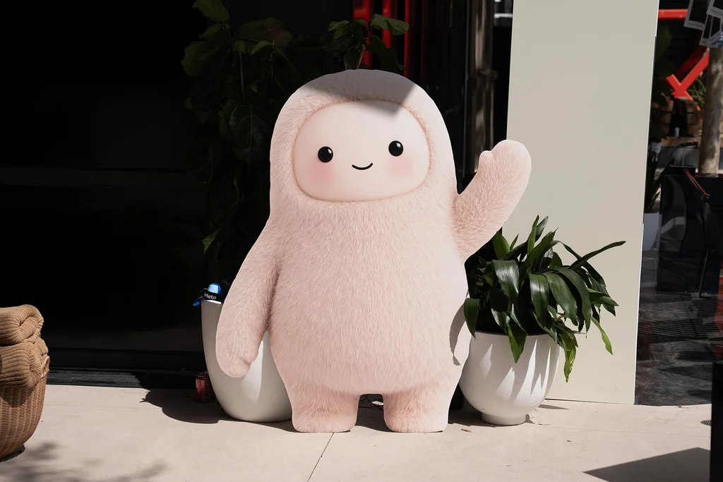
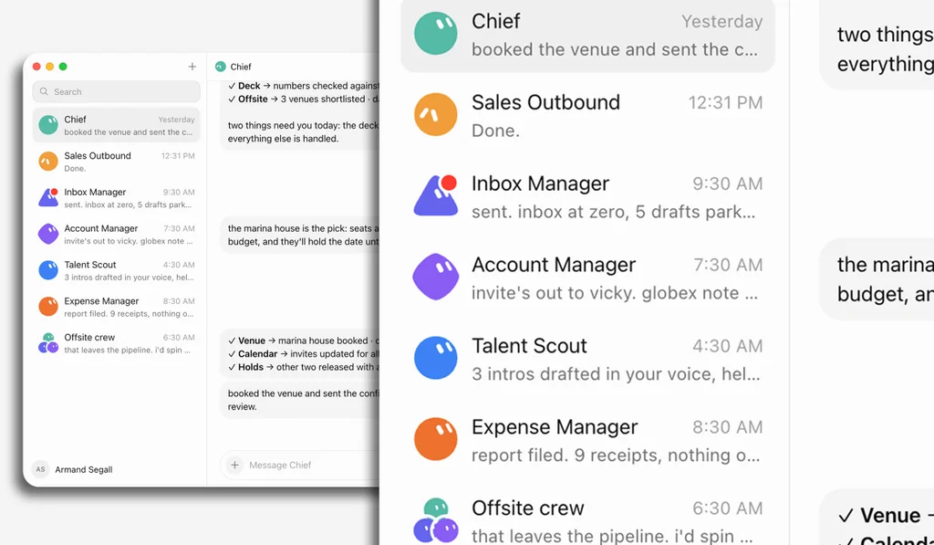
On August 11, SpaceXAI (Elon Musk’s AI-focused mashup company) launched GrokBot, a series of AI agents designed to work on tasks autonomously, even when the user’s computer is closed. They’re represented by shapes with giant, orb-like eyes. On September 8, Meta came out with its own agent, called Muse, which looks like a fluffy monster toy (it has also been integrated into a Tamagotchi-style keychain). Then on September 29, OpenAI joined the party with a suite of AI agents called dots, which look like customizable Pixar characters and were described by the company as “remarkably capable” and “remarkably cute.”
We are firmly in the era of the anthropomorphic AI mascot, and according to multiple researchers and designers I spoke with, the trend makes perfect sense. In moments when tech companies want to encourage mass market adoption of an unfamiliar service, they’ve historically turned to friendly, approachable design.
In a recent interview with Fast Company, Anthony Cappetta, partner and creative director at the creative studio Super Okay, explained that these emerging trends help companies “signal compliance” with established digital norms. “There’s a shared advantage in looking familiar and ‘safe’ within the ecosystem, especially for massive platforms where aesthetic shifts are scrutinized heavily,” he said. “It’s less about being original and more about being instantly legible and trustworthy at scale.”
But this visual shorthand comes with its own drawbacks. As AI makes its biggest consumer play in a moment of unprecedented doomerism around the technology, cutewashing a new and largely untested technology can spark its own backlash.
Investigating the Big Tech aesthetic ‘gravity well’
Kevin Walker, chief creative officer at the creative company Buck, has had a front row seat to watch tech companies falling into what he calls the aesthetic “gravity well”—or the phenomenon that causes Big Tech giants to coalesce around the same visual symbols.

In the mid-2010s, Buck was tapped to help a pre-Meta Facebook clean up its surface and brand expression. Back then, Walker says, there was no “cohesive idea of what Facebook is or the way that Facebook was going to talk to us.” The brand wanted a system that would highlight its ability to bring together people from all around the world, without trying to show literal individuals. The Buck team landed on an illustration style that it called Alegria, Spanish for “joy,” which showed figurative people with slightly wonky proportions that were easy to replicate.
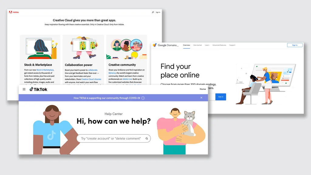
At the time, Walker recalls, it was a “pretty unique brand expression.” Soon, though, everyone from Airbnb to Hinge, Google, and YouTube had embraced similar branding, earning the style the nickname of “corporate Memphis” for its ubiquitously slick and colorful appearance.
“You had a bit of this herd mentality—this brand expression got copied and cloned across tons of different companies, and it all kind of raced to this mean,” Walker says. “Where I like to think that the Facebook expression was actually pretty special and had craft and a POV behind it, it got pulled into this magnet of what we started calling ‘tech illustration.’”
Like skeuomorphism in the early days of the internet and “blanding” at the beginning of the app era, Alegria emerged at a time when users’ relationship to technology was shifting. As Facebook’s usership rocketed into the billions, the brand needed a way to manage the emerging, and increasingly contentious, narrative around social media and its impact on people’s lives. Alegria was one solution to the issue.
Soon, though, the illustration style’s ubiquity in the tech space turned it into a tired, meme-able trope. “Corporate Memphis” became a visual shorthand for everything wrong with technology, with netizens using it as a symbol for Big Tech’s attempt to appear “authentic” while amassing more control over the public’s lives, attention, and personal data.
“When you have this gravity well, it makes it feel like everything becomes the lowest common denominator, which was an unfortunate long tail of that system of Alegria,” Walker says. In 2026, AI mascots appear poised to face a similar fate.
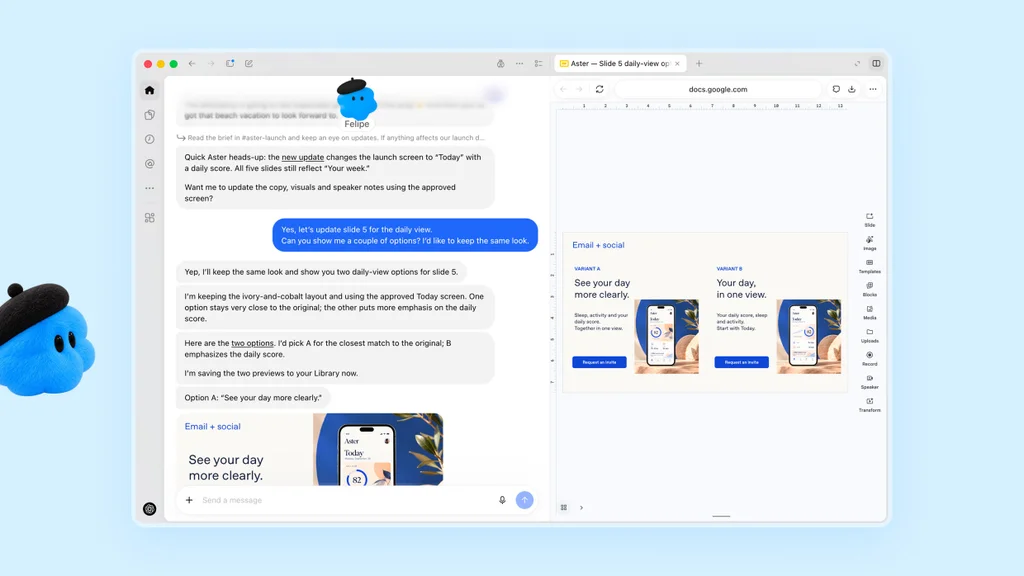
The Clippy of the AI era
From their giant eyeballs to their stubby limbs and fluffy fur, there’s no doubt that AI agents like Meta’s Muse, OpenAI’s dots, and Grok’s Bots are designed to garner your affection. Joshua Paul Dale is a professor at Tokyo’s Chuo University, self-described pioneer of a new field of “cute studies,” and author of the book Irresistible: How Cuteness Wired our Brains and Conquered the World, and he says there’s solid psychology behind these designs.
“Companies are using cuteness because it’s an evolutionary mechanism that prompts us to be social,” Dale says. “Seeing something cute stimulates the pleasure centers in your brain before you have a chance to think about it. Cute things are high in approach motivation, meaning we want to keep them close by.” Plus, he adds, research indicates that we tend to forgive cute things if they make mistakes. “This is a delicate issue for AI companies because generative AI is known for hallucinating. They want you to forgive mistakes but not to expect mistakes, because then you’ll choose another company’s AI.”
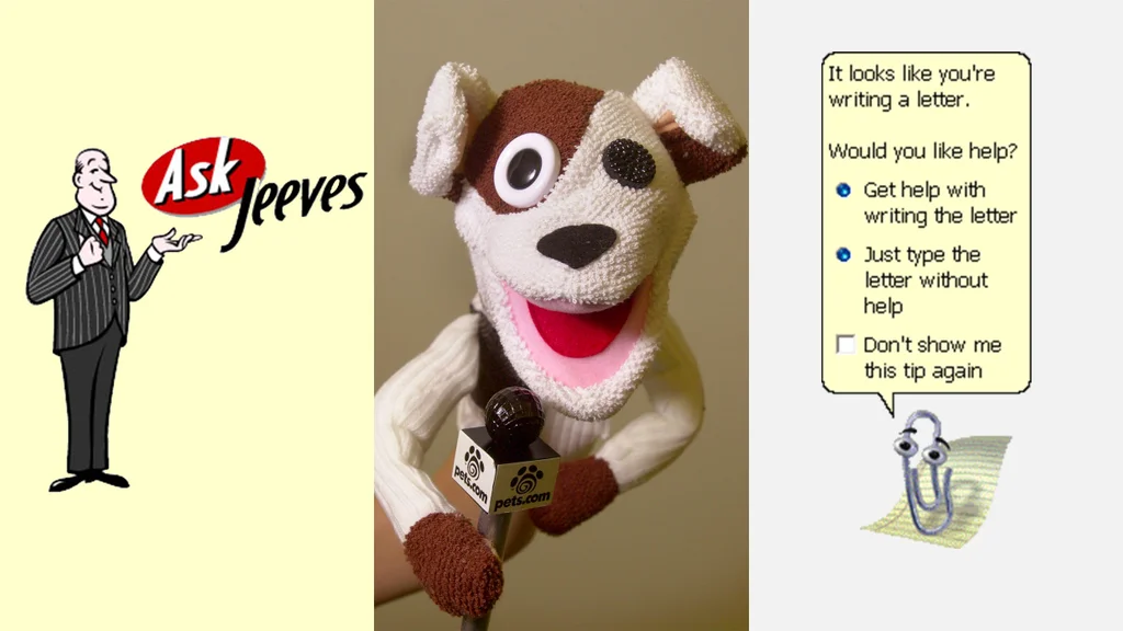
This isn’t the first time that Big Tech has turned to cute mascots en masse in a moment of technological unease. In the late 1990s and early 2000s, they were everywhere: think Ask.com’s cartoon butler Jeeves, Pets.com’s sock puppet, and Microsoft’s Clippy, for example.
As Fast Company wrote in a 2014 memorial on the then-bygone tech mascot, “back in the ‘90s, when the Internet and computers really started to take over American homes, tech companies needed those playful mascots to show buyers that this new technology wasn’t so intimidating.” At the time, these characters acted as “a Virgil who guides through the murky depths of software and user guides.”
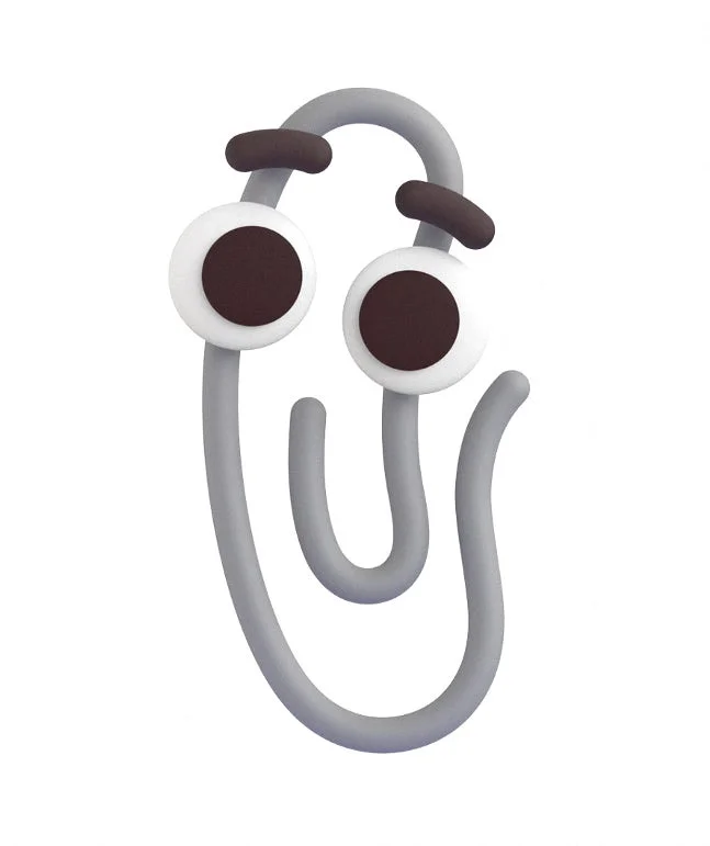
Cute mascots fell out of vogue once users had accepted the internet as a daily part of their lives. In the AI era, though, the cuteness pendulum is swinging back. Suddenly, every company seems to want their own cartoon Virgil.
There’s an obvious issue with the cute-ification of AI agents, though, and it’s the main lesson that Buck’s Walker took away from the Alegria “tech illustration” gravity well: If everyone has an anthropomorphic AI mascot, no one has a memorable anthropomorphic AI mascot.
“If you’re starting to see that same snowball, is there going to be a situation where brands are going to get pulled into this gravity well and come out of it looking all the same, like derivatives?” Walker says. “To me, there’s great learning in that, which I say often when I’m dealing with clients now: You have to be unique. Your first question is, does this stand on its own? When people see this, do they understand who the brand is? And if they don’t, if they’re confused, you failed right there.”
The antidote to cutewashing
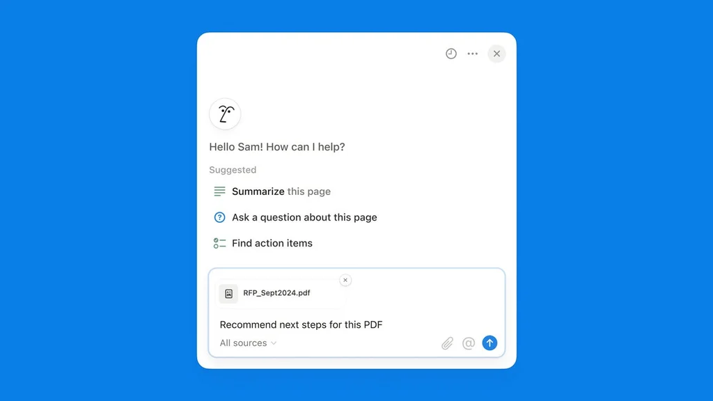
In 2024, Buck asked similar questions when it worked with Notion to design the brand’s animated AI assistant. The agency started with what devoted users loved about the platform—its sleek, easy-to-use interface and classy, hand-drawn brand aesthetic—and converted it into an expressive, classy character composed of just a few strokes and dots. It purposefully leaned away from common AI branding tropes, like the magic sparkle, in favor of a look that reflected the actual platform.
“Know your brand first,” Walker advises. “Notion already had established itself as so illustrative that going in and having this really reductive 2D avatar mascot made perfect sense.”
Other designers are opting for a similar approach. Arjun Mahesh is the head designer at Hebbia, an AI platform for financial institutions, and he recently designed an AI assistant called Max, which is the embodiment of Hebbia’s proprietary harness (essentially, the Hebbia-designed software infrastructure that clients can apply to frontier AI models). Mahesh says he designed Max—which looks like a swirling, modular robot—to “feel alive without feeling like a pet or person.”
“We want it to stick because you trust it and it works, not because it bats its eyes at you and tries to Tamagotchi-guilt you into feeding it,” Mahesh says.
He adds that cute-ified AI mascots, like Grok’s Bots or Open AI’s dots, are clearly geared toward “broad, generalist use cases,” with friendly, easy-to-replicate designs that will allow these frontier companies to easily represent entire suites of AI agents as—presumably—user adoption increases.
Given Hebbia’s more niche clientele, Mahesh wanted Max to feel representative of the brand’s established aesthetic, which pulls from eclectic inspirations including ‘80s and ‘90s tech culture, luxury watches, and architecture. His references for the design included Star Wars’ R2D2, Interstellar’s LARS, watch culture, and, oddly enough, string theory.
“It’s hard to make something that’s both opinionated and generalist at the same time,” Mahesh says. “If you’re trying to design everything for everyone, it’s not surprising to me that a lot of places are landing at a similar conclusion.”
Walker believes this moment of aesthetic convergence should be raising serious alarm bells at AI companies for potential oversaturation and user fatigue, à la Alegria. “Little warning lights need to be flashing: Where are we going to be in 12 months? What is this going to feel like?” he says.
At least for now, though, the tech mascot is officially back, and it wants to weasel its way into your heart—and your AI-powered workflow.
“Cute or not, AI agents can invade our privacy and surveil our every move,” says Dale, the Chuo University professor. “But in a world that seems more and more out of control, even the fleeting chance to say ‘aww’ can feel like a win.”