Novo Nordisk, the Dandish drugmaker behind the weight-loss drugs
Ozempic and Wegovy, announced it’s rebranding to “Novo” beginning this week.
It’s part of a larger trend in healthcare branding. The rise of telehealth, direct-to-consumer pharmaceutical companies, and consumer-facing GLP-1s has drugmakers rebranding their once sterile brands to something more friendly. Novo Nordisk is no exception. Its refreshed public-facing brand is designed to catch the eye of consumers, rather than doctors and pharmaceutical buyers, in order to grab market share and to compete with brands that now offer the drugs directly to the consumer online.
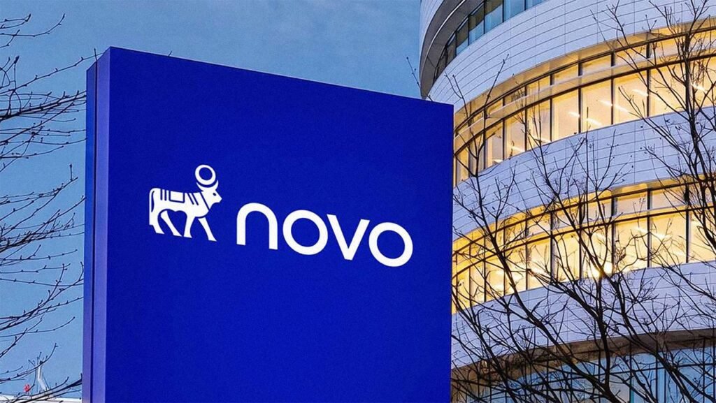
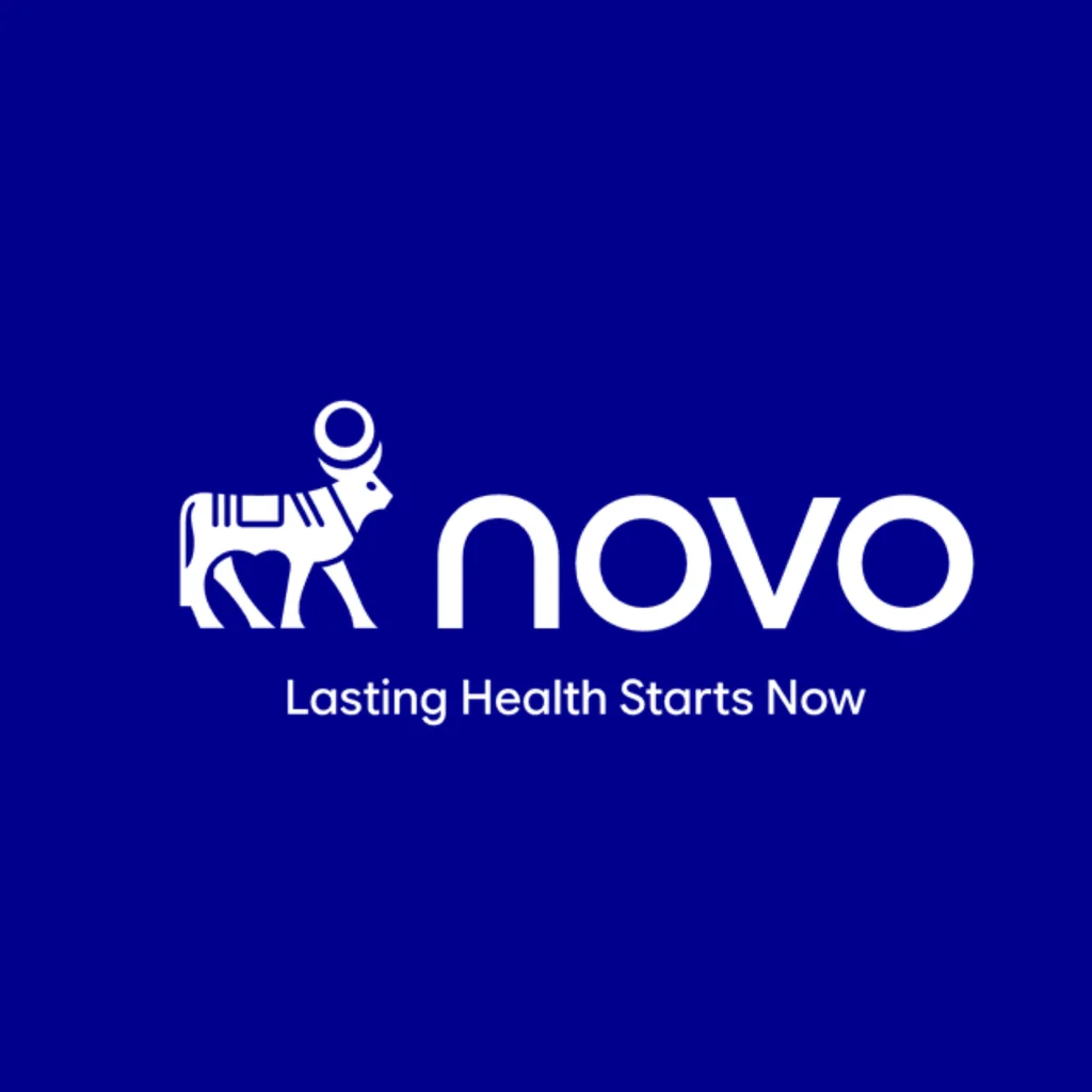
The company hopes its new visual look and name will help. Novo’s new wordmark spells out its shortened name in a more modern-looking sans-serif font, aptly called “Novo.”
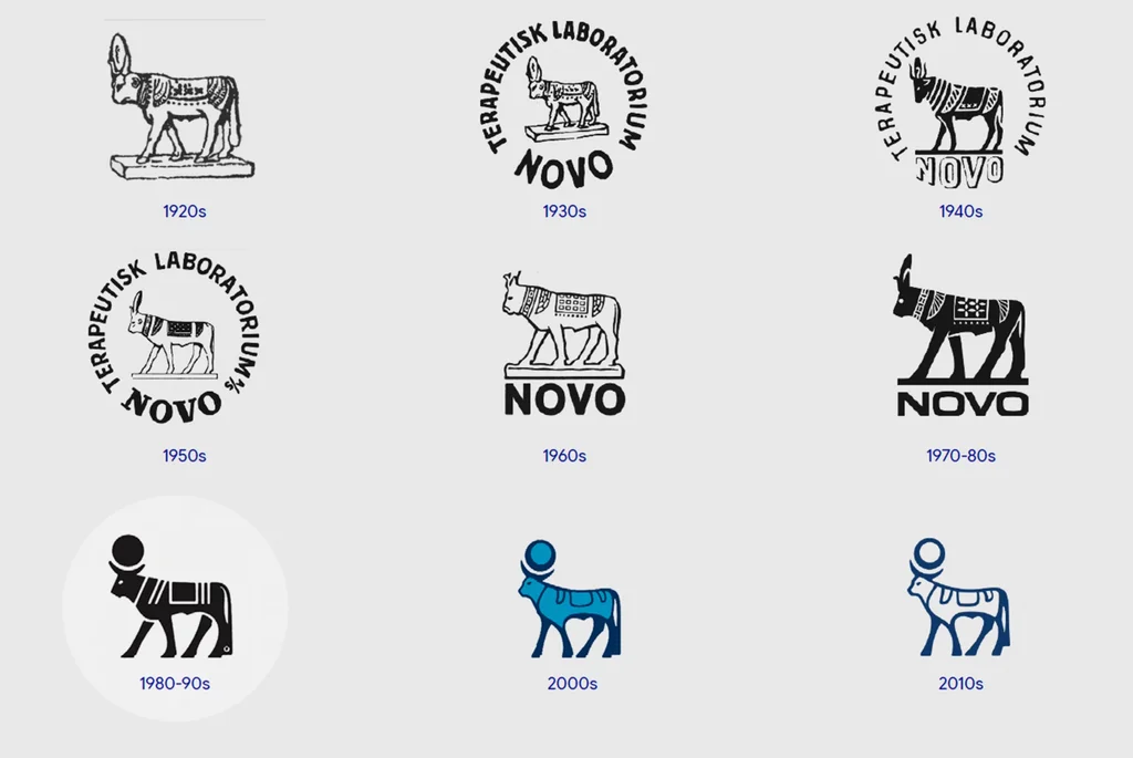
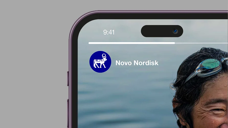
The new logomark also refreshes its longstanding graphic of an Apis bull, a sacred bull in ancient Egypt that the company has used in its logo since the 1920s. A simplified version now faces right instead of left. An updated color palette is anchored by a deep cobalt blue called “Lasting Blue.” Its light blue accent color has been replaced with a bright turquoise. The company explained the new visual identity is meant to feel approachable and modern.
The company simultaneously rolled out a new tagline, “Lasting Health Starts Now,” which is meant to present the brand as more memorable, relevant, and bring it closer to people’s everyday lives.
Novo CEO Mike Doustdar said “people’s expectations of healthcare are changing” in a press release Monday. “Healthcare must become more responsive, relevant and easier to fit into everyday life,” Doustdar said. The rebrand fits that need by presenting the new Novo as more modern and appealing to young consumers.
Big pharma goes humanist
Other pharmaceutical companies have repositioned their brands in recent years to look and sound less clinical for a world where companies like Hims and Hers deliver prescriptions over smartphones.
Moderna Therapeutics, Inc., which developed COVID-19 vaccines, shortened its name to Moderna, Inc., in 2018, while Eli Lilly, which already goes by the shortened Lilly in its logo, added “A Medicine Company” as its tagline beginning in 2021.
Wieden+Kennedy Portland created Lilly’s campaign rolling out the new brand platform. A commercial that ran during that year’s Olympics reintroduced the company as making medicine “not just for some, but for everyone.” It was an effort to market GLP-1s as a weight-loss tool for an even bigger audience than its existing market.
Slimming down for bigger market share
Novo’s full, legal global name remains Novo Nordisk A/S, but the slimmed-down day-to-day name comes as Novo’s struggled to grow its share of the slimming GLP-1 drug market against Eli Lilly.
Per Lilly’s earnings presentation last month, it has a 60.9% share of the obesity and diabetes drug market compared to Novo’s 38.8%. Lilly, which introduced a Zepbound KwikPen earlier this year, said Monday its oral weight-loss drug Foundayo has captured more than 30% of new U.S. patients, narrowing Novo’s lead with its Wegovy pill.
To those unfamiliar, the –disk in Novo Nordisk’s full name could look like it’s for a tech company or chipmaker. With just Novo, it’s on a first-name basis. In a pharmaceutical brand landscape that’s emphasizing humanity and friendliness, that’s a brand refresh and positioning that’s meant to connect and look less prescriptive.