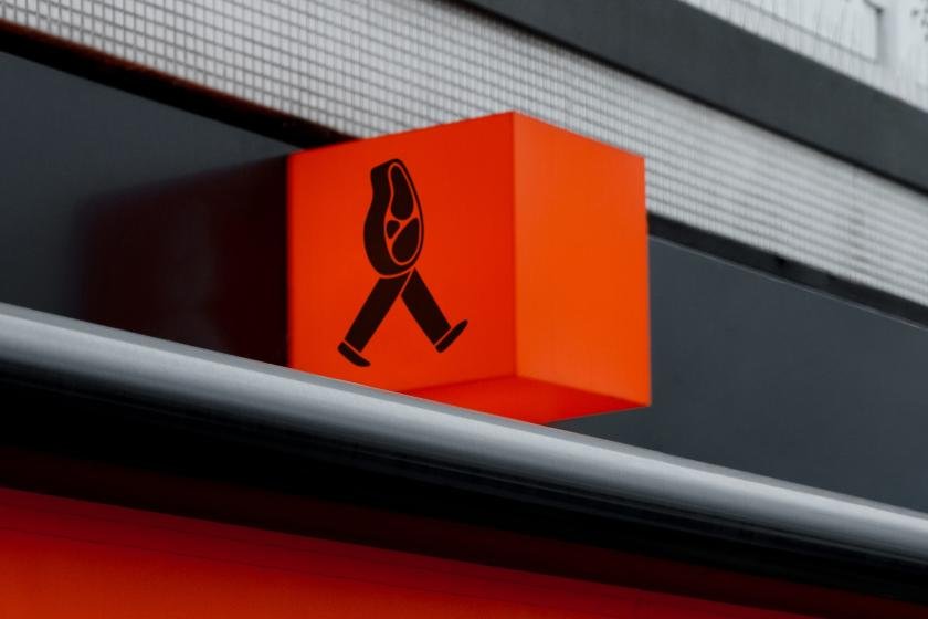
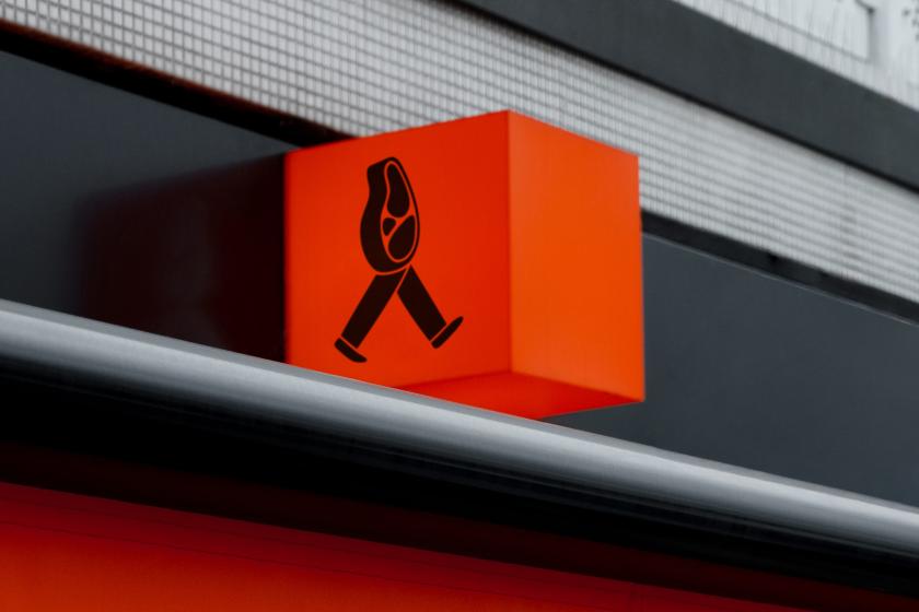
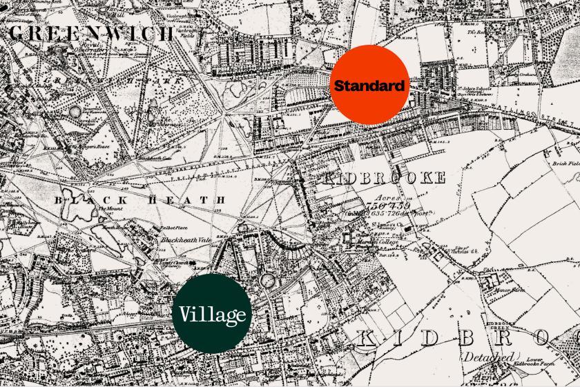
When Nick Ellis acquired two long-standing butcher shops at opposite ends of Blackheath, Studio Blackburn faced a fun challenge: one brand, two very different crowds.
If you’re not a fan of meat, look away now. Studio Blackburn has crafted the new identity for Meat Ellis Butchers, a sustainable “whole-carcass” butcher in London.
The agency was brought in earlier this year after founder Nick Ellis acquired two long-standing butcher shops in Blackheath Village and Blackheath Standard. He wanted a fresh look that would differentiate the two locations and serve their distinct local customers while still feeling like one family under a premium parent brand.
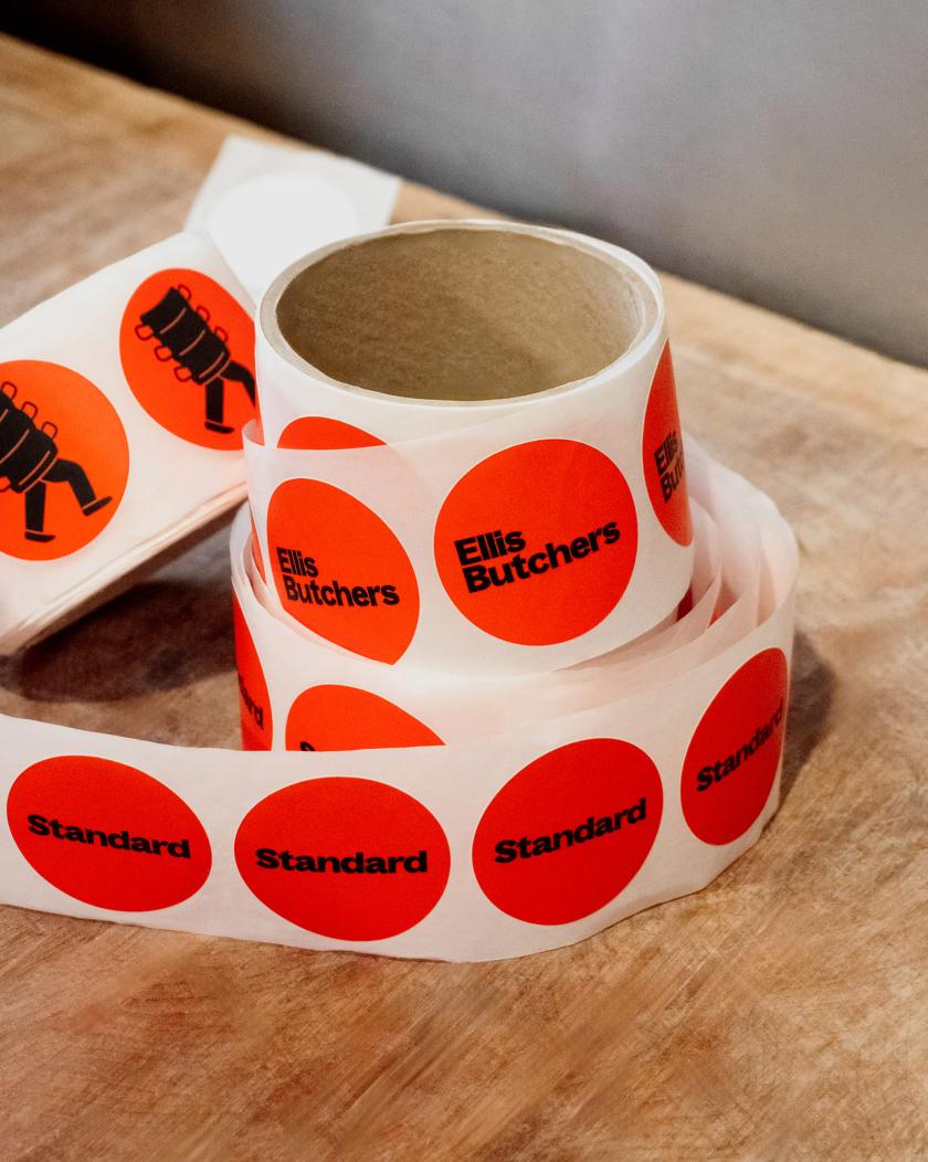
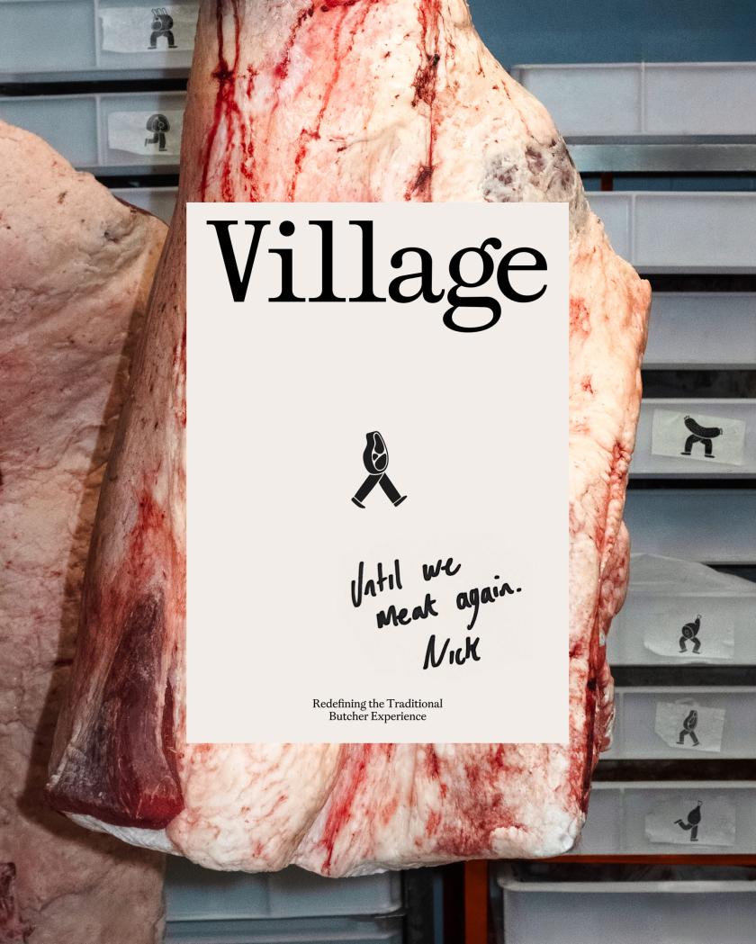
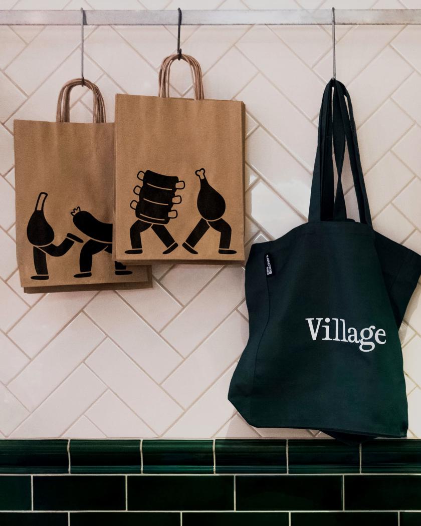
Studio Blackburn drew inspiration from the rich history and charm of each spot, mixing tradition with youthfulness to cater to these diverse demographics. I’m talking cheeky illustrations of meat characters throughout, set against a bright orange backdrop and bold typography for one shop, versus racing-green elegance where serif type takes the lead for the other.
If you’re familiar with these areas, then you’ll understand the contrast. The Village has been around since the 18th century; much of its stock is Georgian and early Victorian, and it has a more established, well-heeled crowd. The Standard came along later, growing around the Royal Standard pub as a shopping parade serving households spreading out from Greenwich and Charlton. It’s the cheaper, younger end of the heath – estate agents treat the two as entirely different markets.
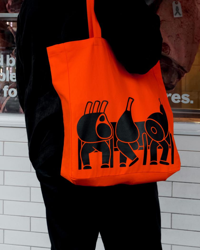
As mentioned, the heart of the visual system is a cast of meat characters, led by ‘Meat Ellis’ himself. These figures smile everywhere, from the signage and packaging to pricing tags and tote bags, bringing warmth and humour to both shops. Alongside the stacked parent wordmark in a confident sans serif, they’re the one thread that runs through both. And they’re animated, too, adding a nice bit of motion to digital channels.
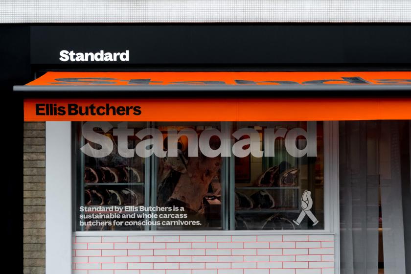
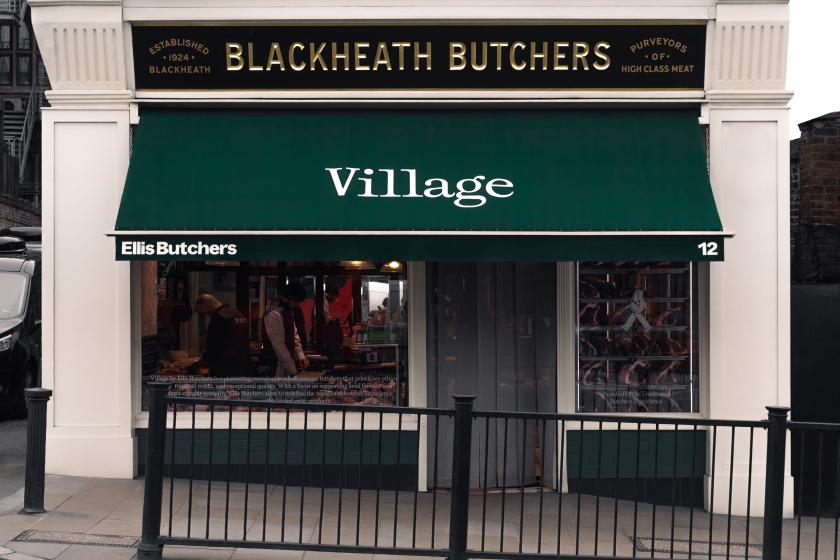
For the historic Blackheath Village location, Studio Blackburn focused on tradition, honouring the establishment’s century-long legacy. Nick Ellis wanted something that celebrated this heritage while giving a welcoming feel. The resulting ‘Village’ identity has a classic-looking logotype and a sophisticated green colour palette, while traditional green tiles and awnings dress the shopfront.
Over at Blackheath Standard, it’s a contemporary, youthful identity – the fun sister brand to the Village. It’s loud and playful, with vibrant orange accents and chunky typography, targeting a younger demographic with “trendy, social-first aesthetics and widespread culinary appeal”, as the studio puts it. Hipsters, basically. If that word is even a thing anymore.
The tone of voice is charming. ‘Nice to Meat You’ features on social media graphics and on staff T-shirts. Product tags include a walking meat chop, as do the shopping receipts. It’s unlike any butcher’s we’ve seen before, and it must’ve been quite the fun challenge to tackle two different markets under one umbrella brand, but Studio Blackburn pulled it off brilliantly. Nice to meat you, indeed.