Check out the hottest new typefaces in our monthly roundup.
Summer is fast becoming a memory. We’ve all had our holidays, switched off our out-of-office replies, and are wondering whether to put a jumper over our T-shirt. And as we power up our laptops once more, there’s oodles of typeface goodness to lap up.
This month’s releases include a Victorian grotesque revival with a political conscience and a Peignot update from Production Type. There’s Castillon, a serif that fuses British and French calligraphic traditions with those from Estonia; Tüpokompanii’s Vee arrives as a younger sister to the Bauer Venus of 1907.
The real standout story, though, has to be Exemplar. Göran Söderström began drawing it way back in 1994, before many people reading this article were born. It is now, more than three decades on, complete. To celebrate, he carved its history into marble street signs in Italy. And after all that work, who could deny him that?
1. Autêntica Serif by Sofia Mohr
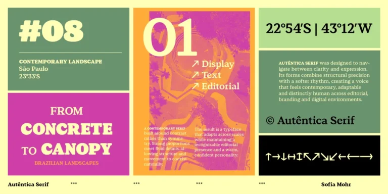
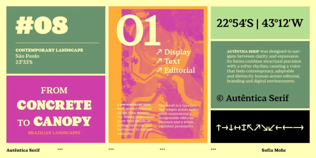
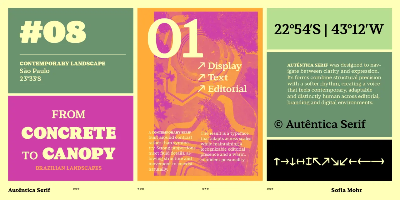
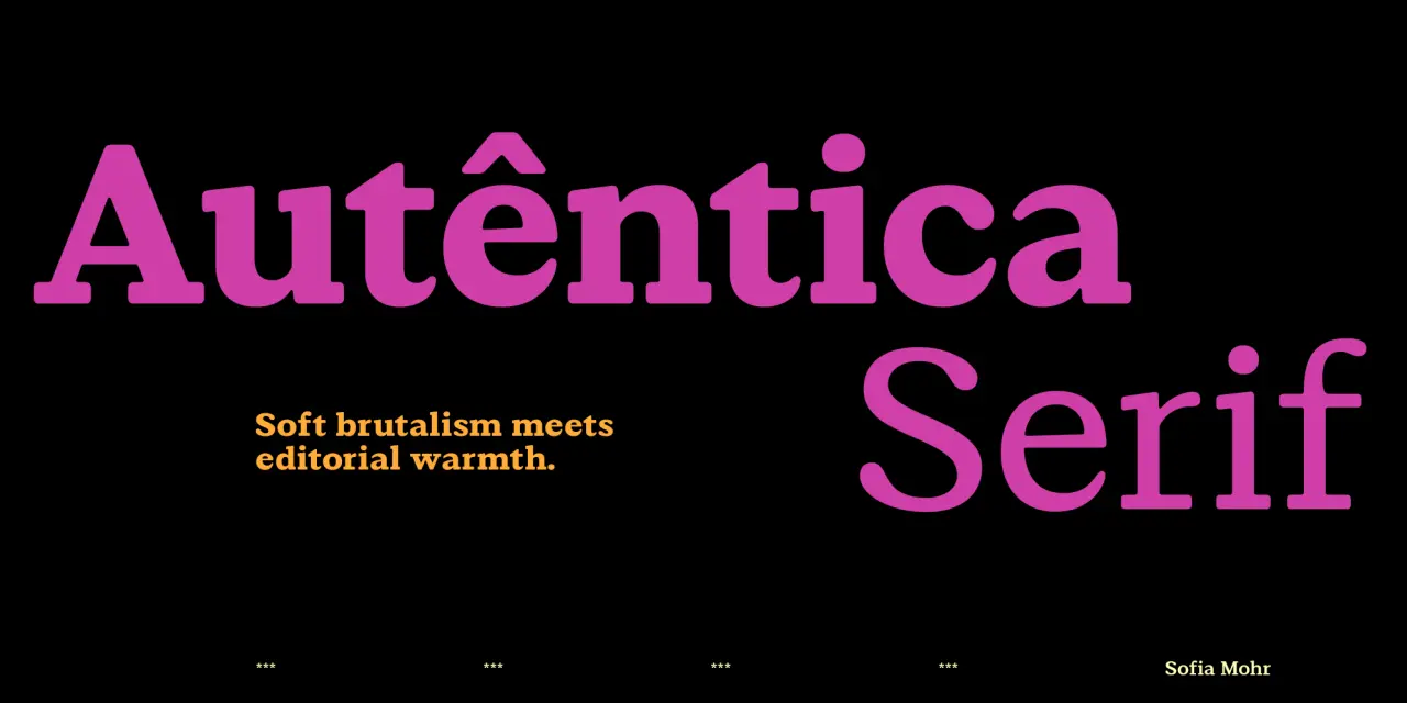
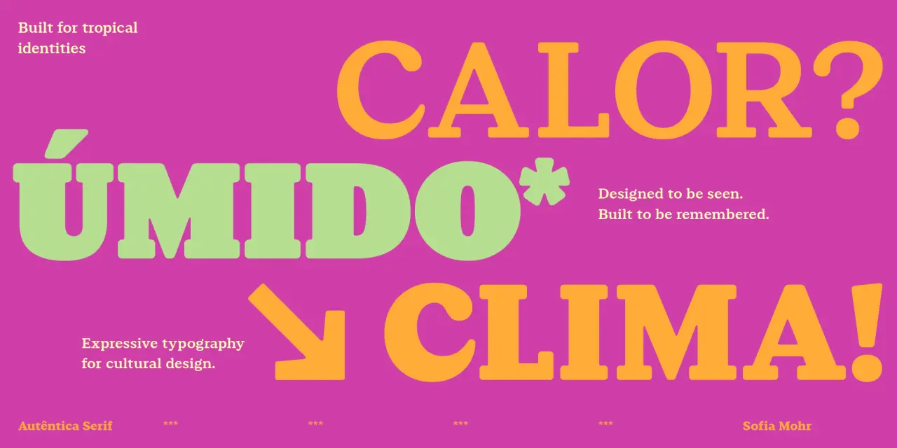
We’ve been watching Sofia Mohr’s Autêntica superfamily expand across the year with admiration, and this serif release doesn’t disappoint. Where Autêntica Sans established the family’s rhythm and editorial personality, this new release translates those qualities into something warmer and more sculptural; inspired, she says, by Brazilian Brutalism and its dialogue with landscape and light.
With its bold, rounded serifs, softened corners and fluid terminals that open into subtle drop-like shapes, this is not a standard serif by any means. Six weights and a variable font make it very versatile, and this font could be a good choice to use for branding, packaging, editorial and cultural projects.
2. Exemplar by Göran Söderström
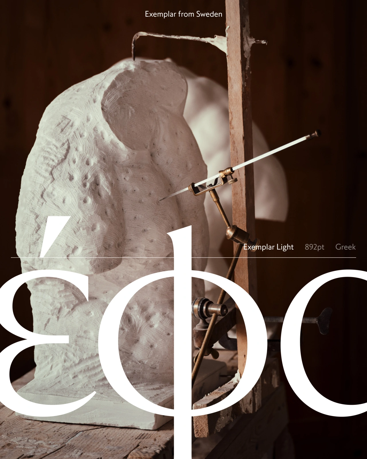
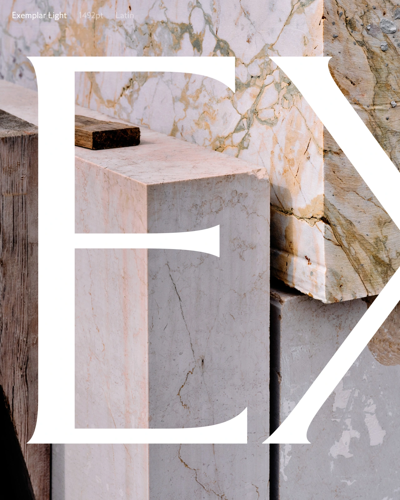
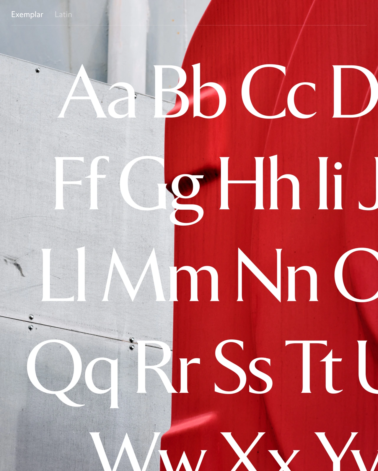
Thirty-two years: that’s how long Göran Söderström of Letters from Sweden has been working on Exemplar. He began drawing it in 1994 on a Power Macintosh 7100. Finally, it’s complete: five weights with italics, 791 glyphs, supporting Latin, Cyrillic, Greek and Arabic across 370 languages.
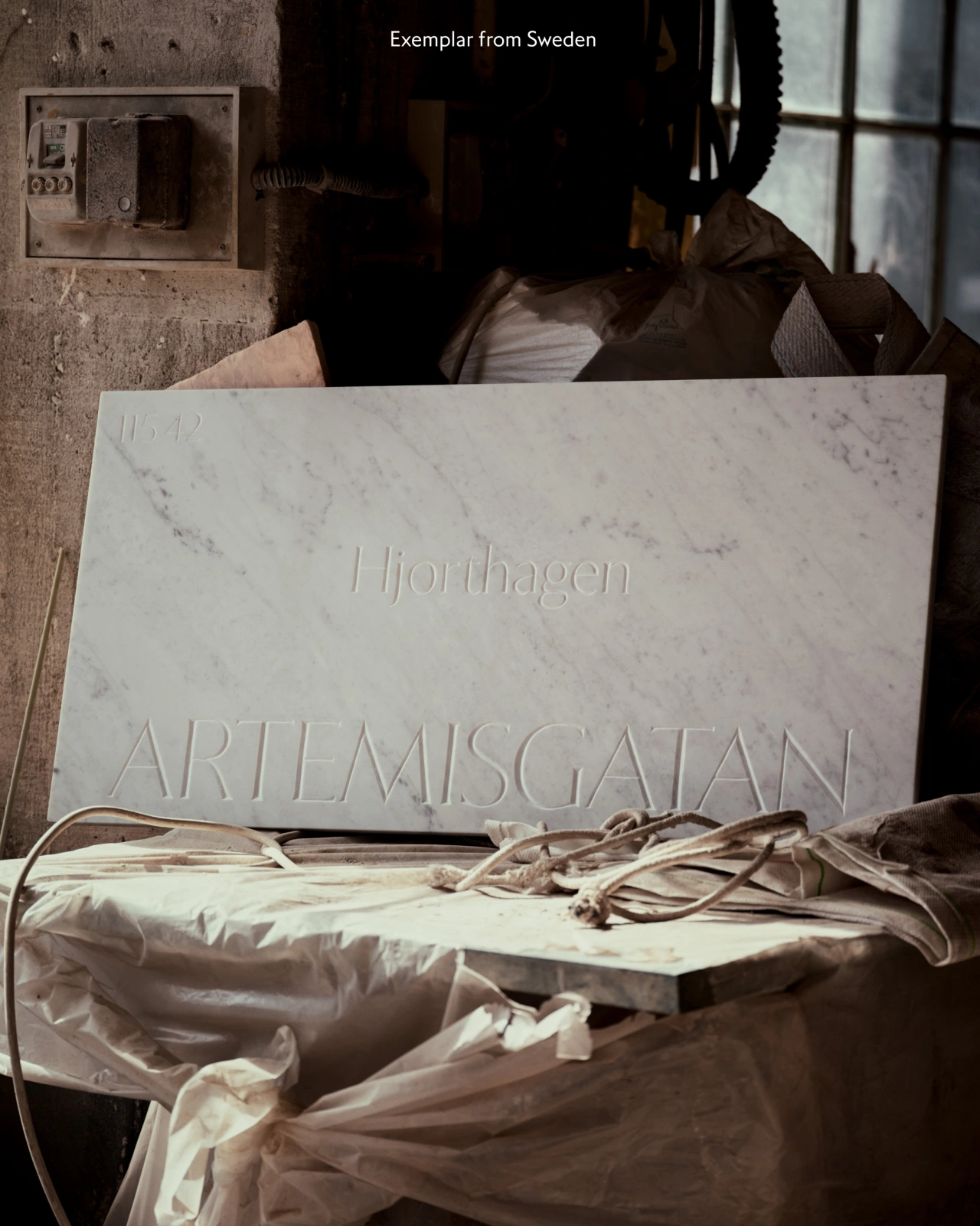
To mark the occasion, Letters from Sweden carved the typeface’s three-decade history into marble street signs in Pietrasanta, Italy: one sign per decade, per address where each version of the typeface was designed. They even made a short film about it. They’re very excited. And rightly so: this is a significant piece of work: a humanist serif that’s been lived with, tested, refined and reconsidered across three decades of design practice. Indeed, Exemplar’s multilingual scope alone—370 languages!—puts it in a different category from most typefaces.
3. Castillon by Malou Verlomme
We always have high expectations for the work of Malou Verlomme, who co-designed 00 Quatorze, which we covered in December 2025. And we’re happy to report that with Castillon, they’ve been met. Released through 205TF, this serif sits at the intersection of two typographic traditions: British and French; the broad-nib pen and the stone chisel.
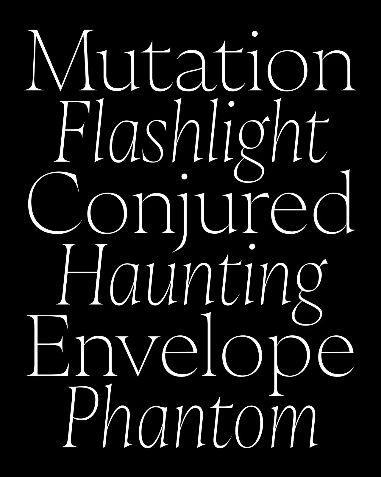
The contrast between thick and thin strokes is pronounced, as is the tension between structural capitals and more fluid lowercase forms. As its makers put it: “The serifs seem to waver between lapidary incision and calligraphic stroke”, creating a lovely tension that could help bring designs across a number of applications to life. Six weights with matching italics, only slightly inclined and deliberately narrow, complete this confident family.
4. Foundry Kingdom by David Quay and Stuart De Rozario
Three years in the making, Foundry Kingdom is described by designer Stuart De Rozario in unusual terms. “[It] is not champagne, it is a pint of bitter in the local pub,” he says. “It is not the King’s horse at Ascot, but the drayman’s horse hauling beer barrels through narrow streets. It is not spectacle or ceremony, but industrial labour: the quiet dignity of work.”
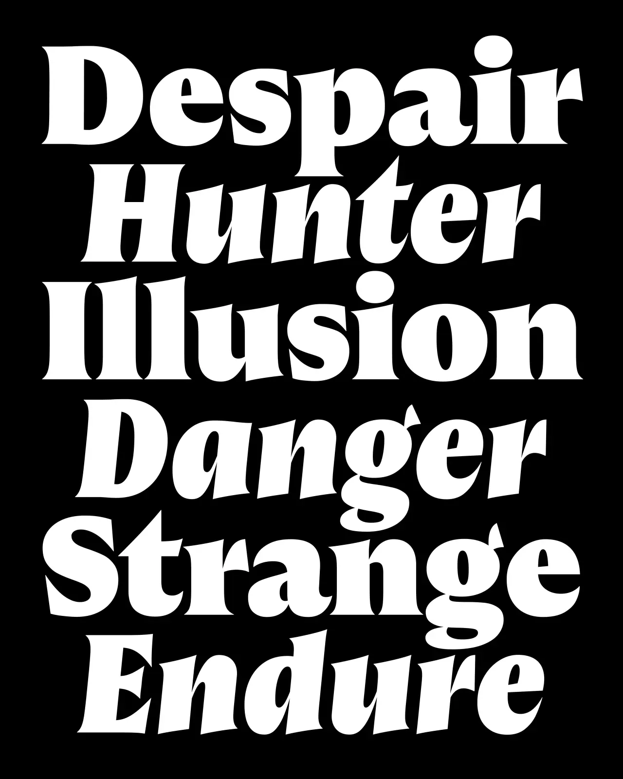
Rooted in the early grotesques of the 19th century, Foundry Kingdom is a homage to that English lineage at the point before it diverged into the German neutrality that eventually led to Helvetica. Within its DNA lie historic forms that were meant to be read quickly and clearly under pressure: railway lettering, newspaper type, hot-metal printing.
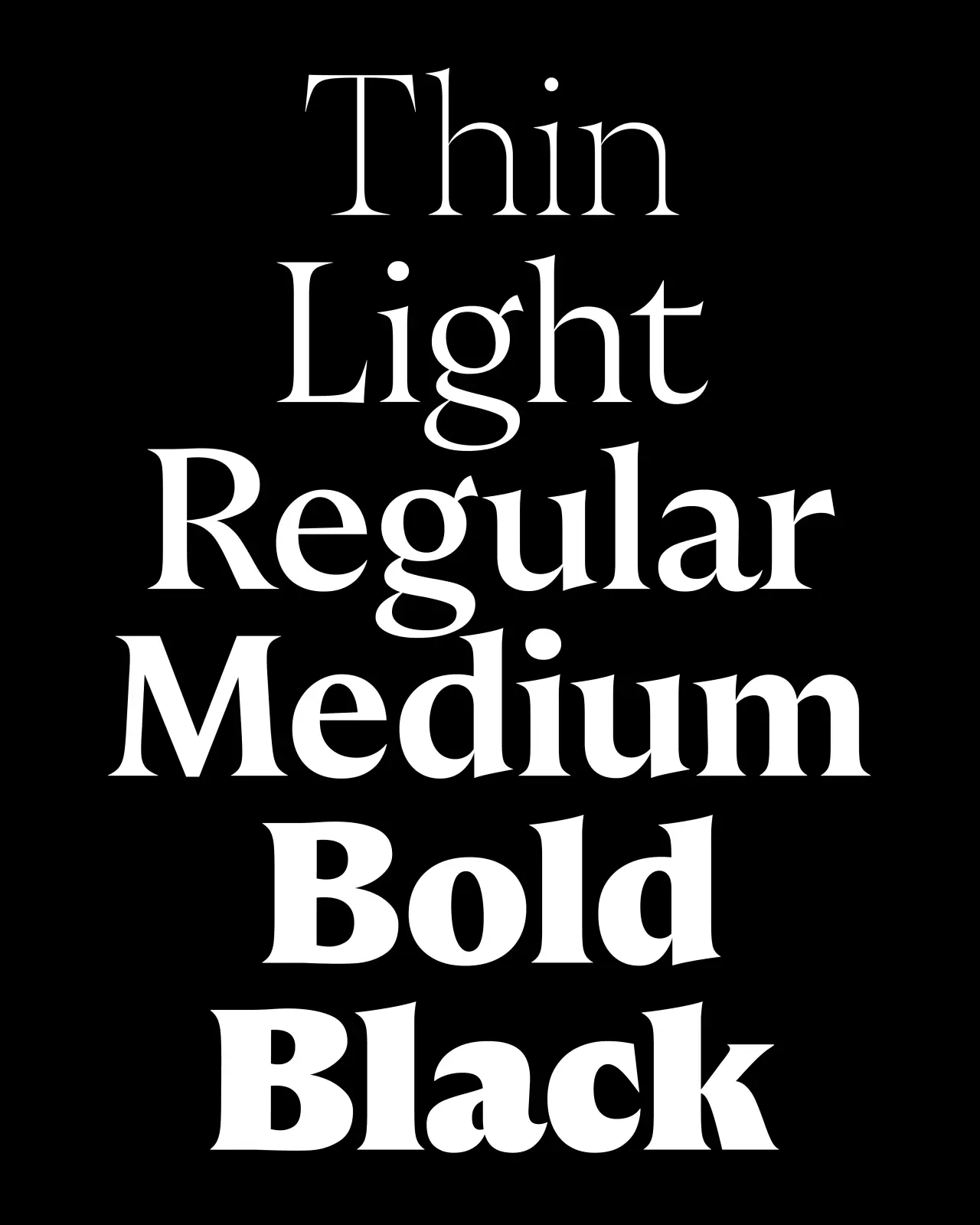
Named as a tribute to Isambard Kingdom Brunel, its strokes are heavy, the proportions functional. Meanwhile, details such as bold terminals on the a, c, g, j, r, s, t and y; a two-storey a, and a double-storey g add plenty of character to the mix. Foundry Kingdom is available across fourteen styles from Light to Black.
5. Peignot Jumbo by Cassandre
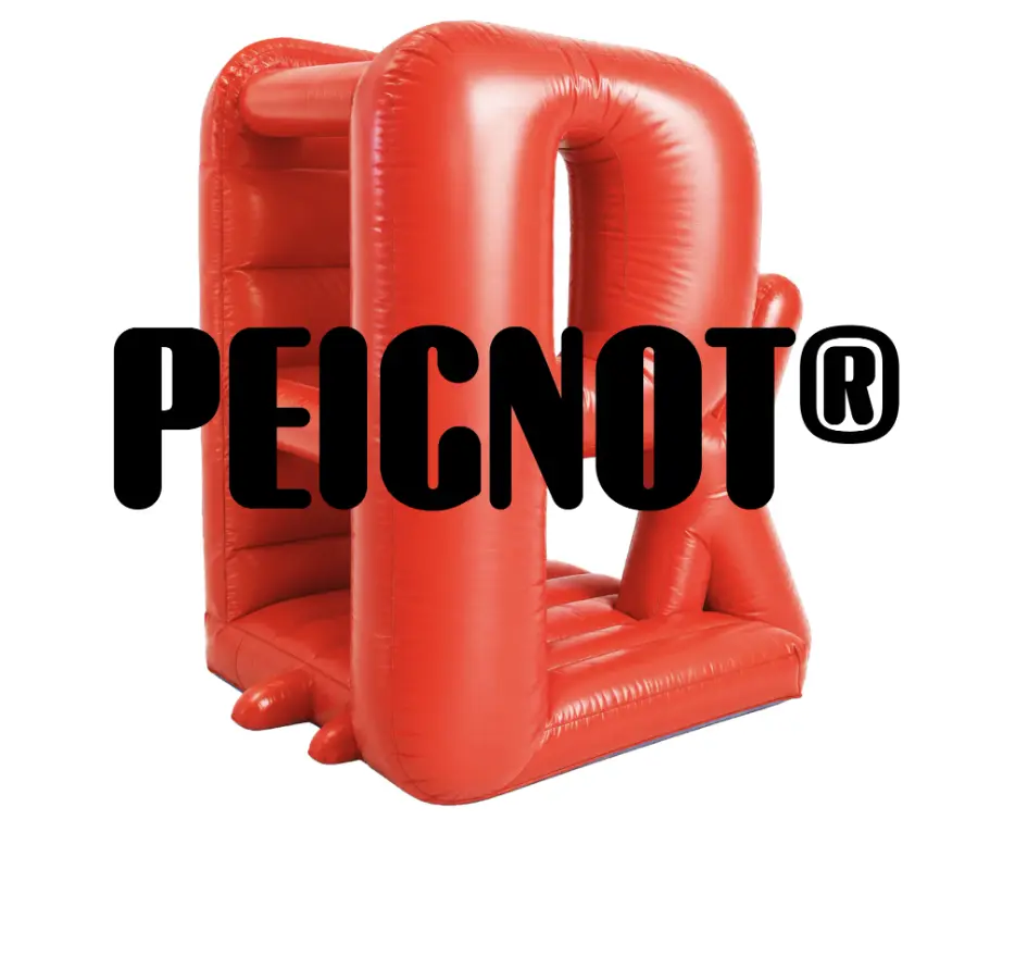
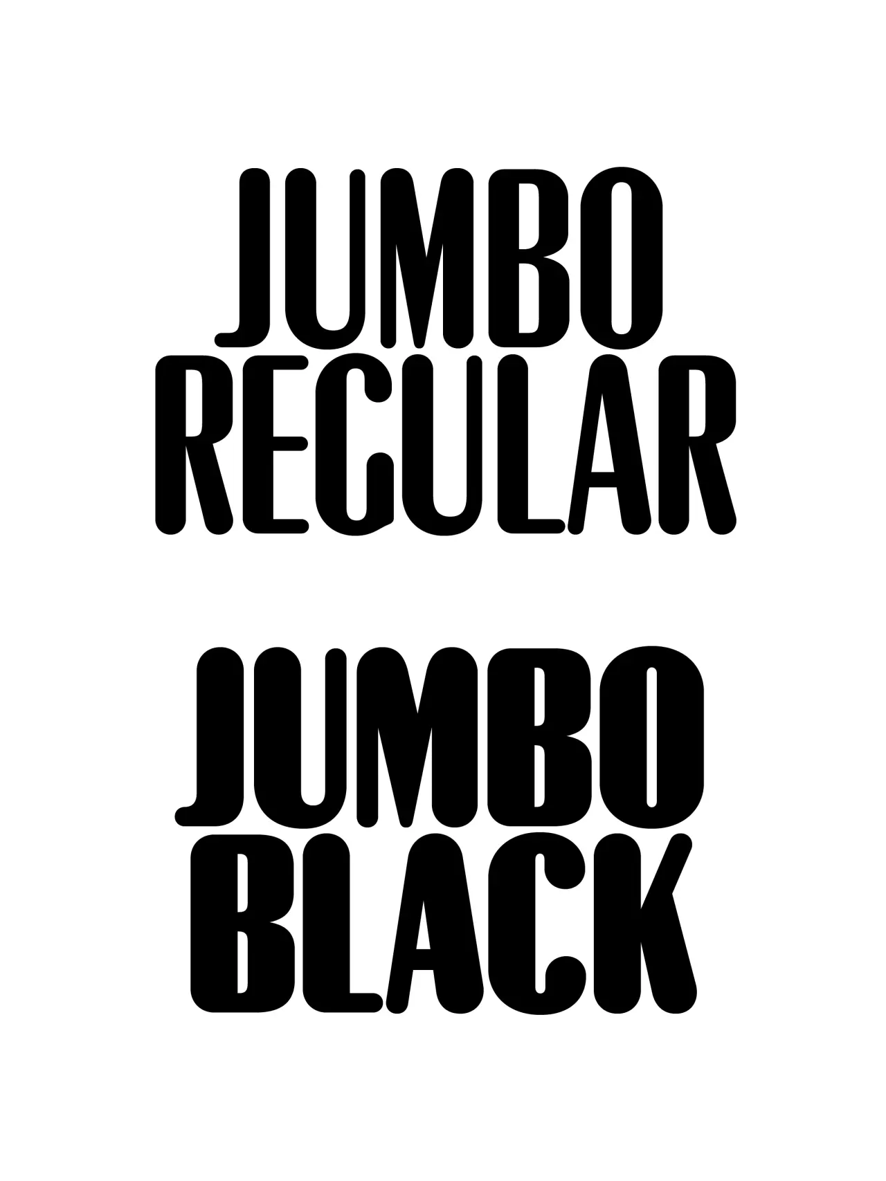
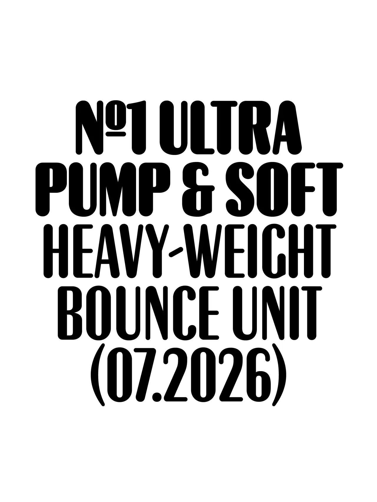
Peignot is one of the classic display typefaces of the last century. Production Type’s House of Cassandre imprint has been stewarding that legacy, and Peignot Jumbo is its latest, carefully considered extension. The concept was a simple one. As Production Type’s Deniz Eser Uslu puts it: “There never was an original rounded version of Peignot in the foundry archives, so we decided to make one.”
Peignot Jumbo is calibrated for maximum display impact, with all the drama of the original at scale, without any of the compromise at smaller optical sizes. It’s a strong choice if you need your typography to be distinctive, whether you’re working in a cultural institution, the fashion industry, or in high-impact editorial.
6. Vieno by Teo Tuominen
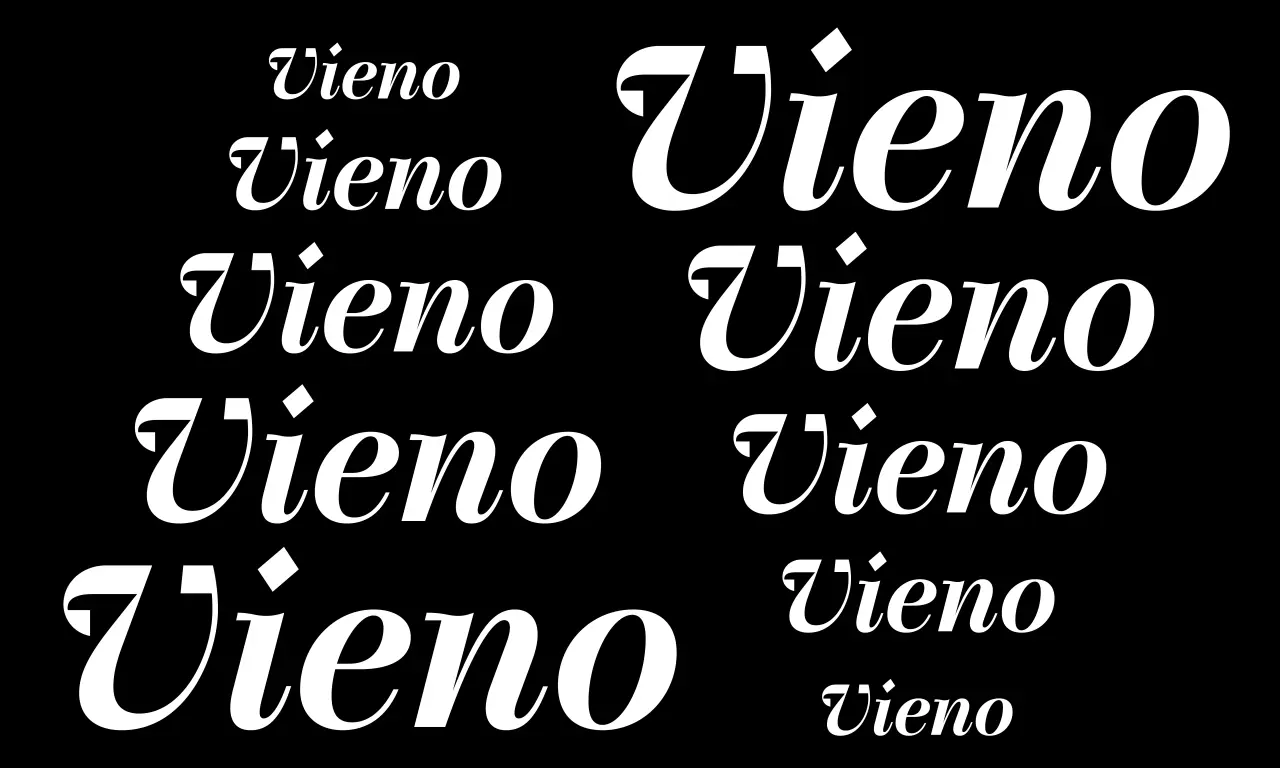
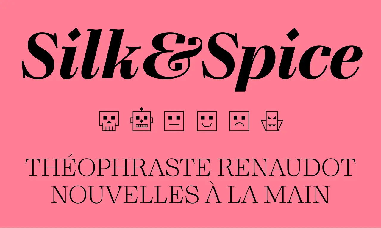
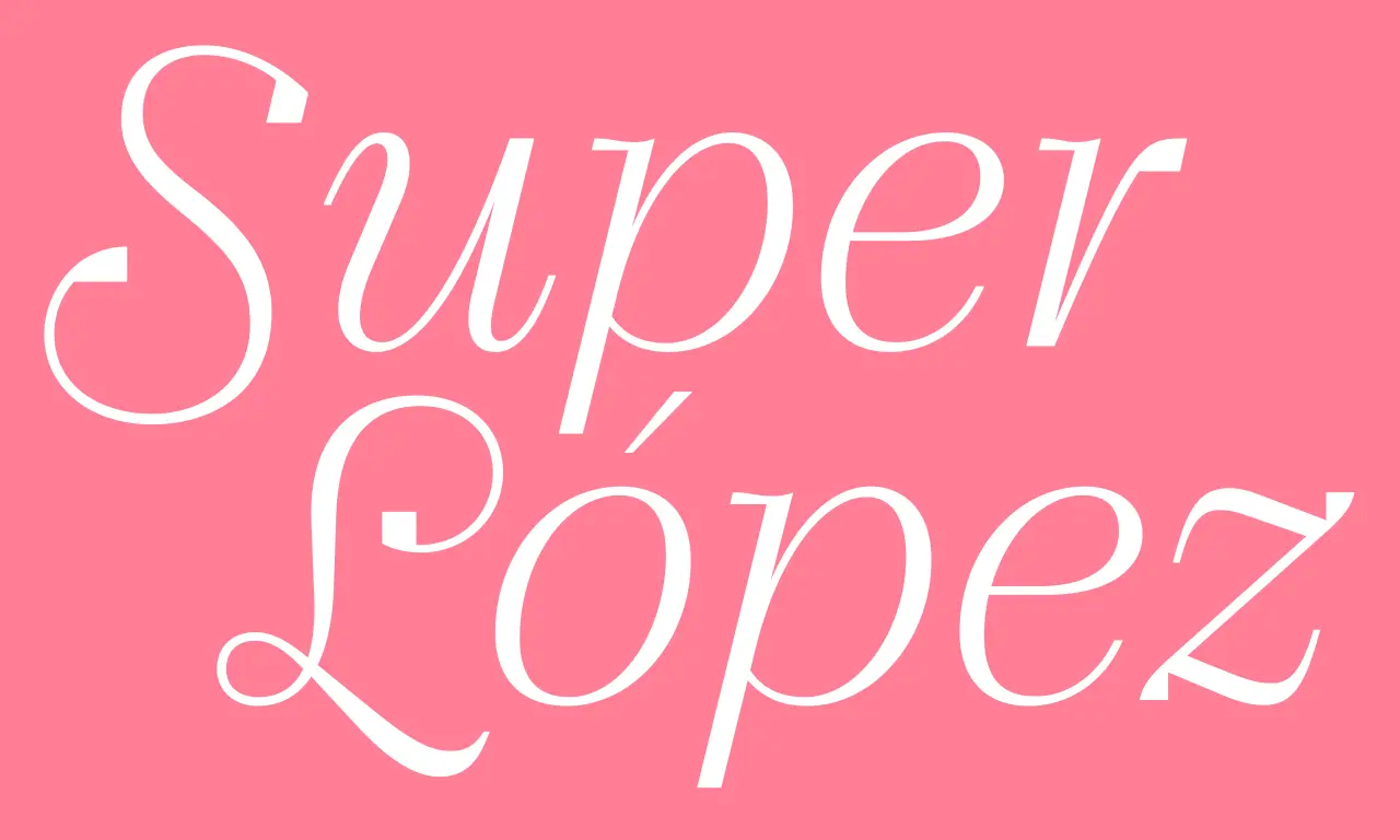
Vieno is certainly ambitious. In developing it, Spoke’s Teo Tuominen took the discipline of Bodoni and Didot as his starting point, then deliberately pursued the contradictions rather than resolving them. The result: a serif that consciously sets organic and mechanical forms against each other, leading to a beautiful tension between tradition and modernity.
Despite these historical inspirations, though, Vieno is also pretty original. As Teo puts it: “The terminals are mechanical, rigid squares, the dots are shaped like a diamond, and sharp angles can be found throughout the character set.”
Vieno comes in 15 weights from Extralight to Black, each with matching italics, plus a complementary monospaced style for contrast. The character set includes old-style and tabular figures, ligatures, circled numerals, inferiors, superiors, fractions, alternates and a set of distinctive icons.
7. Novaform by Identity Letters
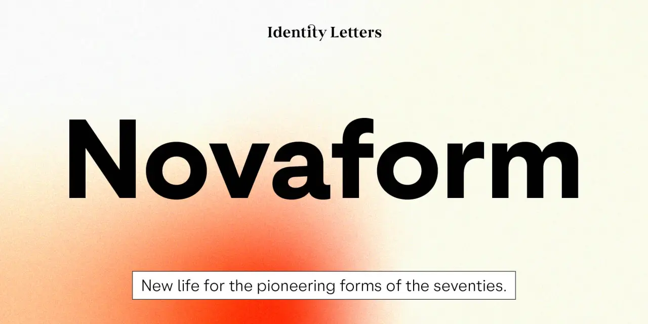
We all love a 1970s geometric type revival. And better still, Novaform is a more nuanced entry into that genre than most.
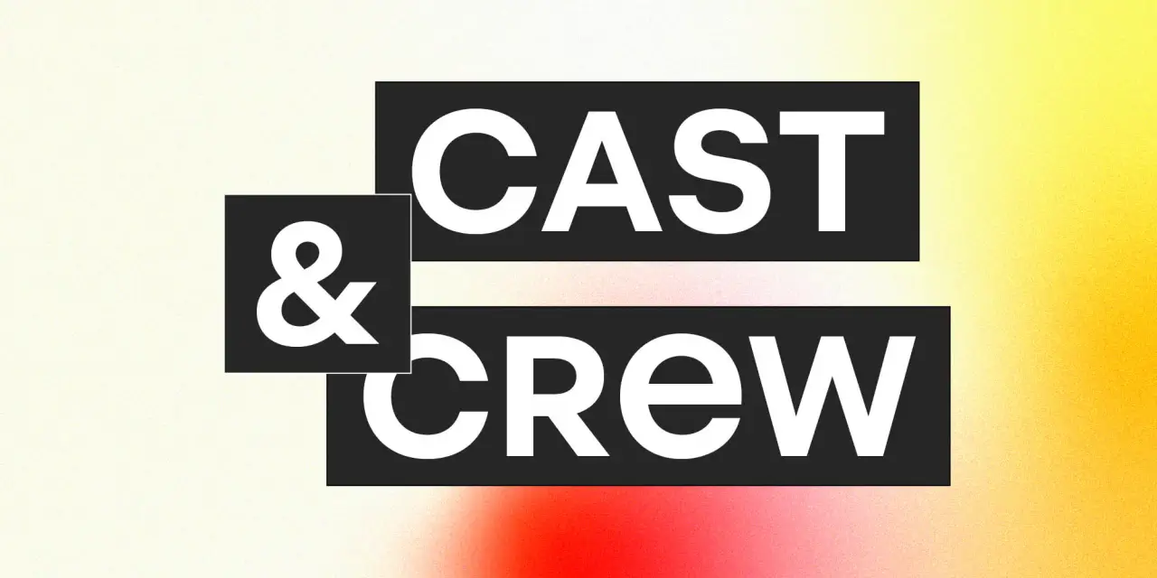
It’s inspired by an era when classic faces like Kabel and Futura were reimagined with interlocking uppercase ligatures, tremendous x-heights, and a boldness calibrated for display.
As Identity Letters point out, though: “These hallmarks of the phototypesetting era were exclusively designed for display use.” By contrast, Novaform has been designed to be more approachable, look more natural and read well in body text.
Ten weights, stylistic sets, hallmark ligatures and a Unicase mode let designers dial up or dial down the showiness as required. The Unicase mode, in particular, makes the typeface’s most distinctive quality available as a choice, not a constraint.
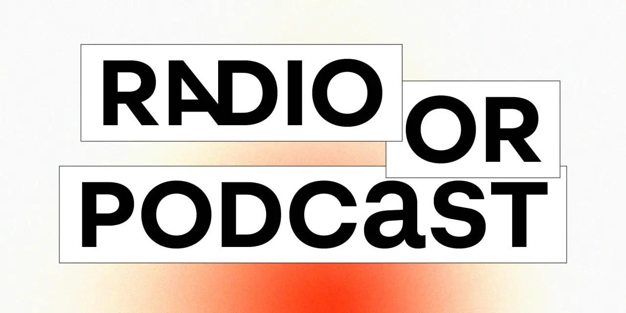
8. Raimundo by Enrique Hernández
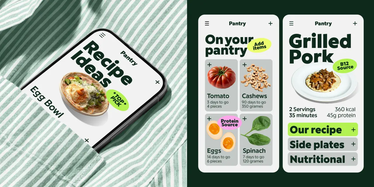
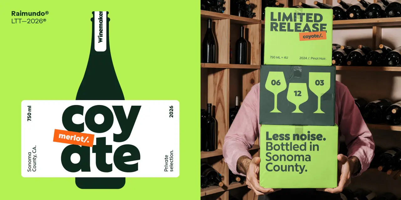
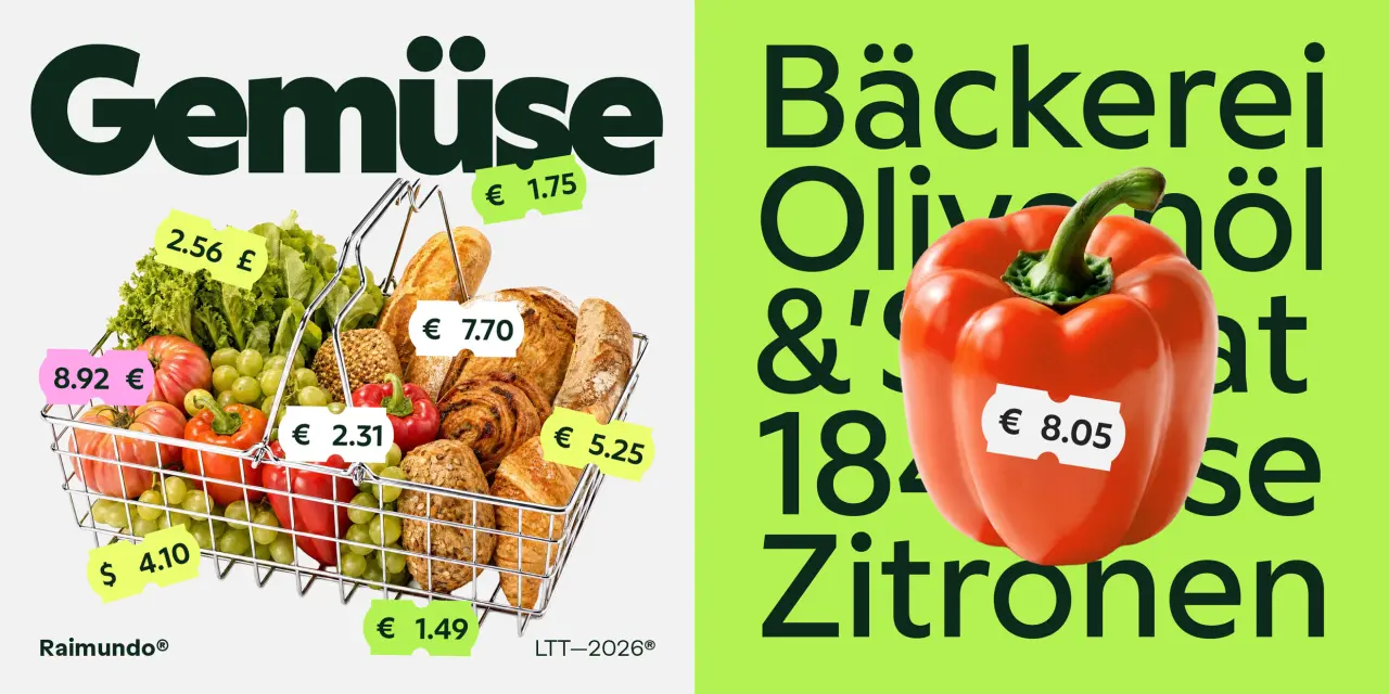
Raimundo was designed by Enrique Hernández, the father of one of Latinotype’s founders, and this familial link seems to have added an extra layer of warmth to its DNA. Type designer Jorge Cisterna describes it as “that friend who gives you straight advice with a pat on the back. A raspy, confident voice that always has a joke behind every line.”
Sitting somewhere between geometric and grotesque, the font features rounded forms, open counters and a weight range that moves from quiet to loud, while alternate forms for a, e and g allow the tone to shift from neutral to expressive in small, controlled increments.
The 541-glyph character set includes typographic emoticons, and not by accident: this is a consumer-facing typeface, not a corporate one. Eight weights from ExtraLight to ExtraBold make it a strong choice for food retail, packaging, digital products and brand identities.
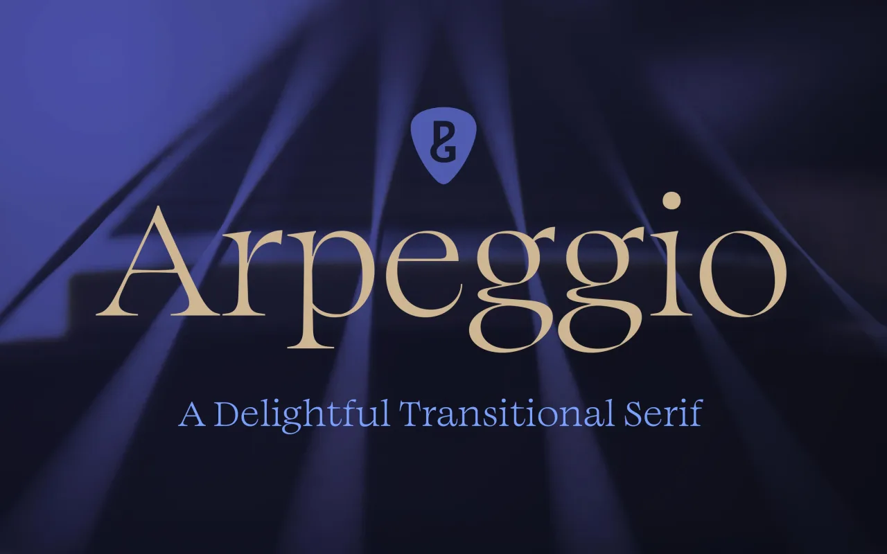
9. Arpeggio by Paulo Goode
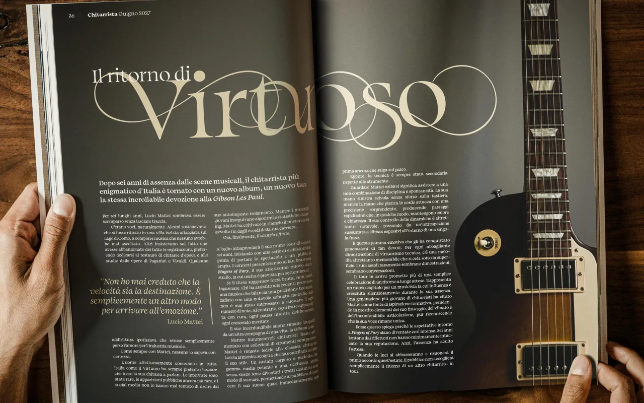
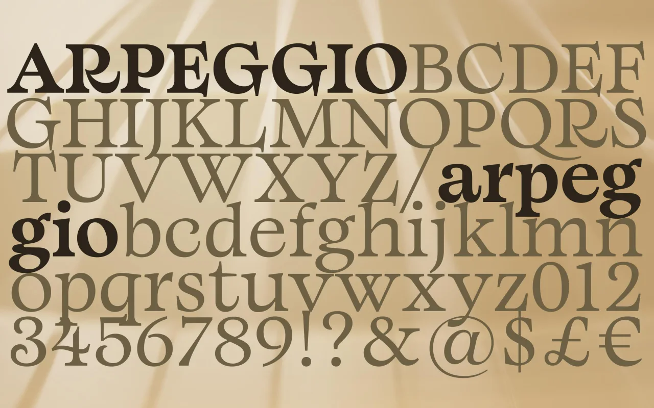
Paulo Goode, whose typeface Raxmus we featured in our May roundup, returns with a typeface that’s very, very different. Where Raxmus was flared and stone-carved, Arpeggio is a transitional serif; warm, readable and disciplined. It could serve as a workable alternative to Baskerville; not to mention Caslon, Mrs Eaves, Georgia, Perpetua and Bookman.
Described by Paul as “an original text typeface that balances disciplined rhythm with expressive character”, it oozes clarity and confidence in the text weights whilst the Display collection amplifies the characterful nuances with sharpened forms, graceful swashes and exuberant flourishes. A strong choice for books, magazine design or a luxury brand identity.
There are twenty-seven fonts in all across Thin to Black weights, with 500+ glyphs covering all Latin European languages. Variable fonts are available on request.
10. The Henston by Elena Genova
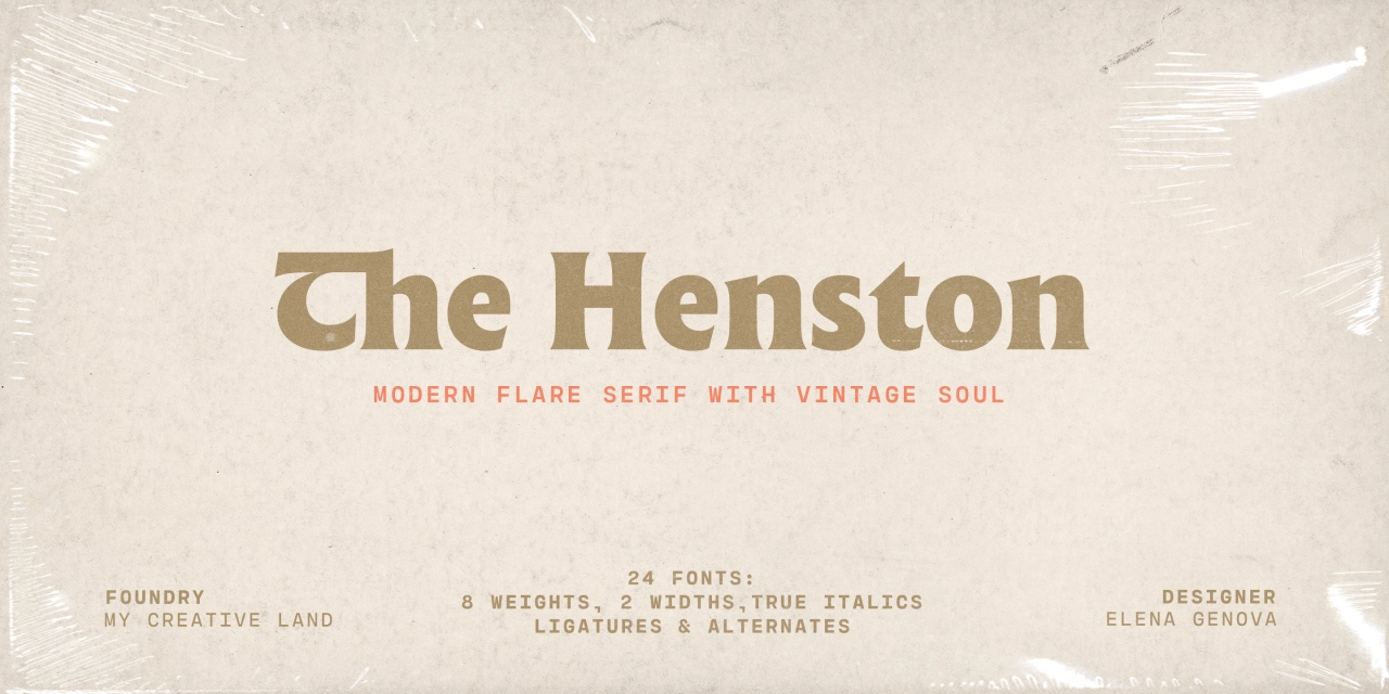
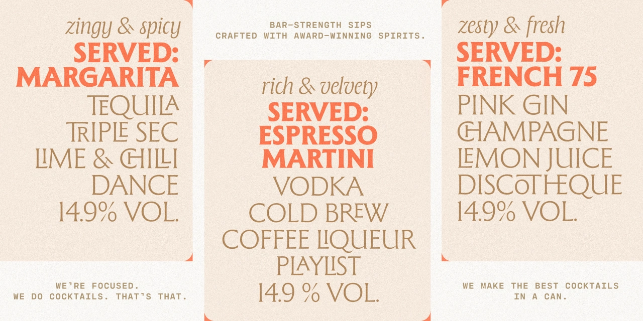
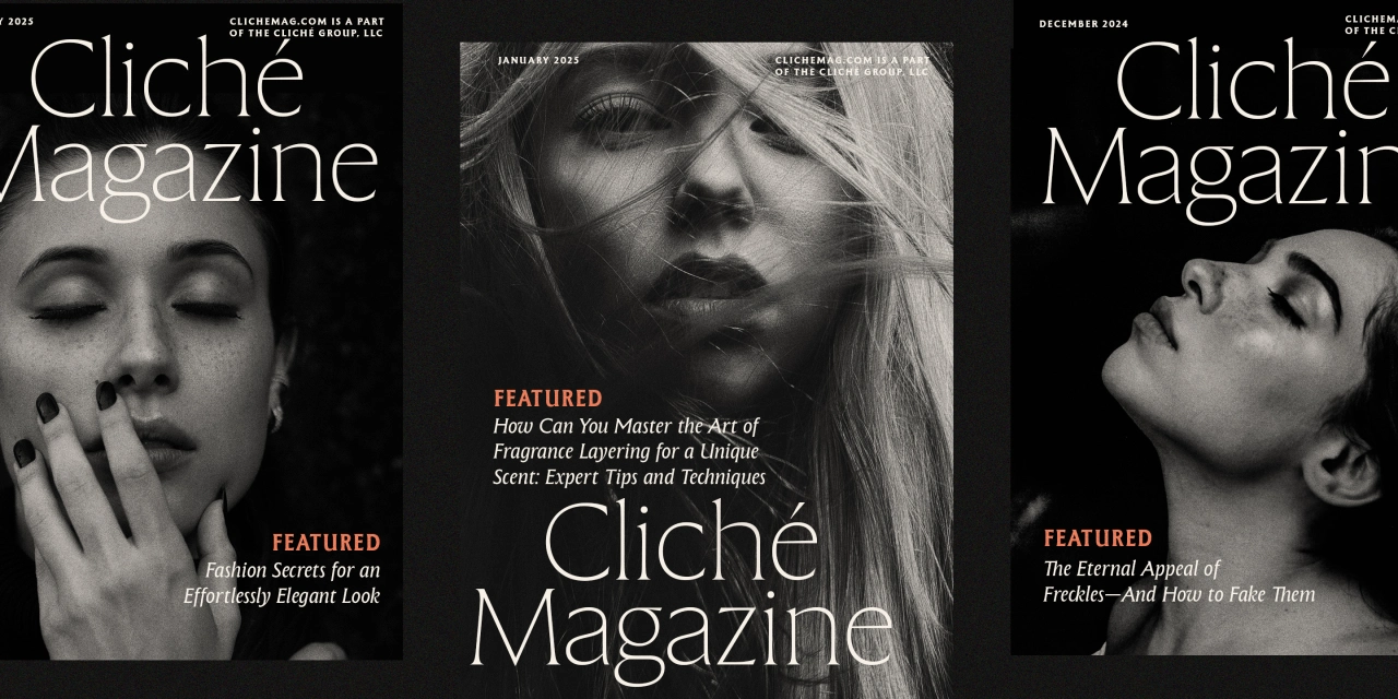
Elena Genova of My Creative Land, whose typeface Differently was featured in our July round-up, returns with a flared serif inspired by the incised letterform tradition exemplified by Berthold Wolpe’s Albertus and Hermann Zapf’s Optima. The design is subtle enough for display, whilst maintaining legibility at subhead and text sizes.
The companion italics draw on calligraphy, and there’s a well-chosen selection of ligatures, swash capitals, alternates and stylistic sets. There are two widths, each with eight weights from Thin to Black, with true italics included in Regular. This would be a good choice for a brand website, a magazine cover or a book cover.
11. Partiche by Richard Lipton
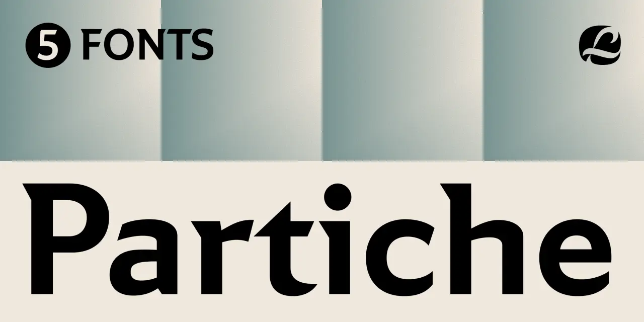
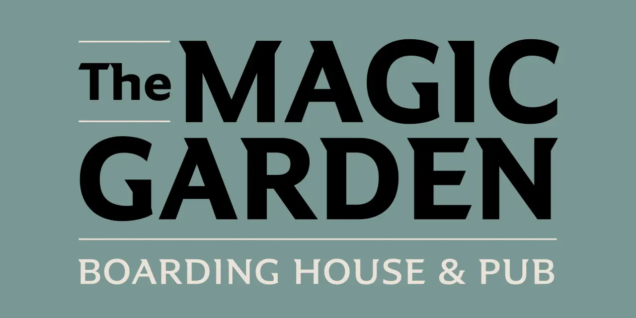
Created by Richard Lipton, who’s been designing type for more than 40 years, Partiche is an expressive sans with a calligraphic eye. It was inspired by the graphic sensibility of Seymour Chwast, the Push Pin Studios co-founder whose mid-century work was characterised by wit, warmth and visual intelligence.
The details Lipton takes from that source are specific: wedge-shaped terminals, sculptural spurs, unexpected details. On the surface, Partiche looks monolinear, but closer inspection reveals the calligraphic thinking underneath. Small caps and a purposeful set of alternates make this font a good choice when a design needs both character and utility.

12. GRX by Daniel McQueen and Bouk Ra
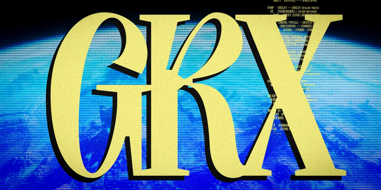
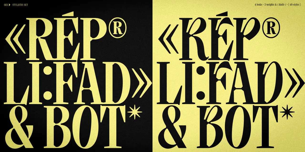
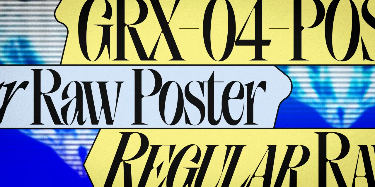
The latest typeface from The Designers Foundry is built across four sub-families: GRX, GRX Raw, GRX Poster and GRX Poster Raw. The base GRX contrasts bold, rugged serifs with controlled strokes. Raw adds rough texture inside the letterforms, giving the type a handmade weight. Poster sharpens the terminals and amplifies the contrast between thick and thin. And Poster Raw combines both directions simultaneously.
There are five weights per sub-family, and built-in stylistic sets and discretionary ligatures for further expressive control: 40 styles in total. The idea is to give creative latitude while retaining a level of formality. The Poster Raw styles in particular have a graphic intensity that would work well in editorial and poster design.
13. Vee by Laura Pappa and Tüpokompanii
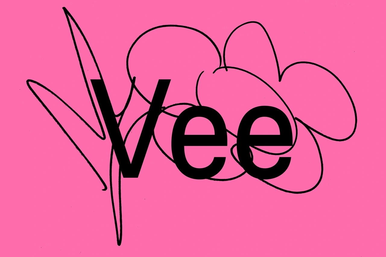
Vee draws inspiration from Venus, a sans-serif typeface family released by the Bauer Type Foundry in 1907 that was popular throughout the first half of the 20th century. Having worked with Venus herself, graphic designer Laura Pappa was eager to develop a typeface that references its distinctive character while introducing new qualities of its own.
A collaboration between Laura and Estonian type studio Tüpokompanii, Vee is described as “Venus’ younger, more mischievous sister.” To accompany its release, Tüpokompanii published a print companion called “Let yourself be bad at things”: a conversation between the foundry and Pappa about the origins of their working process, the development of Vee, and the values embedded in their typefaces. It’s a thoughtful pairing of typeface and text, and suggests a foundry that thinks carefully.
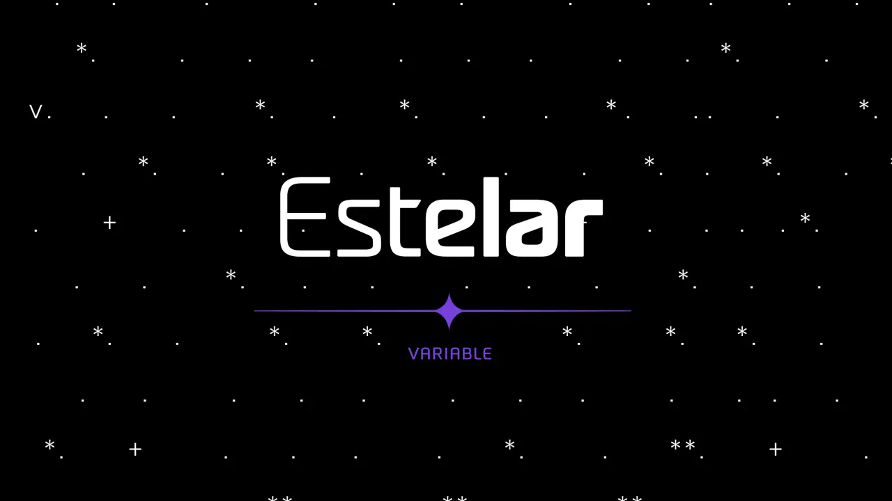
14. Estelar Variable by Mauricio Zanon
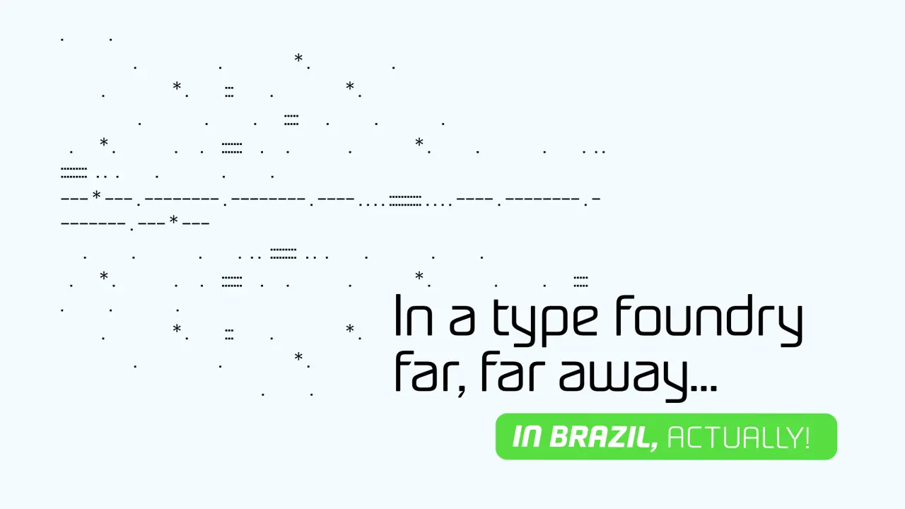
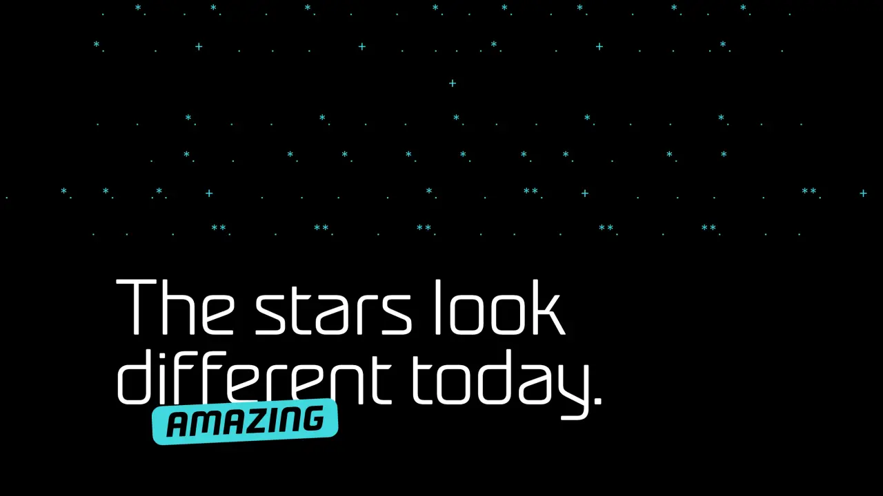
Estelar came out of a sketch. Mauricio Zanon of Zanon Studio, based in Rio Grande do Sul, Brazil, was working on a visual identity project that required a handful of modularly designed letters, and something in those early letterforms suggested a typeface rather than a logotype. Estelar grew from there, developed through the FontePro course from Plau, and ultimately became Zanon Studio’s first commercial type release.
The design sits at the intersection of futuristic and calligraphic: technological characteristics softened by a handwritten quality that prevents it from feeling cold or mechanical. A variable axis covering weight and slant, plus 16 individual static weights from Thin to ExtraBold, 400 glyphs, and support for 95 languages give it plenty of range. A good choice for logos, impactful titles and websites.
15. YJ Handful of Sunshine by Yenty Jap
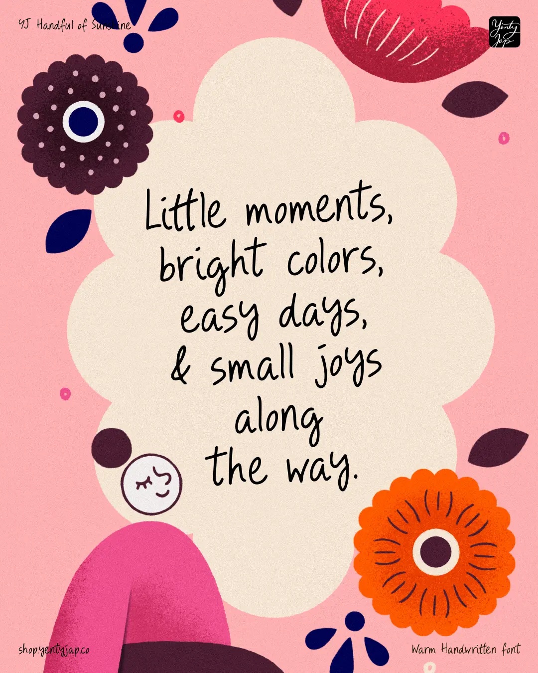
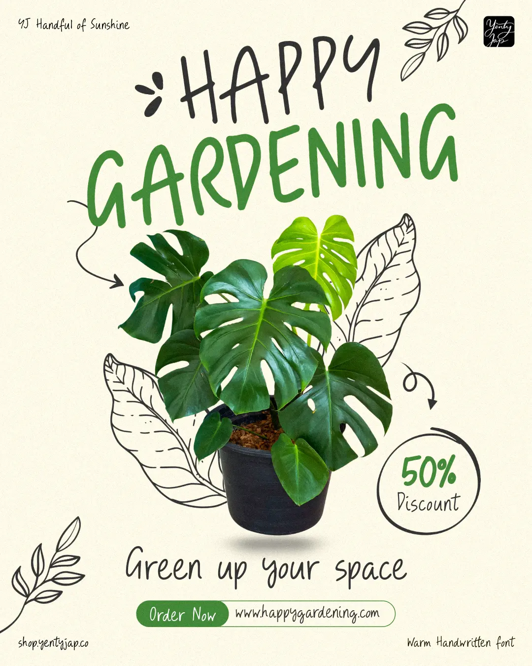
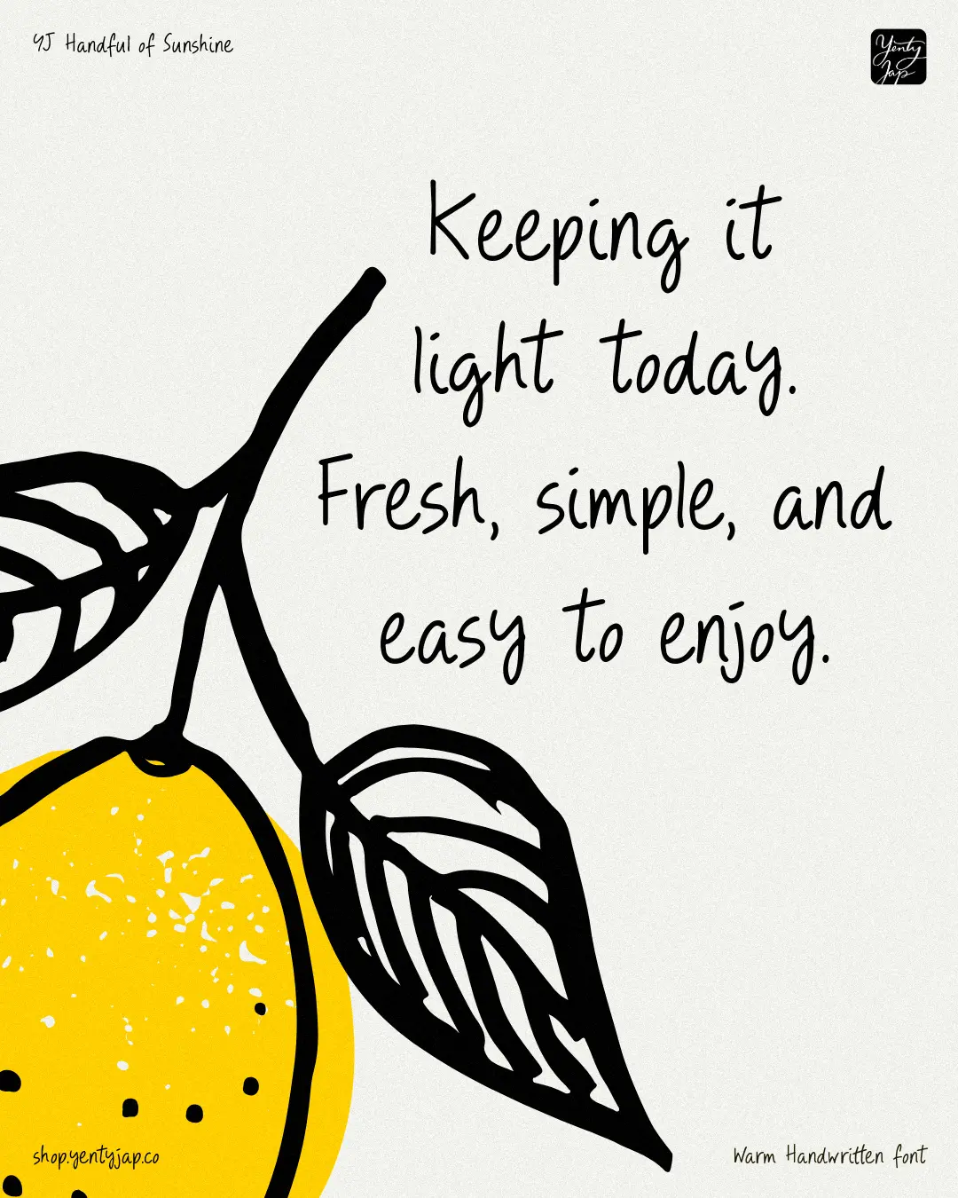
Aussie designer Yenty Jap closes this month’s round-up with something welcoming and cheerful. YJ Handful of Sunshine is a hand-drawn display typeface with two character sets (Standard and Stylistic Alternates). It’s designed to bring a calm, human handwriting voice into modern branding, and is inspired by everyday writing, journaling and note-taking.
The strokes are light and relaxed, with rounded terminals that keep the texture soft. Rhythm is loose but controlled, giving each word a natural flow without losing clarity. Spacing is open, allowing text to breathe in menus, packaging, and signage. Proportions stay steady across the alphabet, creating a handwriting style that feels warm, modern, and human.
This font would be a good choice for use in hospitality, lifestyle, and boutique branding, and more broadly, for anyone trying to give their designs a warm, handmade feel.