- Google’s been working on a colorful new design for the interface you see when accessing your passes.
- Compared to our first look at this refresh, Google has now added even more color, as well as sorted out some irregular screen elements.
- We’re also seeing this new look in preparation for your Play Points balance.
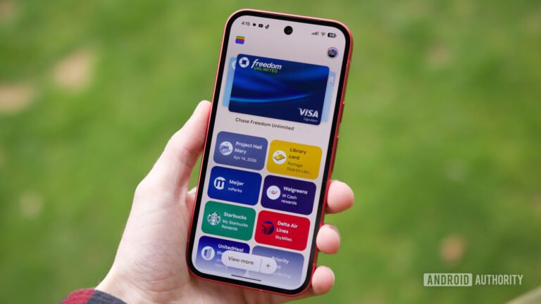
A bold design can go a long way towards enhancing an app’s usability. While an interface dominated by text and menus may feel like it offers the most utility, smart use of color and form can help make navigating even complicated apps feel like second nature. A little over a month ago, we took an early look at some of the ways Google Wallet was thinking about a colorful, bold upgrade for the way it worked with passes, and now we’ve got fresh progress to share.
You’re reading an Authority Insights story. Subscribe to our new Authority Insights newsletter for more exclusive reports, app teardowns, leaks, and in-depth tech coverage you won’t find anywhere else.
Google Wallet already makes some good choices when it comes to color, employing it in the background for its passes UI to help all your different options stand out. You won’t see this new look in the app just yet, but in Wallet version 26.18.910990572, we’re able to get the app to give us a preview of the more detailed, more colorful changes developers have been working on: