Instagram just unveiled a new wordmark, the social media app’s first major logo redesign in a decade.
“The wordmark at the top of the app hasn’t changed in 10 years, so it was time for a refresh,” head of Instagram Adam Mosseri announced in an Instagram post. “Cleaner and more modern, with references to the original and the simplicity and craft that’s always made it Instagram.”
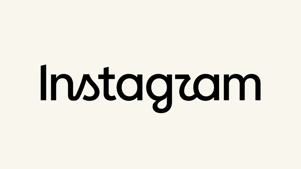
The new design lets go of Instagram’s iconic cursive font. However, it retains hints of script, like a connected “n” and “s” as well as an “r” and a “g” with playful swooshes.
The change also moves Instagram closer to the visual identity of its sibling Meta apps thanks to the introduction of sans-serif lettering, which is also found in the wordmarks of Facebook and Threads.
In fact, Threads rolled out an updated visual identity in May this year. As Fast Company reported at the time, the Threads redesign came as a way to evolve Threads as more than just an offshoot of Instagram, but a platform of its own.
While more details on the redesign are still to come, users on social media have already taken notice of Mosseri’s announcement.
Some are not entirely welcoming of the new design, with one user on X saying, “The new Instagram logo is funky in the worst way possible. It’s leaning both into the classic script and also trying to drop in a standard “a” and “m” sans serif. Also the “I” is a totally different weight.”
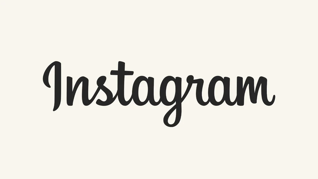
Many are noting that the approach of keeping just some cursive elements and letting go of others makes the wordmark confusing to read, with many commenting on Mosseri’s post that the new wordmark looks like it reads, “Instagzam.”
And while others are welcoming the change, like one user who commented “Modernized we love it,” others are already mourning the old design. One user added, “the end of an era.”