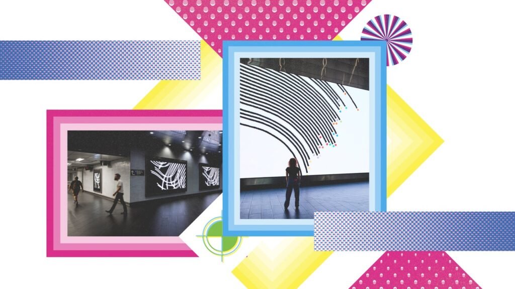
Black lines and colored dot clusters playfully dance and interact with each other against a pure white background, flying across 52 video screens at Fulton Transit Center, for two minutes at the top of every hour. Commissioned by MTA Arts & Design, A Data Love Letter to the Subway was viewed by nearly 300,000 commuters daily from October through December 2025. It’s the winner of an Innovation by Design award in data design.
While the animation is not a functional display of real-time data, a team from Pentagram used the repository of information from MTA Open Data to create the installation. “The trains become characters in a visual language that is almost like a picture book,” says Pentagram partner Giorgia Lupi.
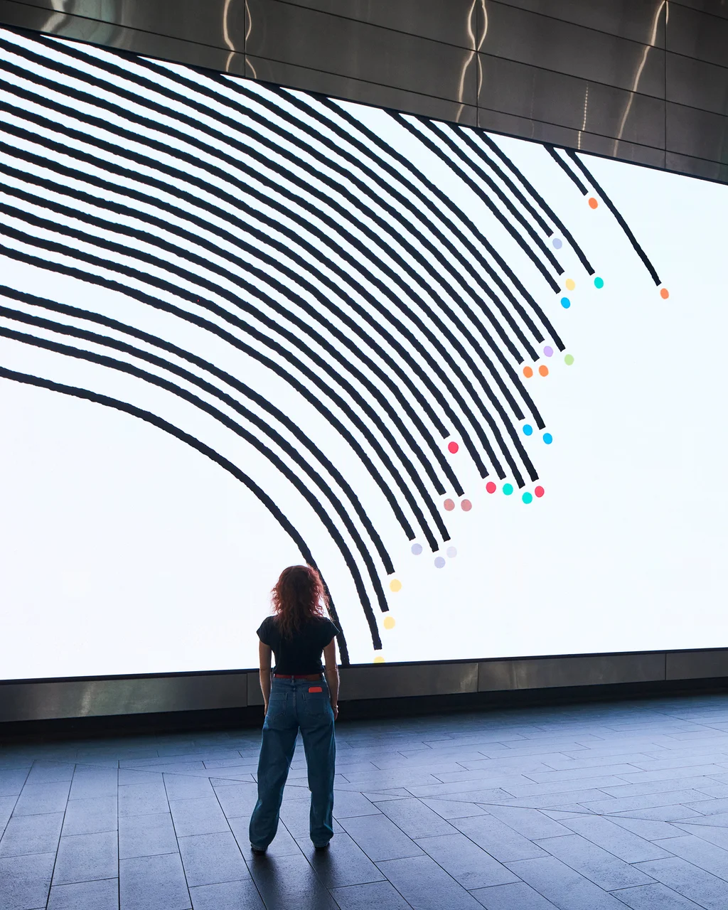
The animation opens with the A and C trains, which run together for 18 miles before diverging for another 14, then goes on to show which trains wait for each other or which lines never intersect, such as the 2 and the G. The animation also incorporates various NYC subway facts, such as how long each line is and the year it was opened.
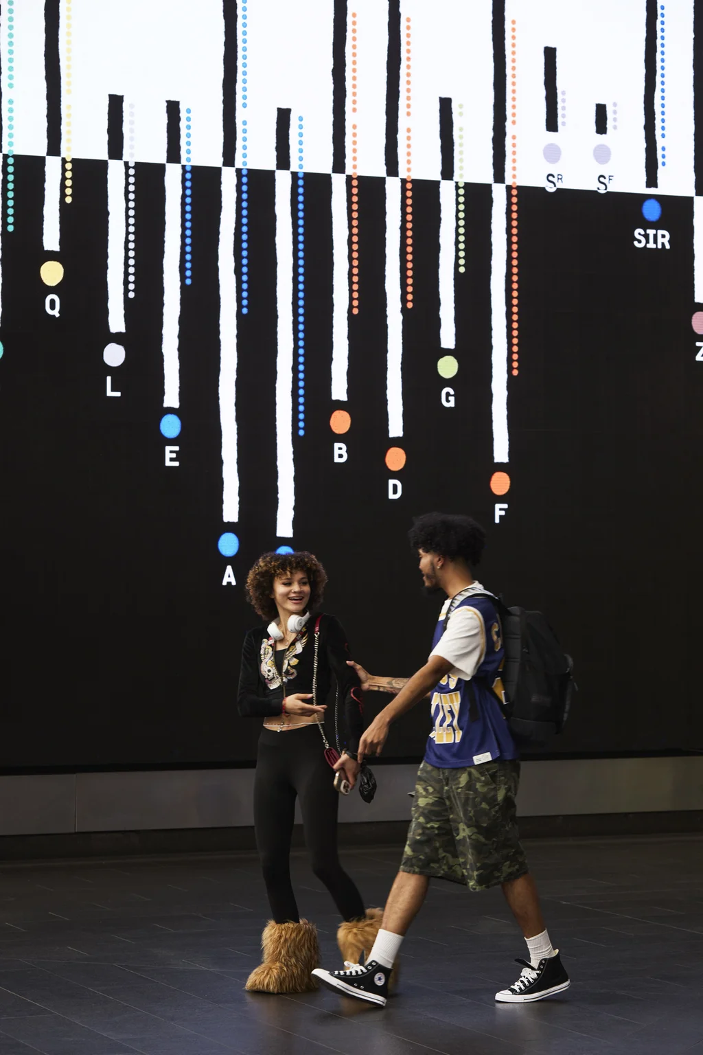
The animation closes with excerpts from the subway’s Missed Connections postings—a long-running section of Craigslist personals where New Yorkers post messages hoping to reconnect with strangers they encountered briefly on a train or platform, often describing them only by what they wore or where they got off, such as “red beret, got off at Oxford Place”—before finally settling into a new version of the classic geographic subway map recognized around the world.